Quick review
The good
The not-so-good
Phones can all look a little same-same these days, but the Nothing Phone 2a offers something different for a mid-range price point.
Have you ever looked at your phone and those around you and wondered… is this it? Are phones always going to look like this, or is there more out there?
Australians have a wide selection to pick from, with a massive assortment of what could be their next phone, be it a high-end smartphone, something more skewed to budget price points, or even something in between via the mid-range. You have options, and that’s great.
But even throughout these options, there’s that feeling of same-same. Most mobiles look similar. They function much the same. There’s a vibe of phones being ordinary, and that’s not something everyone wants.
That vibe could be giving relative newcomer “Nothing” the perfect entrance, with a handset that aims to be different in almost every way. It’s still a smartphone, sure, and much of what it offers is much of what every other model offers, and yet there’s something decidedly different about the Nothing Phone 2a, and it doesn’t even cost all that much to find out.
Design
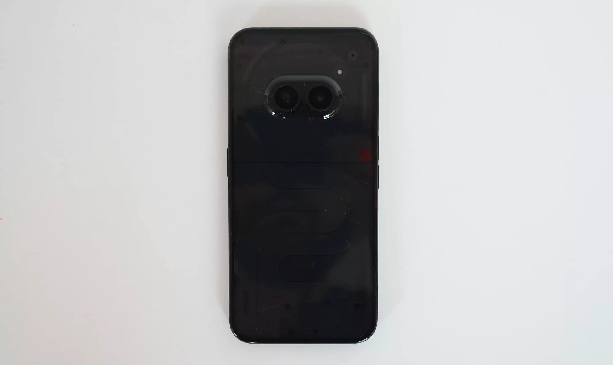
Appearing almost like an iPhone and yet not, the Nothing Phone 2a is striking when you see the back. The front, however, markedly less so.
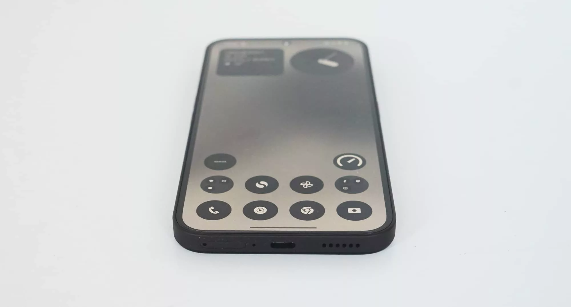
From the front, this phone looks like an iPhone, complete with the same flat edge that Apple’s handsets have offered for several years now. In fairness to Nothing, it’s not as if there’s a whole heap of options for phone design to go, so it makes sense.
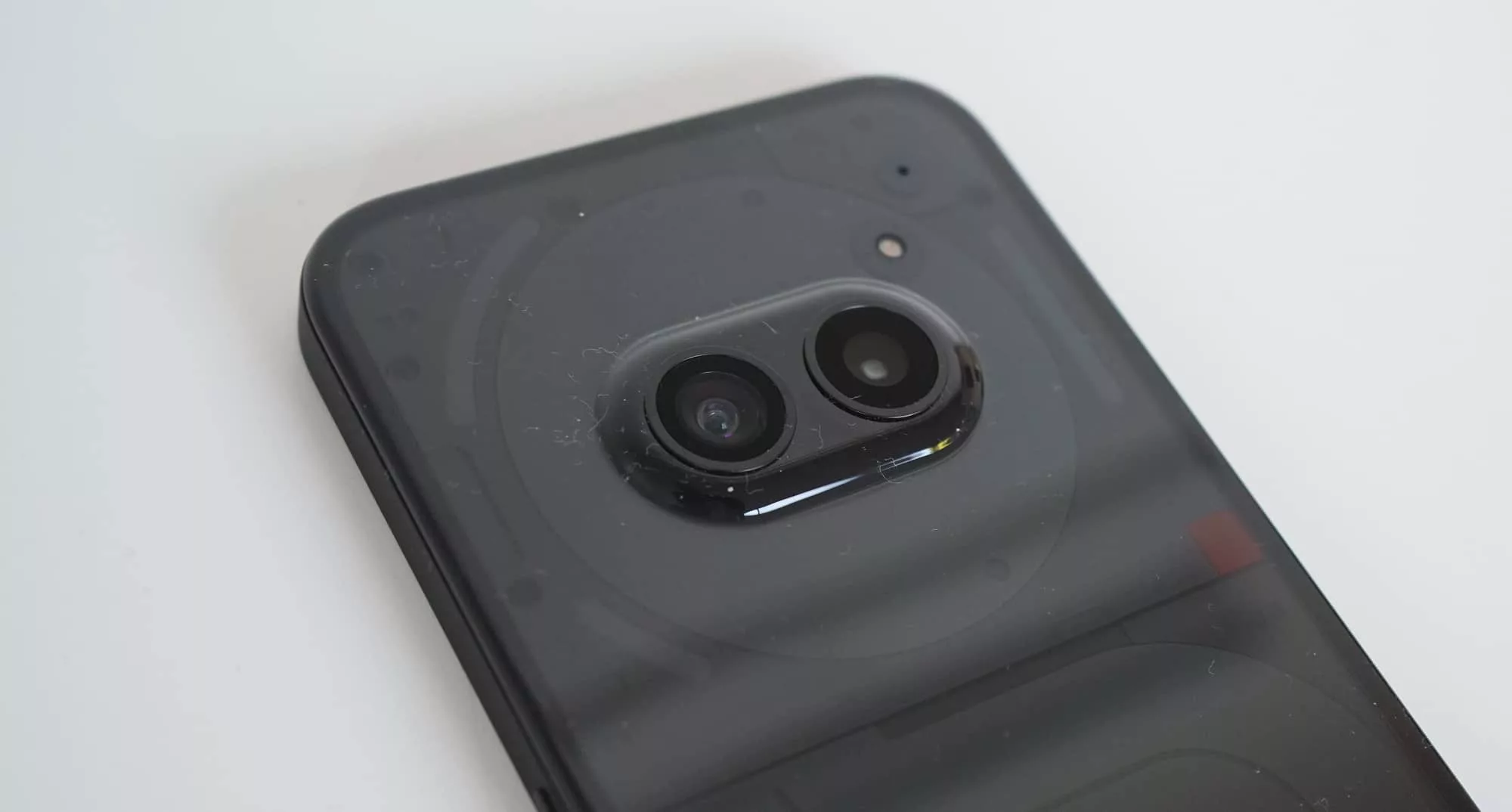
The back is where things get interesting: the plastic exterior is close to transparent, and more like translucent. There’s a dark cast over the design, but you can see everything underneath. It’s stylish and unique. The geek in me loves it, and since he occupies most of my being, I love this design.
There are other aspects that make the Nothing Phone 2a stands out in design, such as LED light strips on the back, but for the most part, it’s a phone. A monochromatic phone, sure, but a phone.
Features
Inside, you’ll find a Mediatek Dimensity 7200 Pro chip armed with either 8GB or 12GB RAM, plus either 128GB or 256GB storage dependent on how much you spend.
Google’s Android 14 appears on the phone out of the box, complete with the Nothing OS 2.5 overlay, while the phone itself offers WiFi 6, Bluetooth 5.3, GPS, Near-Field Communication (NFC) for Google Pay, 4G, 5G, and a single USB-C port at the bottom.
The back sees two 50 megapixel cameras, covering a wide F1.88 50 megapixel camera as well as an ultra-wide F2.2 50 megapixel camera to use, too. Meanwhile, the front sees an F2.2 32 megapixel selfie camera. Three all up.
All of this sits under a 6.7 inch display made with flexible AMOLED and protected by Corning’s scratch-resistant Gorilla Glass 5. There’s support for high refresh rates at 120Hz and a resolution of 2412×1084 (Full HD+), a fingerprint sensor, and facial recognition via the front-facing camera, all sitting atop a 5000mAh battery.
No wireless charging can be found in the phone, but it is rated for IP54 water resistance, which is better than no resistance at all.
| Model | Nothing Phone 2a (Nothing A142) |
| Chip | Mediatek Dimension 7200 Pro |
| RAM/Storage | 8GB/128GB; 12GB/256GB |
| OS | Android 14 |
| Screen | 6.7 inch AMOLED Full HD+ (2412×1084) |
| Cameras | 50mp wide, 50mp ultra-wide |
| Connections | 5G (sub-6), WiFi 6, Bluetooth 5.3, GPS, NFC, USB-C |
| Size/Weight | 8.55mm, 190g |
| Price | Starting from $529 AUD |
In-use
While phones have largely become same-same these days, the experience of using a Nothing phone feels… well, rather like nothing else out there. That’s an interesting way of interpreting the “Nothing” name, which on the surface appears more about being transparent than anything else, but the experience is unique, too.
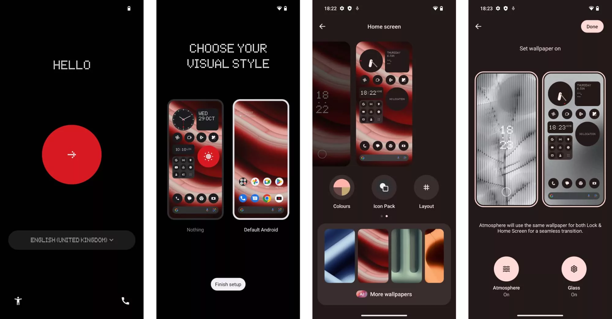
You see Nothing offers its own flavour of Android like most of the other brands, but it also differs greatly in style.
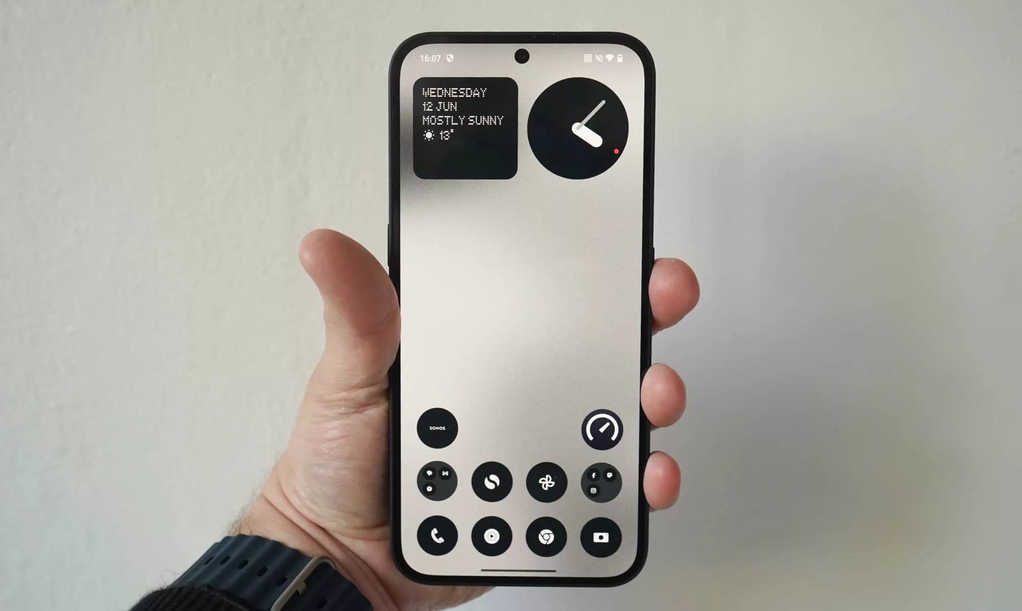
There’s a softened take on pixelation in the design, and a vibe that screams “nerd” in the most fashionable way possible. Forget about Homer Simpson yelling “NEERRRRDDD” at the top of his lungs when he goes back to college, Nothing’s take on nerddom is sleek, sexy, and stylish. Nerd is no longer a dirty word, and this phone is proof.
The look is soft LED lights as art blended with a seemingly art deco glass. The look is artsy and individual, and goes against the grain for pretty much every other phone out there. The fonts are pixelated and close to 8-bit, and they appear in everything.
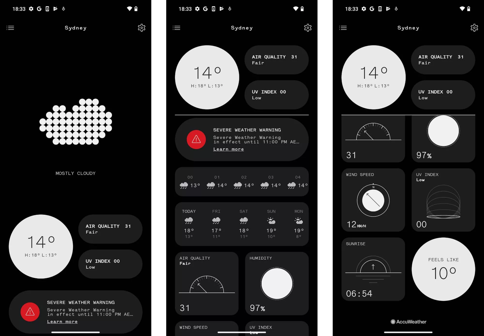
Nothing gives you the same amount of customisation control Android is known for, but it feels better developed: AI wallpaper generators, colour tints on icons, the Nothing style on the default weather app, and the ability to resize shortcut icons so they’re large and small.
While Android is known for being customisable, Nothing feels like it is achieving it better through its tweaks.
And yes, it’s also transparent. You get that transparent look in the casing just like in Nothing’s earphones, but you also get it in the included accessories: the pin ejector tool comes on a transparent plastic cylinder, while the USB-C cable has transparent ends.
Nothing isn’t wrong. This phone is like nothing else out there. And there’s more to it, too.
Glyphs and lights
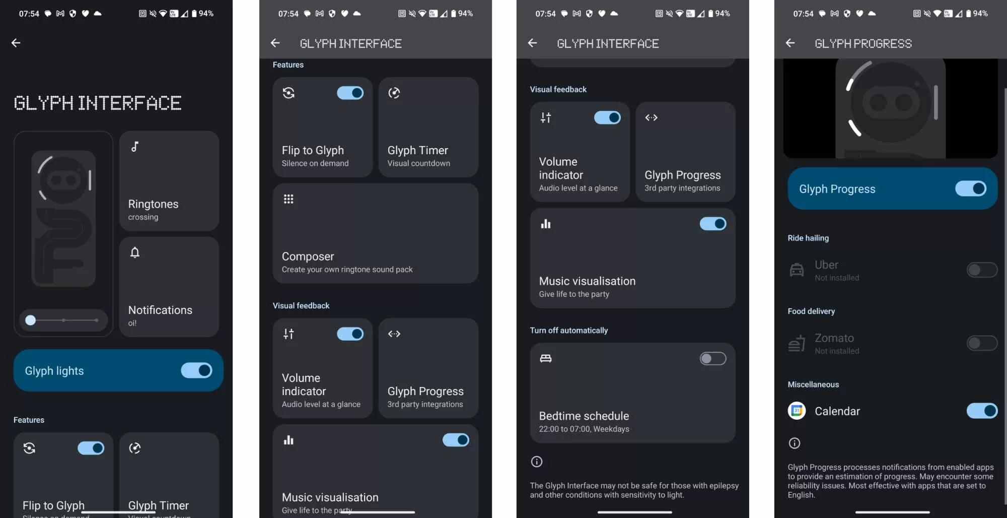
On the back of the phone, there are three LED strips in a sort of cut-down version of something its big brother offers. The lights are white light strips that can light up when programmed to, or act as a ringtone, or even provide a timer for certain apps such as Uber, or work as a sort of volume indicator of sorts.
It’s an extra feature phones haven’t offered, and helps to make this monochromatic mobile not only stay monochrome, but appear different. Think of the tiny LED alerting you to a new message, but made bigger. That’s what the glyphs offer.
AirPods support
Nothing also goes a little further than throwing in a few flashing lights, and definitely tries to attract the iPhone crowd with a feature we’ve never seen on an Android before: AirPods support.
That’s certainly… different.
Apple’s AirPods are Bluetooth so they technically work on any gadget that supports Bluetooth. It’s true: you can take a pair of AirPods or AirPods Pro, throw them into pairing mode (by flipping open the lid and holding down the button the back of the case), and pairing them with an Android phone. Nothing about that is new.
What is new is Nothing attempting to show information about the AirPods when they’re paired. In the settings screen, you’ll find charge levels for each ear and the case, as well as easy to access controls.
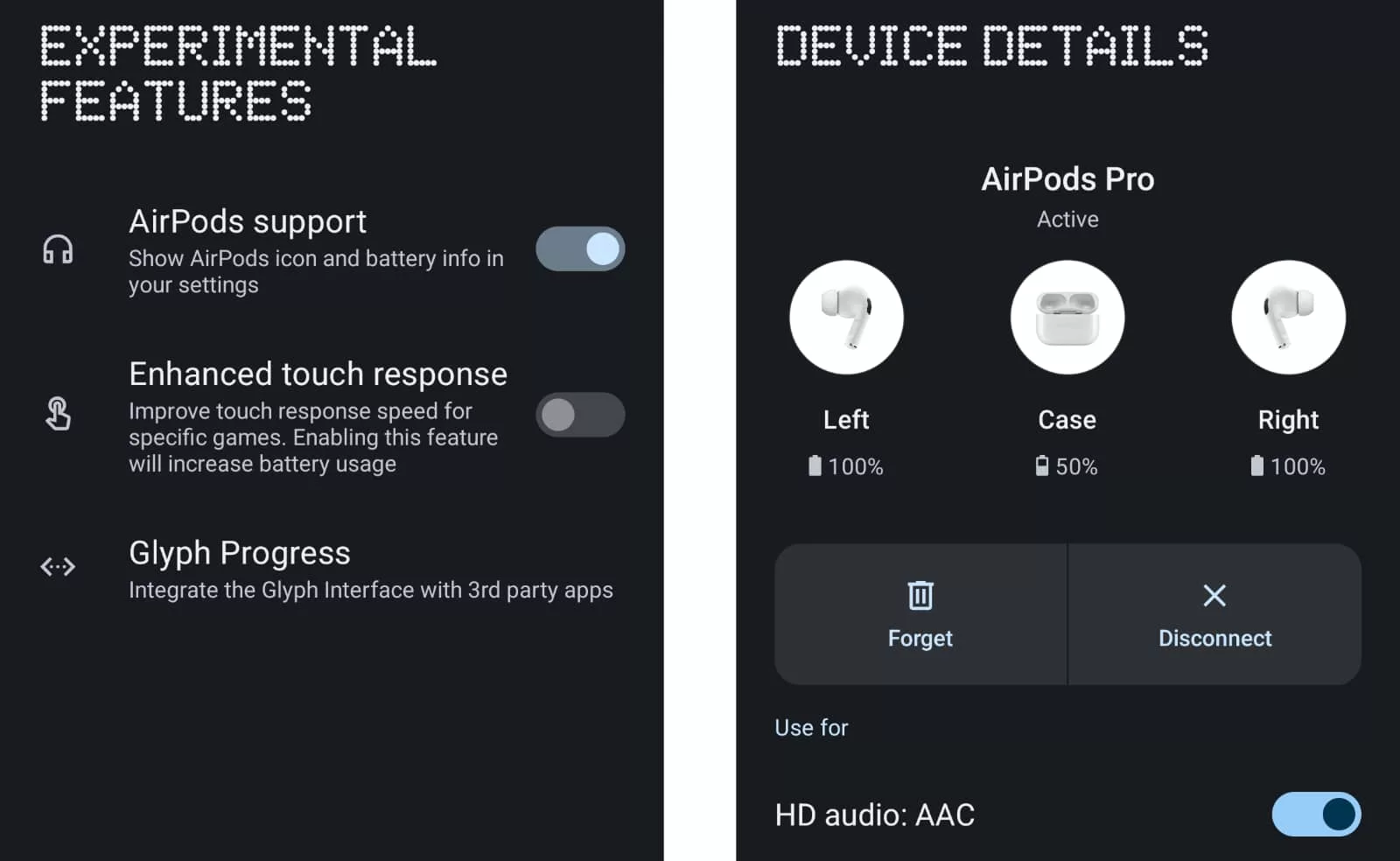
It’s not quite the level of choice available for iPhone owners, and you can’t trigger adaptive mode or the various noise cancellation features here, nor can you switch on head-tracked spatial. Those features are limited to AirPods owners with an iPhone.
But it’s certainly a start, and gives the Nothing Phone something else to lure iPhone owners with: at least one of your accessories will work with a rival’s brand of phone, even if an Apple Watch won’t.
Performance
Next up is performance, and while there’s no Snapdragon in Nothing’s 2a, the Mediatek Dimensity 7200 Pro can still hold its own… kinda sorta.
This is definitely a mid-range chip, and you’ll get mid-range performance to suit.
It doesn’t quite have the chops to match the Tensor G3 in the Google Pixel 8, which also means it’s underpowered compared to the recent mid-range Pixel 8a, but it also doesn’t fare too badly, either.
By comparison, the Nothing Phone 2a has marginally more going for it in the performance category than what was in last year’s Moto Razr 40, delivering better performance in most of the three areas we test for.
It’s not too shabby for system performance, though you may still find the odd spot of lag here and there.
Over in mobile performance, you can expect some decent speeds provided your mobile network has them on offer.
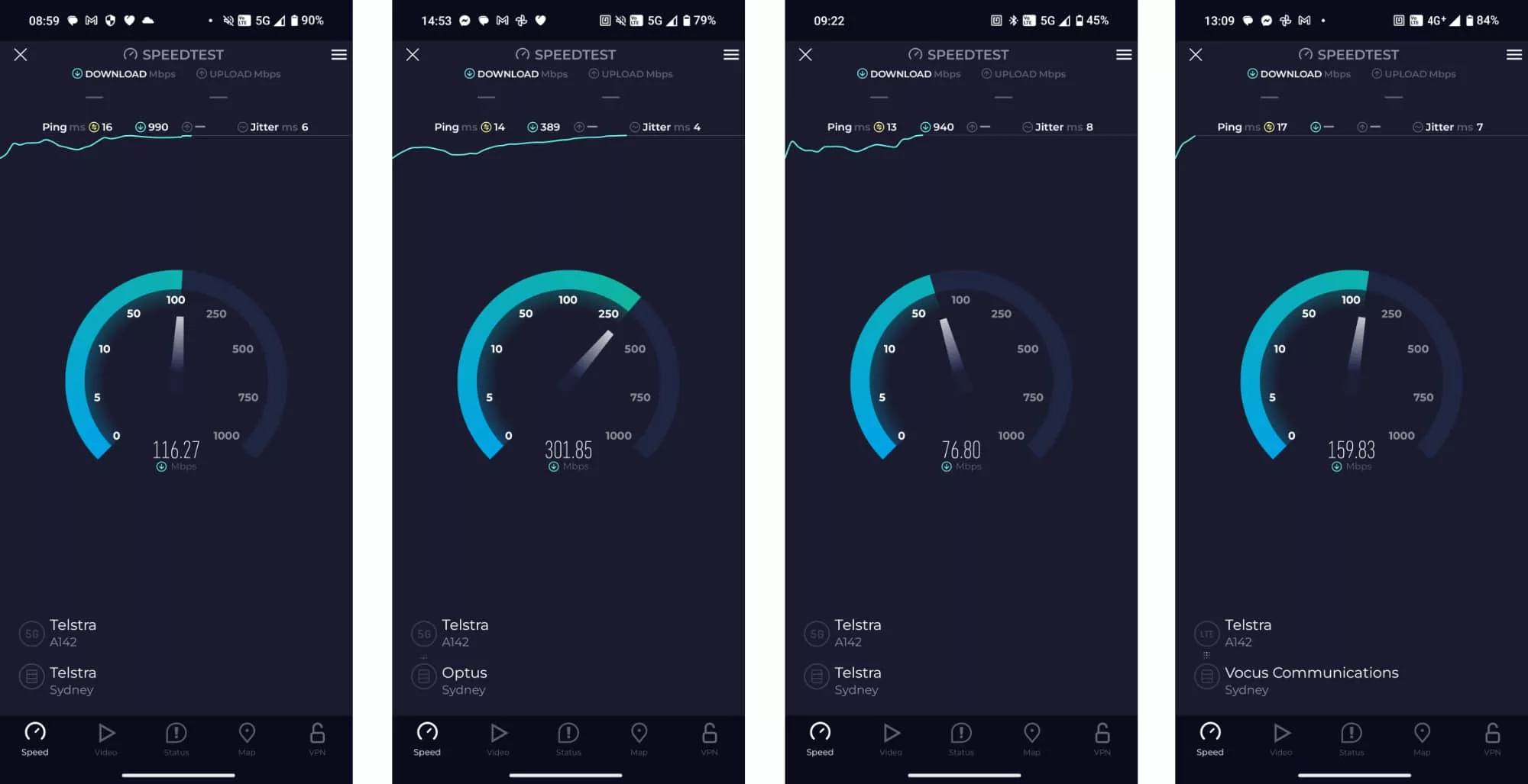
Testing the 2a on the Telstra 5G network by way of Mate Mobile (which is technically Telstra Wholesale), we found speeds as high as 301Mbps were possible, just before Mate’s bandwidth limiting promise came in and crunched our speeds back down.
As usual, your mileage may vary based on the telco you’re with, the area you’re in, and a few other factors, but 5G performance is definitely here in this phone.
Camera
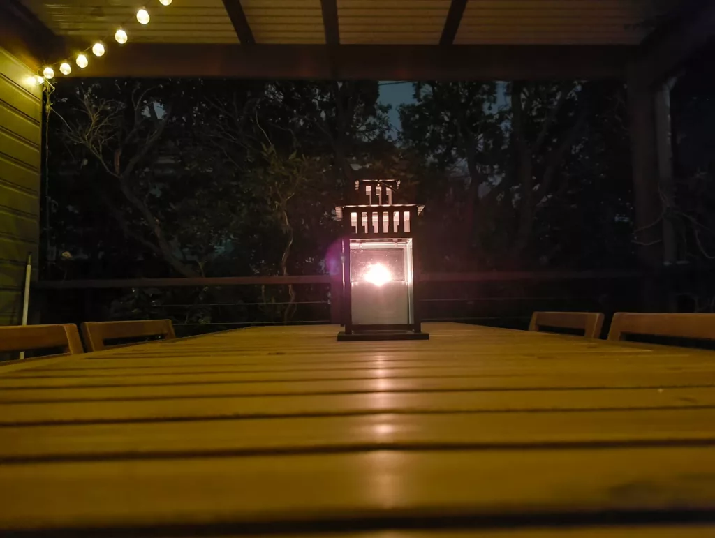
Two cameras on the back also provide some handy image capability, and they are better than expected.
While mid-range mobiles tend to offer varied camera performance (largely based on the assortment of cameras, the choice of sensors, the price of the phone, and who makes the phone in the first place), Nothing’s 2a surprised us.
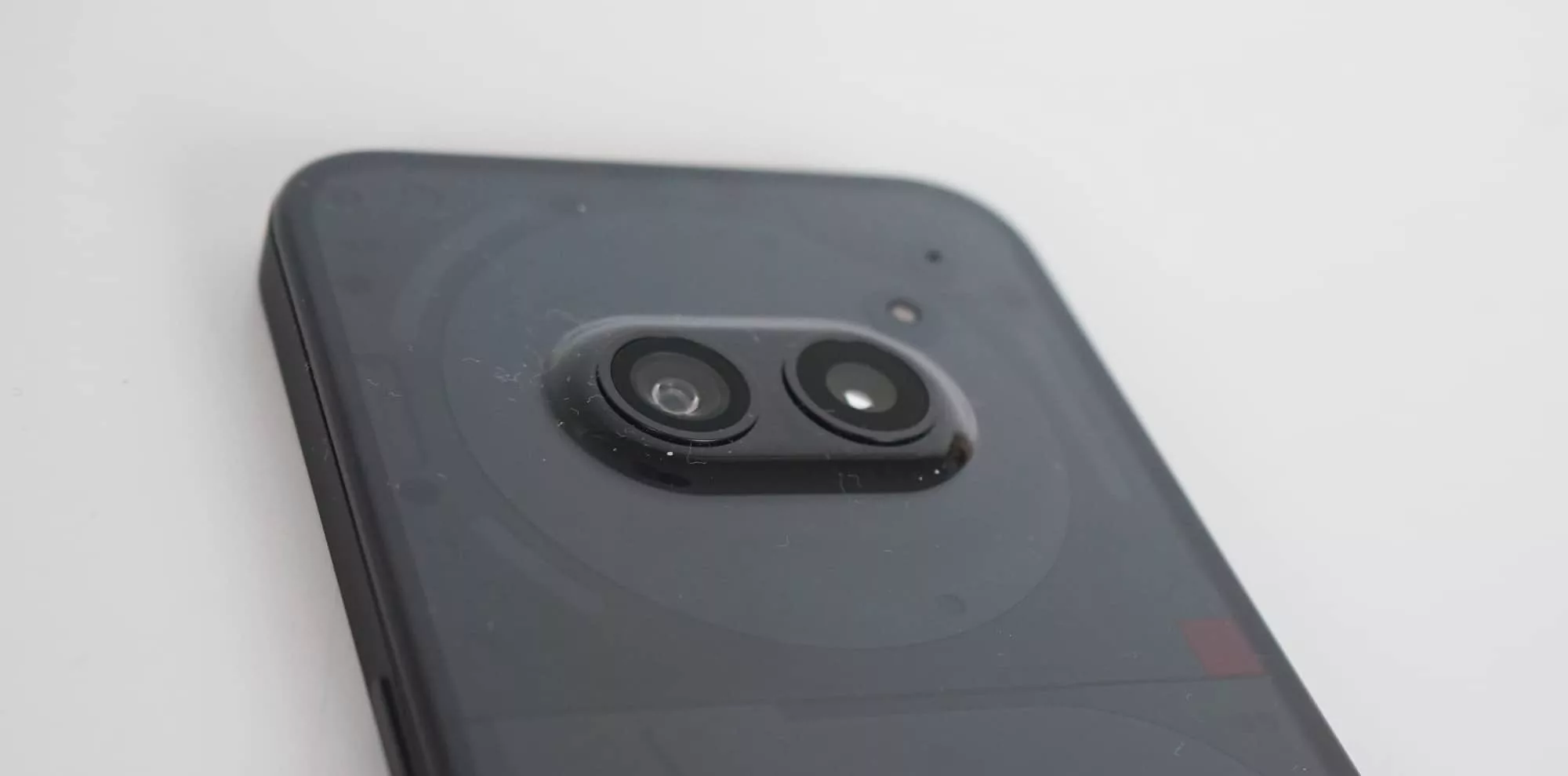
First up, there are two 50 megapixel sensors covering the wide and ultra-wide space. That’s better than one 50 megapixel module, and a surprise, to say the least.
Megapixels aside, you’ll find decent shots from the combination of the two at the back, with capable images in daylight, be it close or at arm’s length. Portraits look nice, details in scenes are clear, and even low light can handle its own at times, as well.
Our only major issue with the Nothing Phone 2a camera is the speed: while it can take a picture fast enough, there are times more often than we’d have liked where the phone can feel slow to fire. You’ll press the button, either on screen or using the physical volume key, and the 2a would fire the shot a half second later, resulting in blur or missing the shot entirely.
It’s worth remembering that the 2a is technically a mid-range phone, and slowdowns can affect any phone class, but often hits lower priced models. The Nothing 2a isn’t immune to this, and does sometimes get hit with a slowdown or two, particularly when firing a shot.



Battery
Fortunately, you’ll get a surprisingly decent battery life out of the 2a, something the mid-range is known for and that Nothing does okay in.
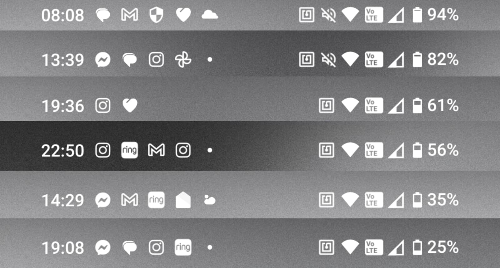
Throughout the week we used the phone, the 2a managed a day with no problems, and typically ventured into the second day without any fuss.
Our average life was roughly 1.5 days of use, with a 6AM start time running out of charge by 6PM on the second night, which isn’t too shabby.
It’s certainly better than many high-end phones, though in fairness, mid-range mobiles tend to do better for battery life due to the difference in hardware.
Value
We’re also fans of the price, which sees the Nothing Phone 2a cost $529 for a 128GB model in Australia, or $599 for a 256GB variant with an extra 4GB RAM for 12GB total.
There’s an easy logic to suggest Nothing’s phone should be below the $500 mark simply because many of its peers with similar performance are. However, the premium aesthetics of the Phone 2a gives it a bit of a leg up in other ways, and may make you hit the go button simply because this phone is so unique.
What needs work?
The biggest problem with being unique, however, could be that the Nothing Phone 2a is too unique.
The transparent look is one thing, but the operating system’s love for 8-bit style design and dots might also throw people off. It’s a unique look, for sure, and one that will either leave you with a total love, or a total distaste.
There’s no two ways about this: the design of the Nothing Android overlay is a “love it or hate it” kind of deal. We suspect more will dig the transparent design than the operating system, which can come off being so unique, it might throw others firmly out.
It’s a similar story with the LED glyphs on the back of the phone, which are a clever inclusion, but one that ultimately feels wasted.
Somewhere between the LED lights being difficult to compose — Nothing includes a composer, but it’s not easy to understand — and the phone often being in your pocket and thereby wasting needing to see them at all, the idea feels only half useful.
It’s definitely a point of difference, but not one where we’d specifically choose it over another phone.
Final thoughts (TLDR)
If anything, the main reason you’d consider the Nothing Phone 2a over others is its design, which helps to make it different.
You know what it’s like: glance around at everyone’s phones and you’re probably going to find consistency. A lot of iPhones, some Pixels and Galaxy handsets, plus a few others for good measure.
While there are differences, many of these look the same. And many of the owners of these haven’t changed a thing about their respective devices.
Owning a phone means actually owning it, and being able to make changes so that it’s properly yours. Yet we find people leaving Samsung’s stock Galaxy ringtone and keeping the stock wallpaper. Plenty of people own their phone, but also leave it the same.
With Nothing’s phone, customisation and tweaking seems encouraged, which makes them just so, so different. It’s a phone with an experience. It stands out in all the right ways.
It still won’t be for everyone because that experience will draw you with a “love it or hate it” vibe. But as far as making phones different goes, Nothing is nailing it. There’s something clever going on here, and the mid-range Nothing Phone 2a may be the perfect model to introduce people to it.


