Quick review
The good
The not-so-good
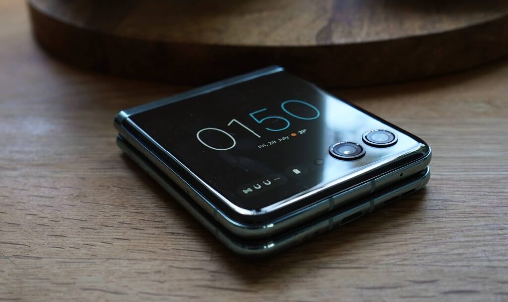
The Motorola Razr 40 Ultra expands on foldable idea not only by making a compact powerhouse, but also making it one you can use while closed.
With the age of foldable phones finally beginning to take off, mobile makers are really getting their footing. The designs are better, the screens are more reliable, and the general vibe is that the models are worth owning now more than ever.
And in the latest Razr, Motorola is trying to make the compact foldable even more useful by giving it a bigger screen.
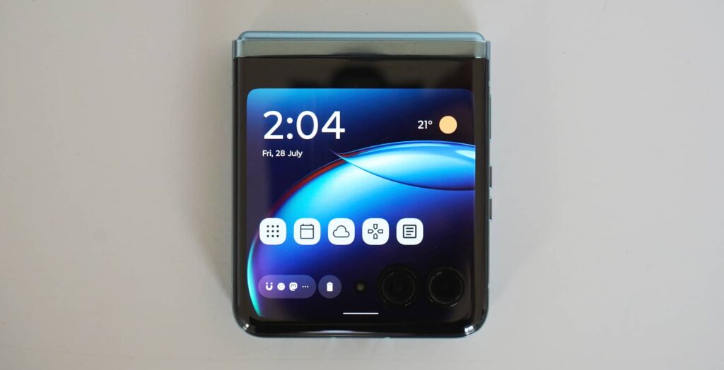
We’ve seen small screens in foldables ever since they first popped up in the initial versions, but Motorola is trying something else, giving the front of its Razr 40 Ultra a bigger screen so you can do more with the phone before you open it.
Does it work, and does it make for an even better foldable?
Design
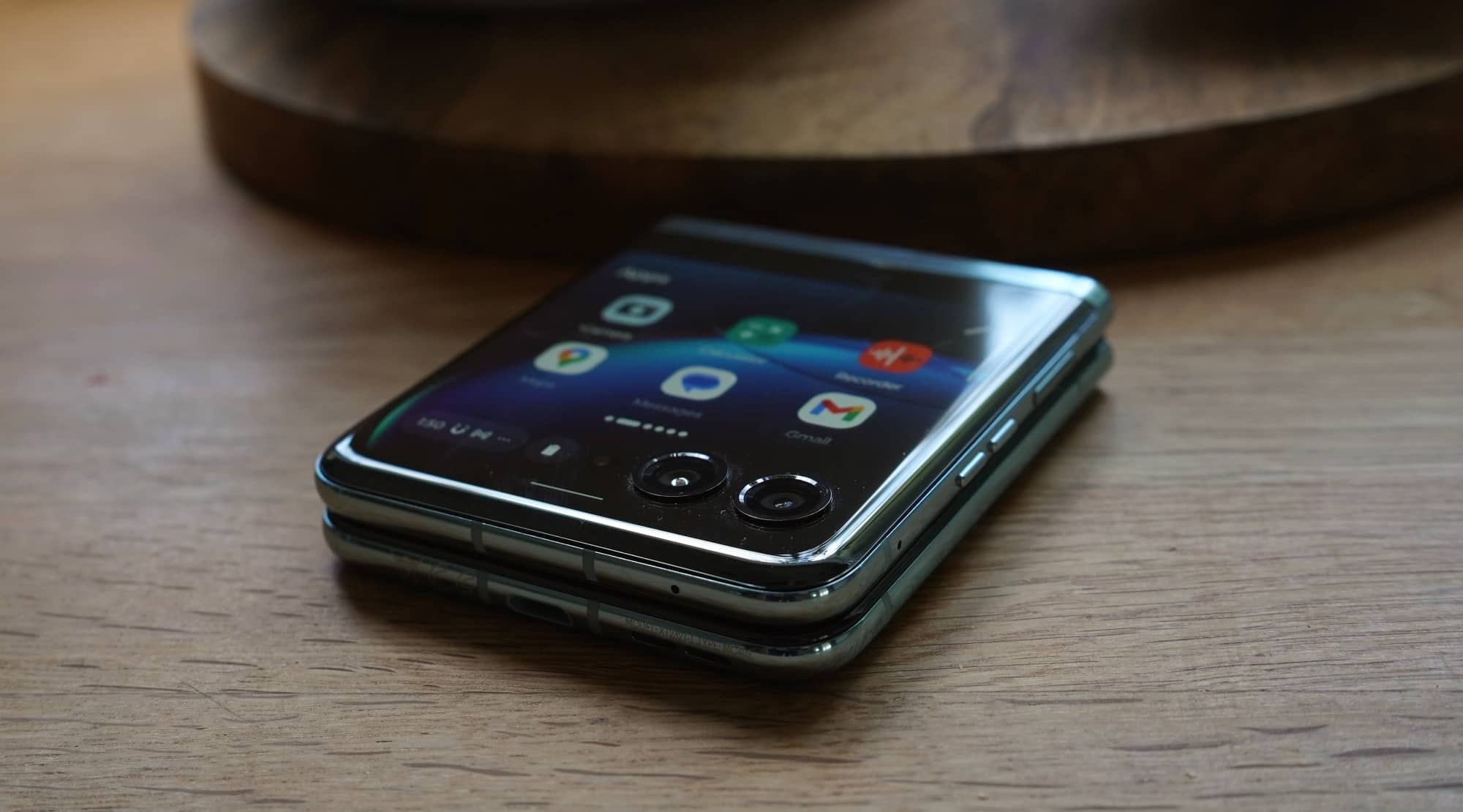
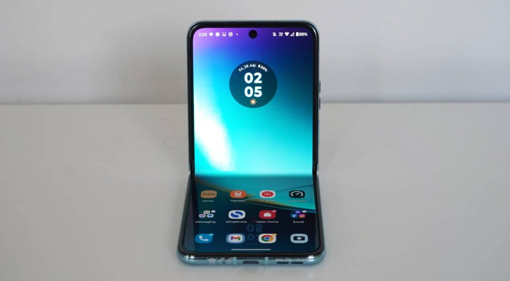
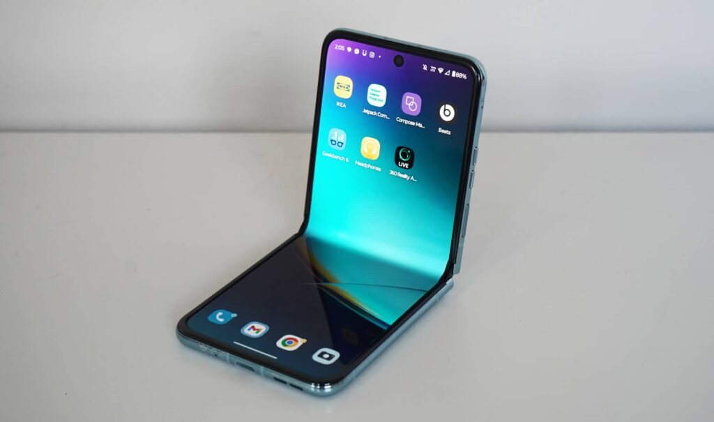
A phone folded in on itself, Motorola’s Razr 40 Ultra follows many of the design conventions we’ve seen in the past few years for foldable flip phones.
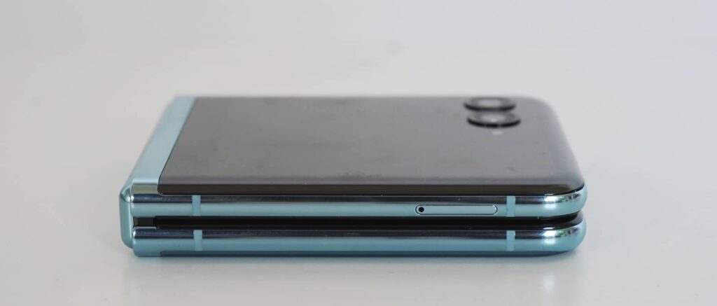
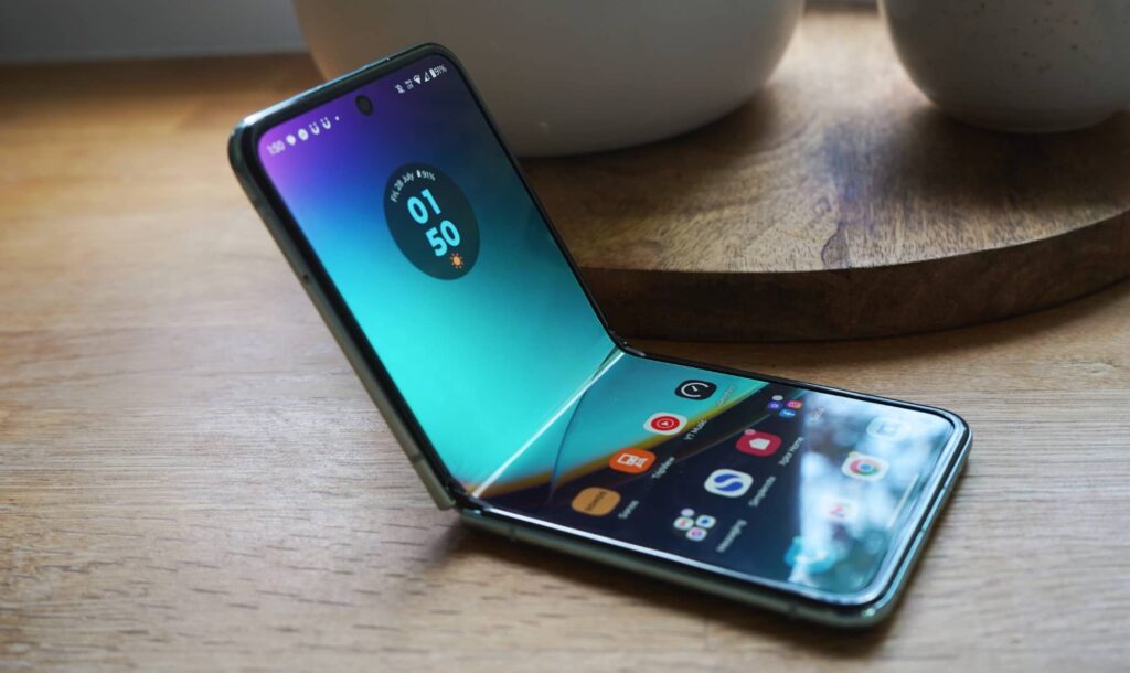
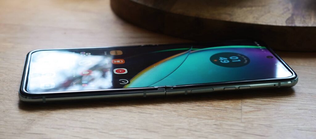
Probably our favourite foldable phone design of the two major types that have popped up, the Razr 40 Ultra keeps the hinge on the size holding two phone sections when closed, while opened sees the two halves not quite laying flat and tilting up slightly.
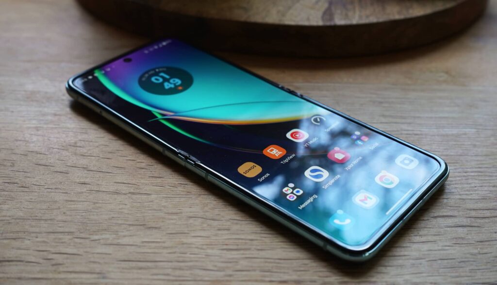
The finish is both shiny and matte, with some softened edges not unlike what you might have found on the iPhone X or iPhone XS Max.
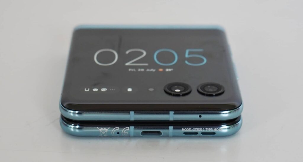
The blue Razr 40 Ultra we had in for review was sleek and shiny, glass coating the front and back, and a screen that runs right up into where the cameras are.
It’s a look that helps make the 40 Ultra stand out in such a big way: the screen isn’t shying away from the cameras, and the handset looks like everything just fits. It’s something special.
Features
Under the hood of this special smartphone are things we’ve seen before, thanks in part to Motorola using the template of its previous phones.
Also called the Razr+ in America, Motorola’s Razr 40 Ultra doesn’t just share the naming convention Moto uses for all its Razr models, but some of the technical specs. In fact, short of the cover screen and camera, reviewing this phone can feel a lot like something else we’ve reviewed recently: the end-of-2022 Motorola Razr.
Sure, there are some technical differences, but if you’ve considered the regular Razr, you’ve kind of also considered the more premium Razr 40 Ultra and Razr+.
So what’s inside?
Qualcomm’s Snapdragon 8+ Gen 1 is the chip of choice here, a shared with the other Razr models in the country, as well as 8GB RAM and 256GB storage.
Connection options cover the typical amount for a flagship phone these days, with the one wired Type C USB port at the bottom and a plethora of wireless options, including 5G, Bluetooth 5.3, 802.11a/b/g/n/ac/ax WiFi 6E, GPS, Near-Field Communication (NFC) for Google Pay, with support for both a nanoSIM and eSIM.
You’ll find two main cameras on the back here covering 12 megapixels F1.5 wide and 13 megapixels F2.2 ultra-wide, while the inside camera is a 32 megapixel F2.4 that can be downsampled to 8 megapixels F2.4 and use four pixels for one.
Then there are the screens, and yes, that’s plural in this phone.
On the outside, you’ll find a mostly square 3.6 inch pOLED display running at 1066×1056, while the inside sees a foldable 6.9 inch Full HD+ 2640×1080 pOLED display.
The phone itself is encased in Corning’s Gorilla Glass Victus on both the front and back, with the Razr 40 Ultra also sporting IP52 water resistance.
The battery is rated at 3800mAh and while it can’t be removed, it can be wirelessly charged, though will be much faster with a cord.
In-use
Normally this is the part in a folding phone review where we’d say “open up the phone and you’ll be able to start using it”, but in the Razr 40 Ultra, you don’t actually need to do that. You can keep it closed.
Thanks to that massive 3.6 inch screen on the front and a version of Android that lets you access the apps inside, the Razr 40 Ultra can be used closed. The apps don’t always work amazingly due to the small screen size, but they can work in a pinch.
Most of the time, you’ll be opening the clamshell foldable screen to reveal the full 6.9 inch size, which can seem impossibly big for such a small phone, but it works really well.
Some screens will change the size to match what Motorola has crafted here, and we found not everything was as responsively sized as the screen Motorola had.
If all of this seem like jargon, it means that Moto’s cover screen can load most apps, but not all of them will render in a useable way.
You can read emails via the Gmail app and look at notes you’ve previously written in Simplenote, but writing or editing sends you to a one-line edit screen that just feels clunky and not at all usable. Ookla’s Speedtest, our regular 4G/5G mobile benchmarking tool, also technically worked, but seeing the results was impossible in real-time on the screen.
Interestingly, you also have games available from Moto, and strangely you can’t even find them on the main screen. They’re little time wasters and basically a Moto equivalent of a compact game system from the 80s and 90s, but handy in a pinch, as well.
Mostly, though, that’s what the cover screen aims to offer: apps in a pinch. News in a pinch, whether at a pinch, email at the ready, and so on. It’s designed to help you use your phone without having to be distracted by opening it and getting all in on the 6.9 inch foldable screen, which is largely Android the way you’d expect it.
While not a Google Pixel phone, much of what Motorola offers is reminiscent of that, thanks to Motorola largely leaving the stock experience.
The extra little touches you might have seen on prior Moto phones, such as the Windows PC support we saw on the Lenovo-branded ThinkPhone is one of them, as is the twist the launch camera feature Motorola has been using for years.
Outside of those extras, the fact that this is a foldable has seen Motorola ensure how genuinely intuitive the handset is.
Anyone who has owned a flip phone in the past, especially a Razr, understands the basic nature of picking up and finishing a call, namely by opening the handset and closing it shut.
Both of those actions work here, though not necessarily with as firm and satisfying snap. Neither action is particularly new to foldable flip phones — the Samsung Flip 5G did this, too — but it’s a handy inclusion you mightn’t think to use, and you should.
Foldable Display
It’s also worth talking about the display, because this is a foldable phone after all, and foldables tend to pay more attention to the internal screen due to that folding section.
Since their release a few years ago, foldables have come with a bit of a fold inside that you can feel and often see. Call it one of the issues with being an early adopter, the ripple of the folding screen can grind at people in use, particularly if it’s easy to see.
But in the Razr 40 Ultra, Motorola has used one of the nicest foldable displays we’ve seen yet, making for a ripple you can feel, but that’s hard to see. It goes a long way to improving the state of the rippled foldable screen, and is easily one of our favourite aspects of this device already.
Performance
Get to using the Razr 40 Ultra and you should find a reasonably snappy system, even if it’s one that comes with its fair share of laggy moments.
Motorola unfortunately didn’t opt for anything different compared to what it offered in the previous Razr or even the ThinkPhone, meaning it’s much for muchness here, delivering the same system performance in this generation.
That’s not necessarily a bad thing, but it means the chip you’re using is a little out of date by comparison to say Samsung’s latest Flip 5. The 40 Ultra uses the Snapdragon 8+ Gen 1, while the Flip 5 gets the 8 Gen 2. Minor differences, but they’re still there.
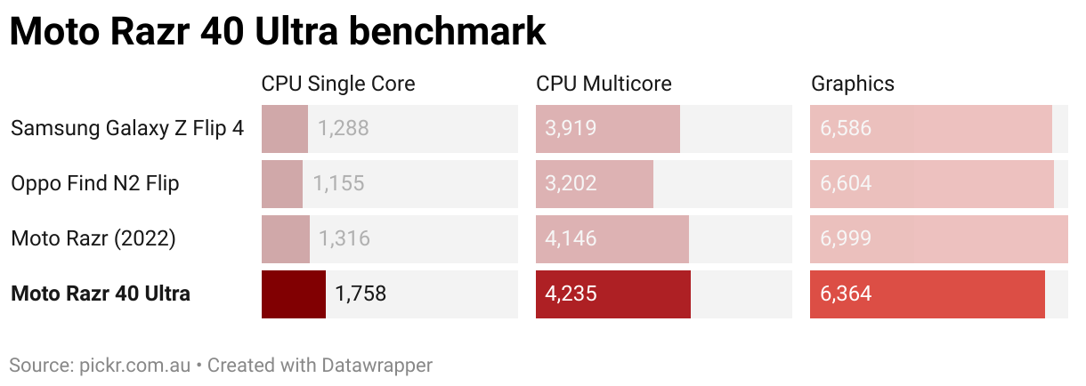
Fortunately, you shouldn’t see too much in the way of speed differences, though we did find the odd spot of lag here and there often in web browsing. Some apps would just stall for several seconds before crashing out, a problem we’ve not seen in a long time. That sort of thing can happen with any phone, but we saw it a few more times than normal while reviewing the Razr 40 Ultra. Here’s hoping Motorola can fix it up with an update.
Mobile performance is also capable, thanks in part to the 5G capability of Qualcomm’s hardware in the Snapdragon.
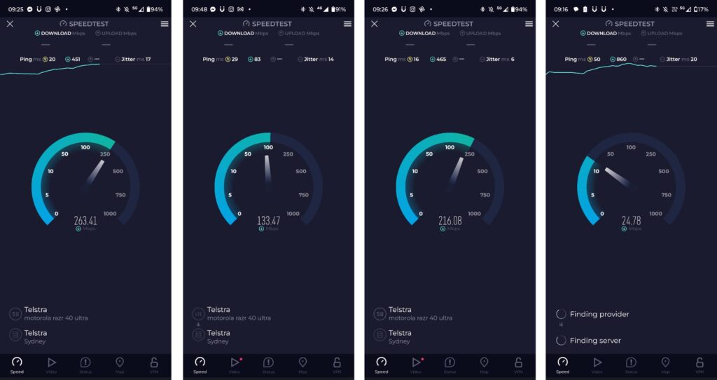
Tested on the Telstra network by way of Mate, we found 5G speeds as high as 260Mbps were possible, giving you plenty of speed in a pint-sized design. Your speeds will of course vary based on a variety of network factors, but decent mobile speeds are possible in this handset .
Camera
Most of that experience is consistent with other flip foldables, and also keeping things consistent with other foldables are the cameras, with two on the back of this phone, sporting the regular flip inclusions of a wide and an ultrawide.
Very little about that is a surprise, largely matching the Galaxy Z Flip 4 and Oppo Find N2 Flip which came out before it. Even the Galaxy Flip 5G from a few years ago featured this camera configuration.
What Motorola has managed to improve upon, however, is the quality, giving you some macro worth talking about, while that enormous front screen helps you take advantage of the external camera for selfies because it’s just so damn useful.
Take the pictures from the standard wide and ultra-wide, which are crisp and sharp in daylight, delivering solid imagery with nice colours and great results. Low light could be a little better, but it’s not a terrible result, just sometimes a little underexposed and noisy.


One area surprised us, with the macro feature of the 40 Ultra’s camera working so well. Granted, the macro here isn’t quite as close as what you can get on the iPhone 14 Pro, but the results are clear and detailed for sure. It’s certainly a lot better than we expected a foldable’s camera to deliver on.
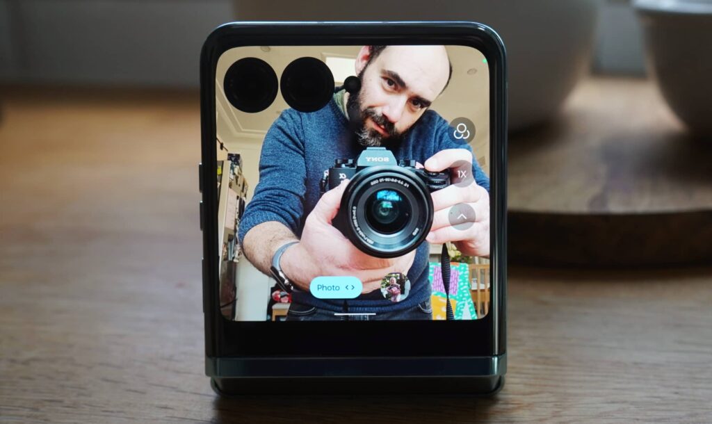
Also helpful is the extra large outside screen and flip hinge, allowing you to place the Razr 40 Ultra in a clamshell 90 degrees orientation and get selfies simply by holding your hand up.
It’s a combination that works, and means you can lean more on the better 12 megapixel external cameras for wide and ultra-wide selfies than the 32 megapixel internally. Leave the phone on a table and aim the screen up, and you’ll have what is basically a camera on a tripod of sorts. It works so well.
Battery
Getting all of this out of your phone does come at the expense of battery life, with the Razr 40 Ultra maxing out at a day of battery life before needing a charge.
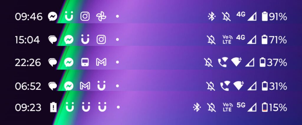
In our tests, we found a nightly charge made the 40 Ultra reliable for the next full day, though if you had to make it stretch, the phone could hit 26 to 28 hours on 3 to 4 hours of screen time.
While this isn’t super impressive, it’s also not outside of the norm. Few high-end phones hit the second day of battery life these days, so while Motorola’s result here isn’t mind-blowing, it’s also not terrible, either.
Value
But while the battery could be improved slightly, we think Motorola’s price in Australia is just right.
At $1499, Motorola has drawn a line in the sand for what represents value in the high-end. For just a shade under $1500, you can find a flagship foldable. It rocks.
Phones could always be less expensive, and the roughly fifteen hundred mark is still quite a bit for a phone. You may not have that amount to spend, and that is totally understandable.
As it is, Motorola’s Razr 40 sans-Ultra aims to get even more right on a value level, doing away with the big screen but little else that’s different. If you can live without the extras, the sans-Ultra 40 saves a good $500, which is clearly no small amount.
But even at $1499, the Moto Razr 40 Ultra makes a lot of sense.
What needs work?
So what needs work on this otherwise solid package? Surprisingly not much.
The cameras could be a little better and the chip could be upgraded to something newer and better, but that’s the bulk of the complaints.
Nitpicking the Razr 40 Ultra that little bit more, we found the Near-Field Communication (NFC) tech powering the mobile payments wouldn’t always fire properly with how you hold the phone, likely because it’s in the bottom half of the phone and that’s typically where you hold the handset.
It’s a small issue, as is the inclusion of games for the closed Razr 40, which are little basic mini-games you can’t remove. They’re built into the handset and inaccessible when you open the screen up, and yet for some reason you can’t remove them. They’re probably taking the smallest amount of space up, but you can’t get rid of them anyway.
Clearly, it’s another thing Moto needs to fix up, like the more than occasional slowdown we encountered using the phone.
Final thoughts (TLDR)
There are a lot of reasons to consider the Razr 40 Ultra. It’s a sleek device with offering solid performance, a big foldable screen, and don’t surprisingly capable cameras.
But the best reason is one this reviewer genuinely didn’t expect: it’s so much fun.
It might sound crazy to call a phone “fun”, but that’s what the Razr 40 Ultra is: fun.
From your first few moments of opening up the handset to closing it and hanging up a call with a satisfying click, this phone delivers the goods with very few of anything bad. Like a delicious chocolate truffle, it’s a surprise that lingers.
The design is great, the external screen useful, and the overall experience a delight. I’ve enjoyed using this phone immensely, and it’s one of the most intriguing and well-executed foldables yet. This is a triumph. I’m making a note here: huge success.
Highly recommended.


