Quick review
The good
The not-so-good
Apple’s computer and mobile operating systems have been gradually edging closer and closer, and in macOS Big Sur, the designs can feel linked.
It’s not hard to imagine that using a computer is different from using a phone, and not just because one has a keyboard and the other does not. While you can use each for similar purposes, they’re totally different, but the learnings from each can be applied.
For instance, if you’ve learned how to post to social media on your phone, you can take those learnings to a computer. And if you’ve learned how to type on a computer, you can use the on-screen keyboard in much the same way on a phone.
While they’re not the same, they share things, and lately, they might even share the apps.
That’s something Apple started dabbling with in recent versions of its macOS operating system, gradually bringing the apps from its iPhone and iPad to its Mac desktop environment for laptops and desktops, and allows the apps to work in more places than mobiles.
But Apple’s push to bring apps from the mobile world was just the beginning, and in the latest version of macOS, Big Sur, the whole operating system is beginning to feel a little more like how you use the iPhone, too.
Big Sur is very visual
Released this week, the latest version of macOS is out and ready for recent Macs, though it’s one that is big on delivering an experience much like that of the most recent version of iOS.
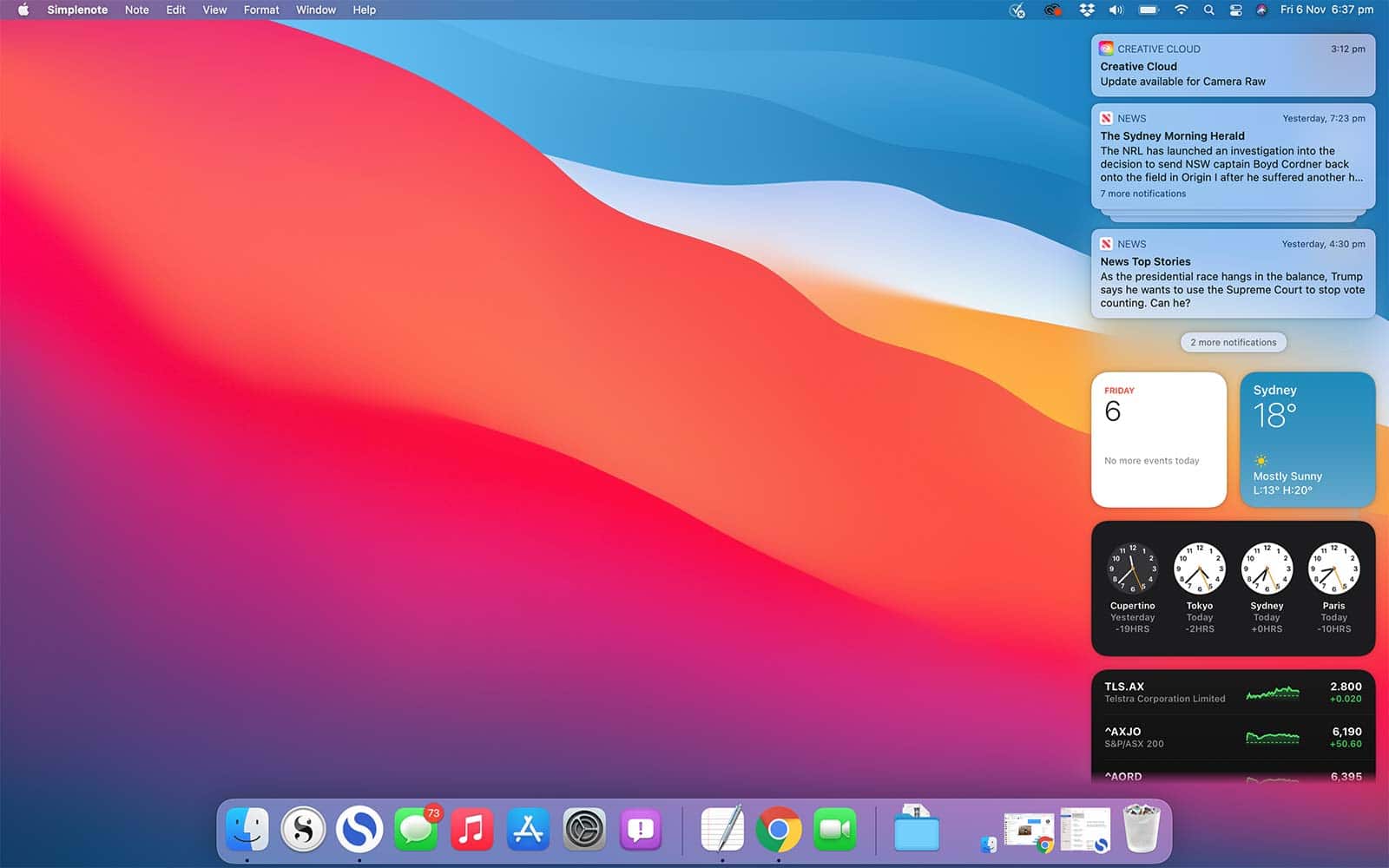
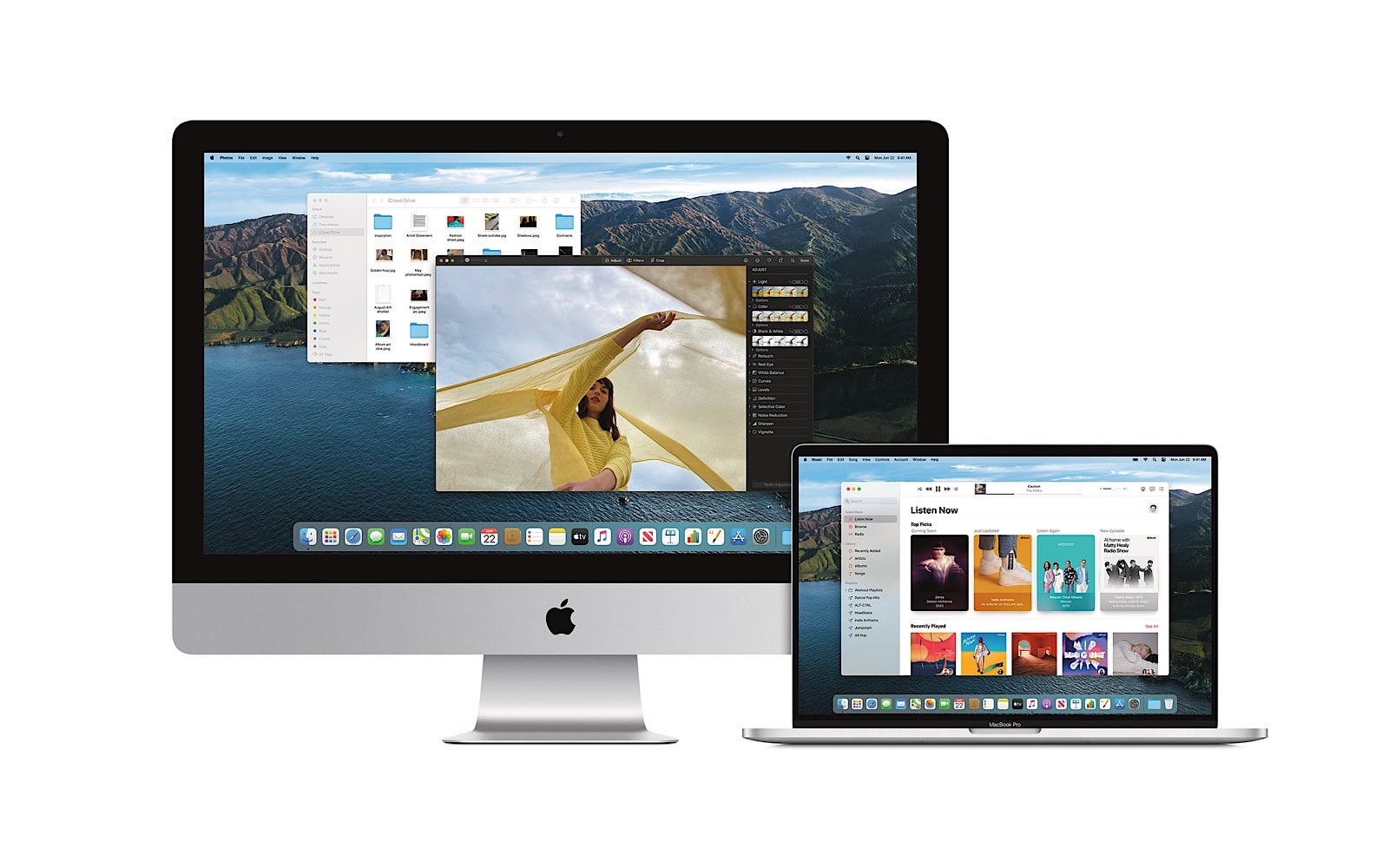
It’s something you’ll notice almost immediately, with what can feel like more softening of the windows, cleaner app design, and a focus on the text that feels downright spacious for everything. The dock gets a subtle change app icons becoming either a circle or a softened square (also known as a “squircle”), but the biggest change for visuals happens in the top right.
Mac owners will know this area well, because it’s where the settings are typically controlled quickly. Bluetooth, WiFi, Siri, and search are all found here, as well as the battery check, and they’ll stay in Big Sur, but become more collected in a way not dissimilar from how they’d appear in iOS on the iPhone or iPad.
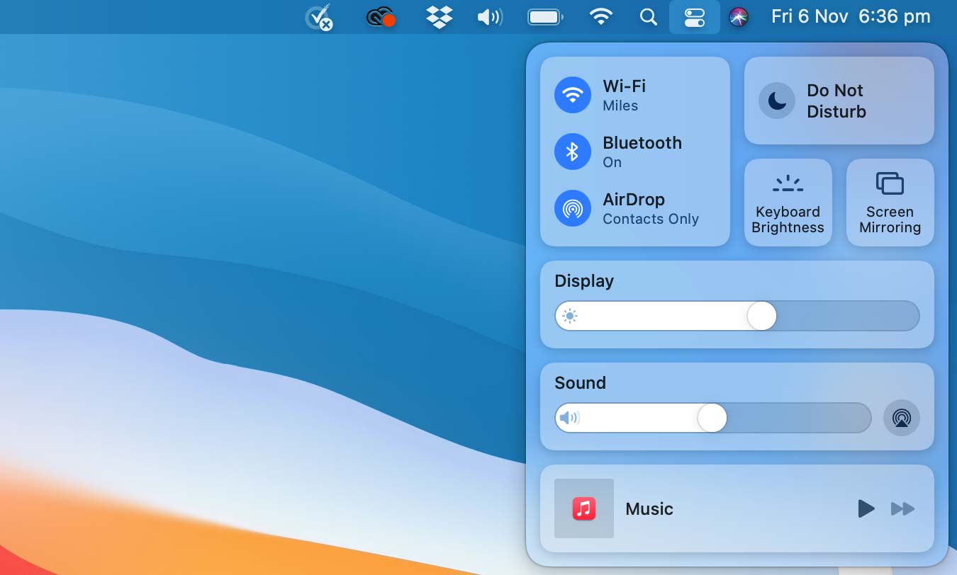
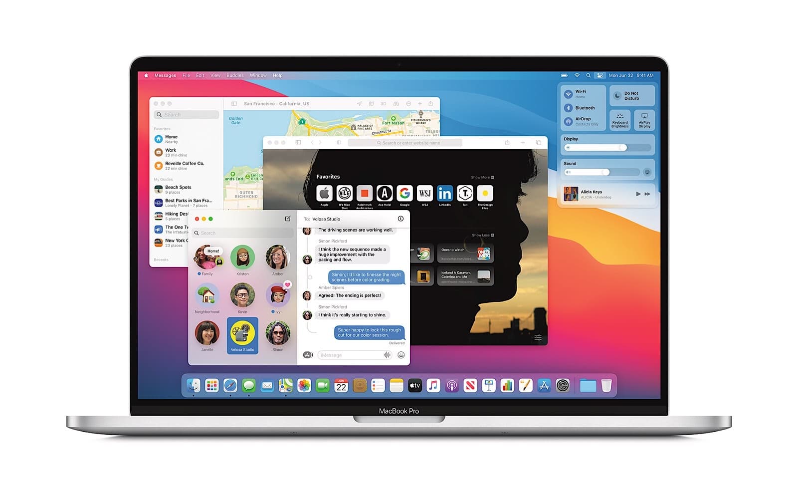
You can find them in individual settings or you can find them collected in a group, pressing the control centre icon next to Siri, and you can do something else with that control centre, too, dragging out the icons you want in your notification bar and completing your own power control settings. It’s a change that actually works well, and means if you know which settings you need to use regularly, you can quickly design the notification bar to look how you want.
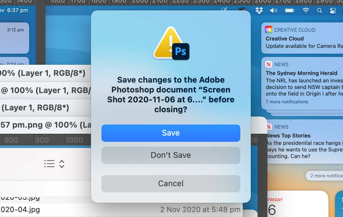
Apple has also integrated a sidebar straight out of the iPhone and iPad here, with the same style of notification bar found on iOS 14 also found on macOS Big Sur. Click the time and date, and your notification bar will pop in from the side, complete with the widgets iOS 14 offers. You’ll even see a change in how dialog boxes pop up, because they’re now almost their own entity, with a more spacious alert message that draws attention to something happening even more greatly.
More than just looks
Of course, there’s more than just a different visual style going on in Big Sur.
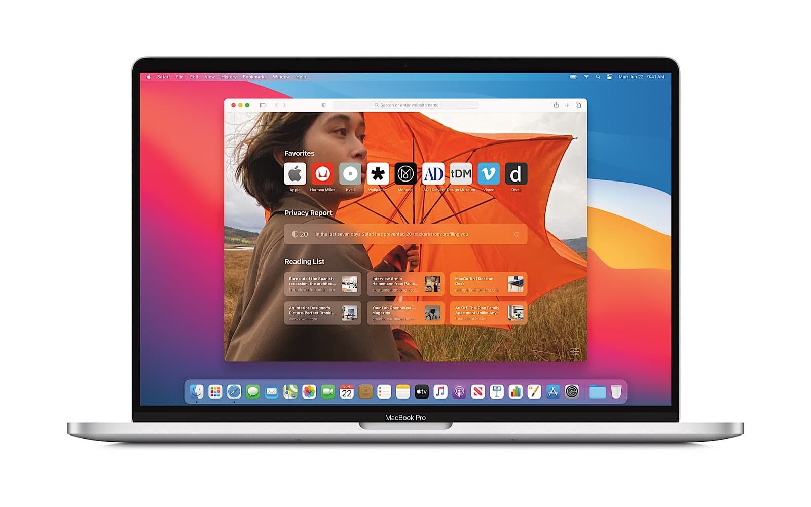
Testing it this week in its final beta, Apple has a cleaner and more minimalist approach for its Safari web browser, complete with fewer buttons and minimalist tabs, plus a start screen that’s not only customisable, but simple and easy to read.
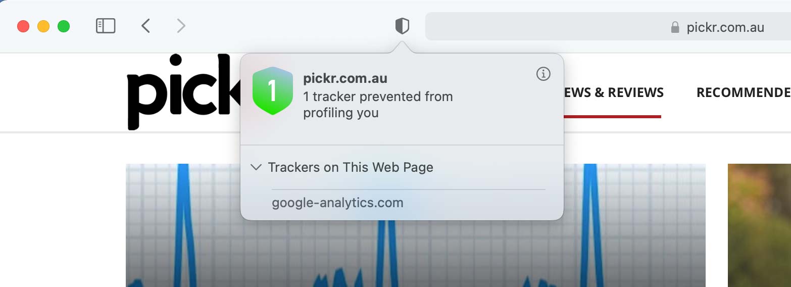
Some of Safari’s changes include adding little apps that can give Safari some more power, much like the extensions offered for Chrome, Opera, and Firefox, but there’s also an included “Privacy Report” with every webpage that shows you how many trackers are being blocked by the browser. That’ll be handy if you’re not a fan of cookies doing too much, and means you can stop sites snooping.
Alongside those changes, Safari supports password breach notifications, something Chrome offers as well, plus a translation system to make sure you can read a website, and there’s performance improvements as well.
In fact, those performance improvements go beyond Safari, with optimisations to battery charging that aim to use predictions to improve the charging routine, faster search results in Spotlight, and changes to Siri that now mean it can answer questions from results it finds across the web and not just showing a list of results like it has.
There’s also easier switching between Apple-made earphones, jumping between Apple devices, though we weren’t able to test this to find out for ourselves. In theory, though, this should provide a faster performance for folks who regularly use a pair of Apple earphones between a couple of devices, like jumping between an iPhone, iPad, and a Mac.
Getting a bit social with Big Sur
The other side of things worth pointing out is on the social side, because if you message friends using your Mac — something you’re likely to do if you use an iPhone or iPad, because the messaging can be connected across desktop and mobile — you’ll find some new features here.
Messages can be pinned, conversations can have replies specifically to one comment more like a conversation on another platform (like Slack), and you can mention friends in a conversation to bring them in, as well. Apple’s Message menu also gets GIFs and trending images, much like you can find on both Twitter and Facebook Messenger, providing more ways to use the web to reply.
When worlds collide
The result is an OS update which may end up feeling a lot like worlds colliding, as mobile meets desktop in a way that delivers the capability of what computers can do, but with the style and panache that Apple’s mobile devices deliver.
It comes together to make a Mac more like an iPhone, and one that we like, though could concede not everyone might.
If you’ve come from an iPhone or iPad, it’s an immediate connection that’s impossible to ignore, but if you’re using another device, it’s just likely to be new and not like your phone.
Long story short: macOS Big Sur looks a little like an iPhone, even if it doesn’t perform like one. If you dig the iPhone, there’s a good chance you’ll probably dig Big Sue, too.
Compatibility with Macs, both old and new
And while our initial experience with Big Sur is just that — initial — it’s one that appears made to make the most of Apple’s new Macs. We’re sure you’re probably not shocked by that, but when we say “new Macs”, we don’t just mean the hardware we’ve reviewed all year. Rather, the new Macs are the ones running Apple’s silicon, the M1 chip in the MacBook Air, Mac Mini, MacBook Pro.
There’s not much of a surprise that Apple’s latest software is made to take advantage of Apple’s latest hardware, but it is a good sign that the new macOS will also be compatible with iOS apps on the new computers, something we’re checking to find out whether it means macOS Big Sur in general, or just the new Macs with the M1 chip and Big Sur. Our guess is the latter, given the technology behind the M1 chip would be closer than what Intel’s chips use.
But Big Sur will still work with plenty of Macs today, with computers going back as far as seven years supported, including MacBook Air models from 2013 onwards, MacBook Pro models from late 2013 onwards, and Mac Pro models from the same time period, too. The iMac and Mac Mini from 2014 onwards can be updated, while the standard MacBook from 2015 onwards before it was cancelled sees the Big Sur update, as does the iMac Pro.
For most people, it will likely be a visual change that’s noticed most of all, and probably in the settings screen. If you use Safari as your main browser, you’ll notice some things there too.
Set to be available this week, Apple should be ready if you are and with most of the bugs patched, though we did run into a few in the final days of the beta. However Big Sur is here, and if you have a Mac, your update is likely not far behind.


