Quick review
The good
The not-so-good
No longer just an iClone, Oppo is going fullview and fullscreen, delivering a phone that finds the middle ground between Android and iPhone. Does the R11s spell success?
Design
If there’s one thing that has been properly consistent with Oppo’s phones for the past year, it’s been design.
Specifically, it’s a design that does its best to emulate the iPhone, with so many of last year’s Oppo handsets feeling like the inexpensive cousin of the iPhone. In fact, almost every Oppo we put our hands on felt that way, and consumers responded in much the same way.
Readers we spoke to continually told Pickr time and time again that Oppo’s phones were inexpensive clones of the iPhone, something that was completely obvious when you picked one up and held one.
This year, though, Oppo is changing things slightly. With the departure of the front-facing home button, it feels as though Oppo is returning to what makes Android “Android”.
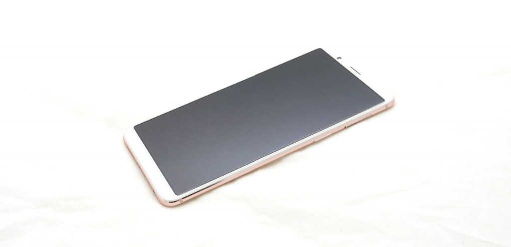
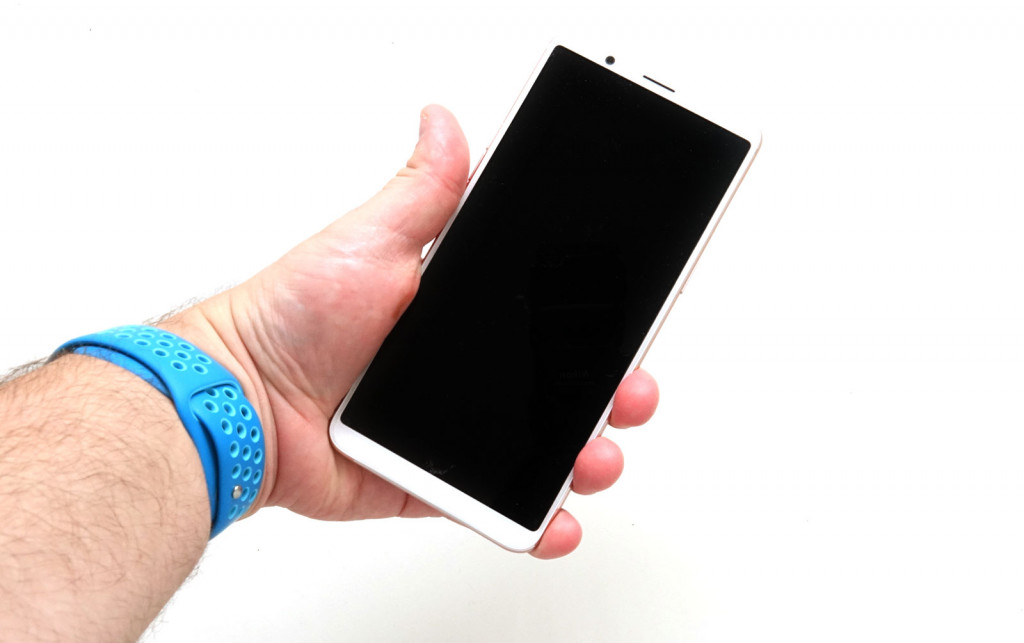
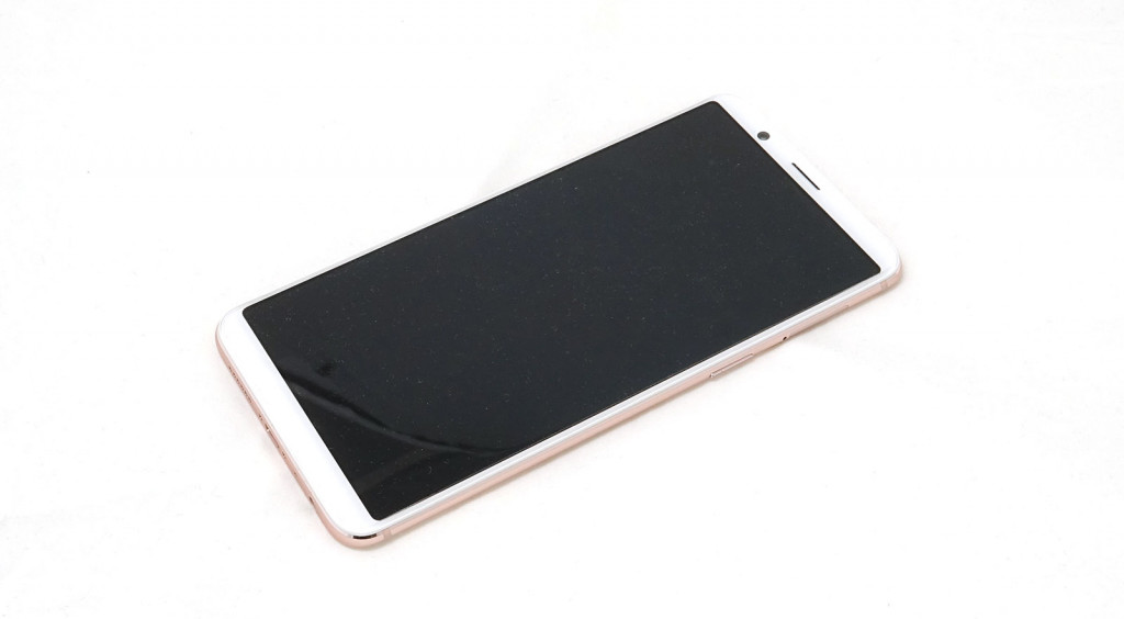
On the Oppo R11s, you’ll find a design that actually feels closer to what an iPhone and an Android might look like if they had a lovechild, and one from the past year where all those lovely fullview 18:9 screens arrived.
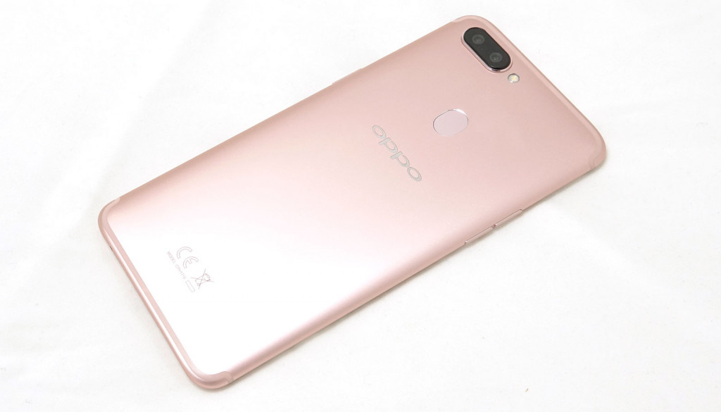
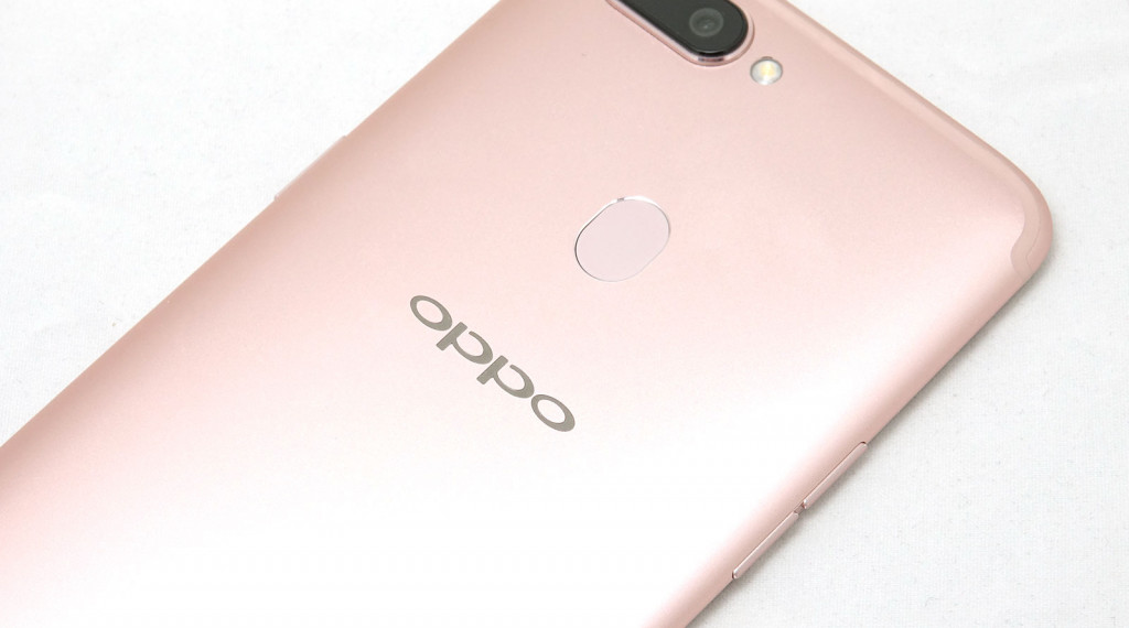
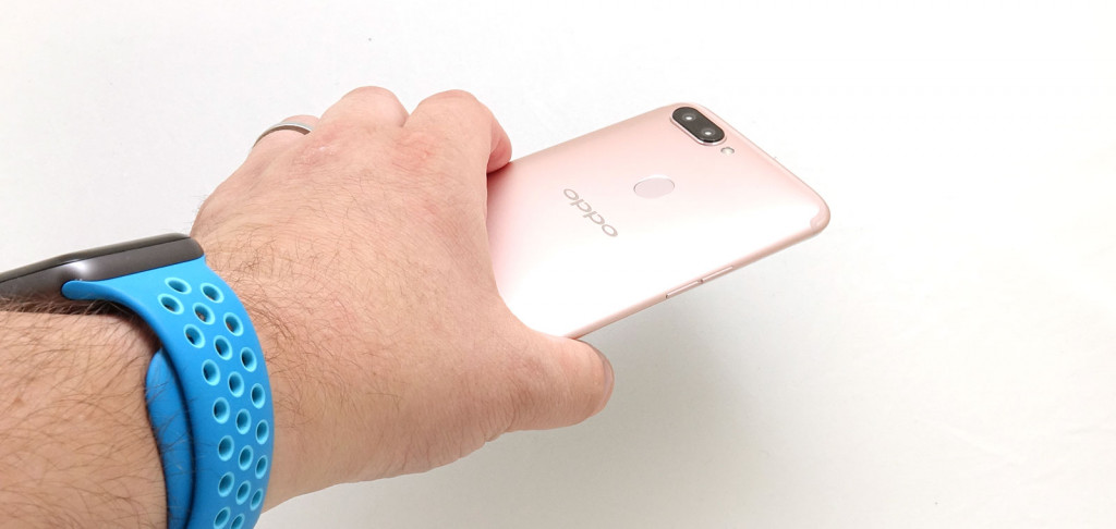
As such, Oppo has provided a metal body in Apple’s colours, a long screen, and a rear fingerprint sensor that makes the R11s more like a proper Android.
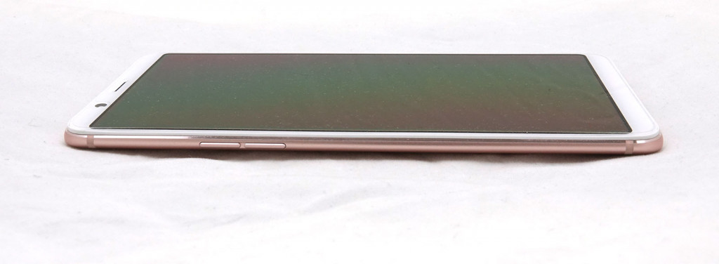
It’s about as middle-ground as a phone can get, and it’s helped by a design that can come off deceptively thing. That might come off as a criticism, but for the R11s, it’s a total compliment, as the softened curvature of the phone helps to make the R11s come off thinner than it looks, while a 153 gram weight helps keep the handset comfortable in the hands, as well.
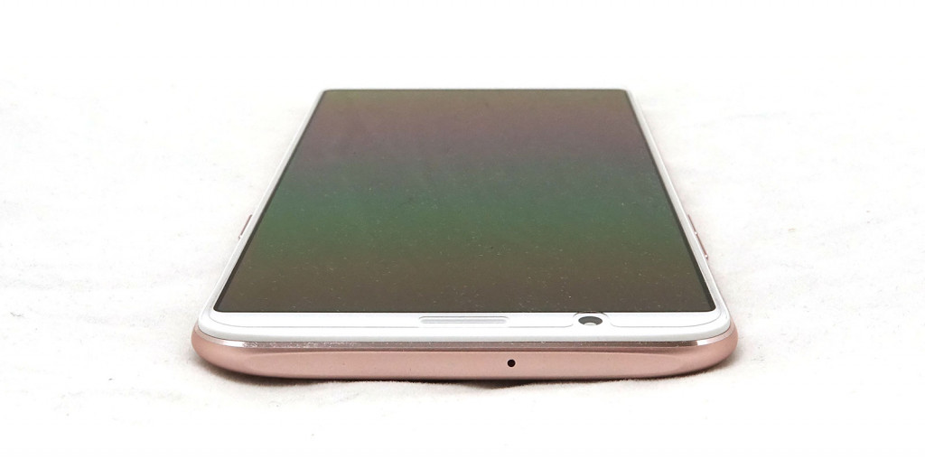
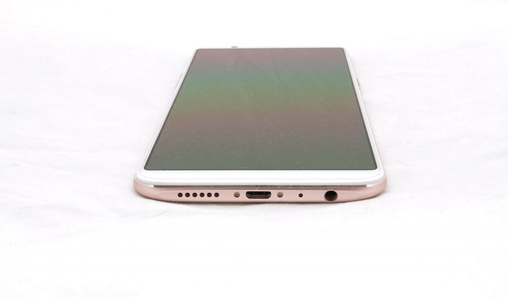
The only slightly strange aspect of the design is on the top and bottom, where those lovely aluminium curves feel like they’ve been smushed a little too hard, flattened rather sharply as if the phone forgot to brake when it encountered the end of the product line.
Despite that noticeable design point, we found the R11s to be a pretty little handset, and wonderfully thin.
Features
A lack of thickness isn’t all the phone has going for it, however, because Oppo has been quite generous with the R11s, following on from the R11 with some solid updates.
That means you’ll find Qualcomm’s Snapdragon 660 processor paired with 4GB RAM, 64GB storage, and a slot to either upgrade the storage using microSD or add a second SIM, dealer’s choice.
Connectivity has also improved slightly, with wireless now stretching past the standard of 802.11a/b/g/n and moving to 802.11ac, while Bluetooth is set to version 4.2, GPS is included, and mobile connectivity works in 3G as well.
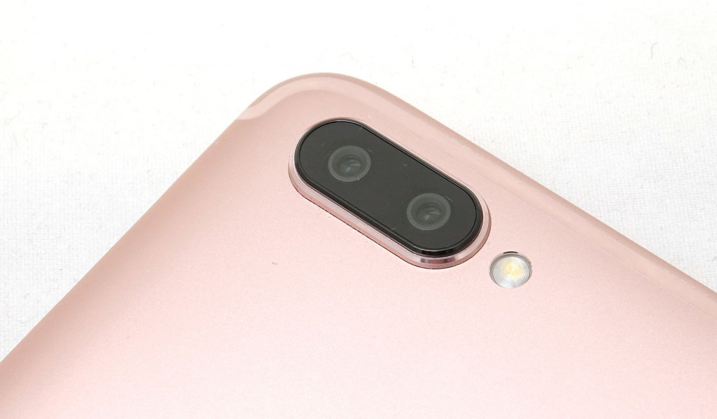
Cameras have changed slightly, because while the R11 included a wide-angle and a telephoto lens atop two independent sensors, the R11s includes two wide cameras atop slightly different sensors, catering for both 20 megapixels and 16 megapixels independently. We’ll explain more about that later, and you’ll also find a 20 megapixel camera at the front, as well.
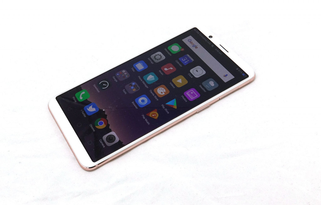
All of this sits beneath a 6 inch screen AMOLED screen with Full HD+’s 2160×1080, the 18:9 version of Full HD that you can find on screens that happen to skip the buttons, which this does.
In fact, with no soft buttons on the front of the handset, that makes for a change for Oppo, which is using digital on-screen buttons instead, and only a few physical buttons to speak of, with the power button on the right side, volume buttons on the left, and a fingerprint sensor at the very back.
That fingerprint sensor is assisted by a facial scanner at the front of the handset,, and the whole thing is encased in a metal body covered by Corning’s Gorilla Glass 5.
The Oppo R11s includes a 3200mAh battery and is charged through a microUSB port, sitting alongside a 3.5mm stereo headset jack.
In-use
From the feature set, it’s pretty clear the Oppo R11s strives to be a relatively inexpensive phablet with a big full view screen, dual cameras, and a decent set of processing technology, but it’s also one that aims to be easy to use.
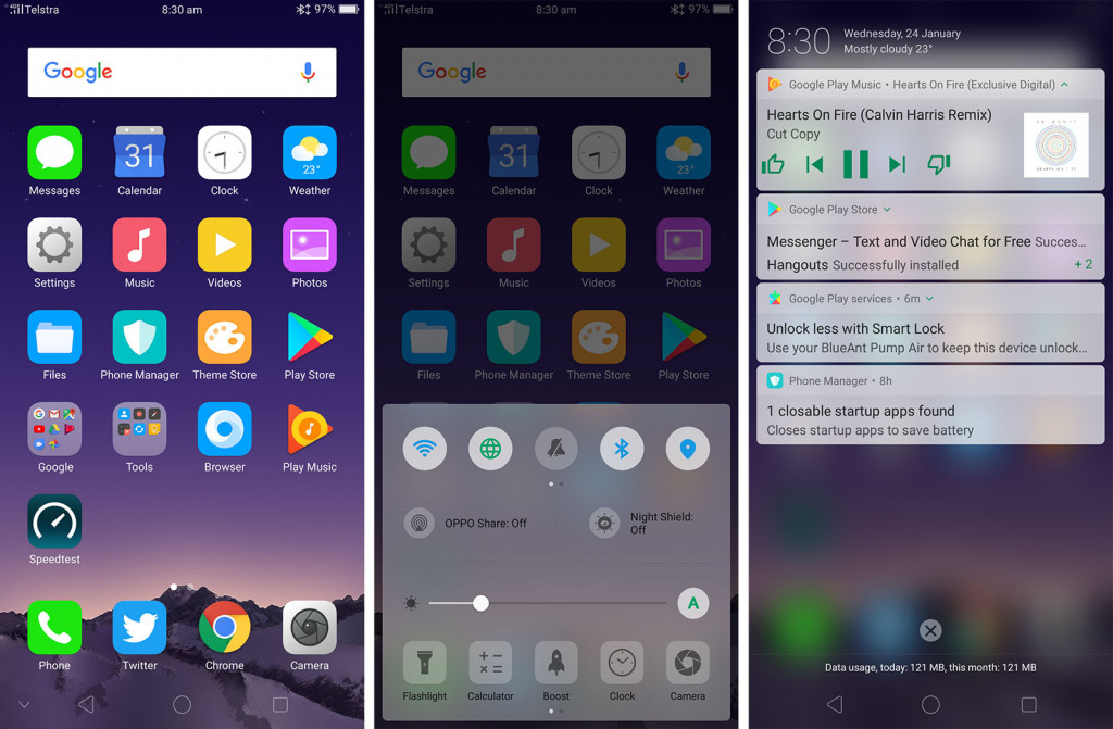
In fact, with Oppo’s custom version of the Android included, it’s an Android experience that is more like using an iPhone, and that’s entirely intentional.
Oppo’s Android experience is called ColorOS, and it’s one that has always looked and felt like what would happen if Android and an iPhone got into a serious relationship and made a couple of compromises. You’ll still find the top drop-down notification bar from Android and a converted swipe-up power centre emulating iOS, with the whole thing feeling like the love child of the two.
It works, though it’s definitely geared at folks looking for a less expensive iPhone than those after a serious Android.
Performance
At least it’s easy to use, and that’s good, because armed with Qualcomm’s eight-core Snapdragon 660 processor and 4GB RAM, you’ll struggle to find the Oppo R11s slow down at all.
It’s great to know that we’re at the point where the right balance of hardware can really make Android a success, and that combination of a mid-range processor, 3 to 4GB of RAM, and a good 32 to 64GB storage kind of nails it, because that all works swimmingly in the R11s.
Sufficed to say, even with a slightly older version of Android — which is what you get under Android 7.1.1 “Nougat — the Oppo R11s works beautifully, delivering little to no lag, easy multitasking, and a setup with that nice 6 inch AMOLED screen that looks the part. You can even force the on-screen buttons to hide themselves when they’re not needed, just like you can on the Samsung Galaxy S8 and Galaxy Note 8. Booyah.
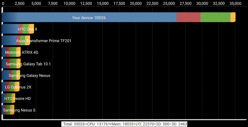
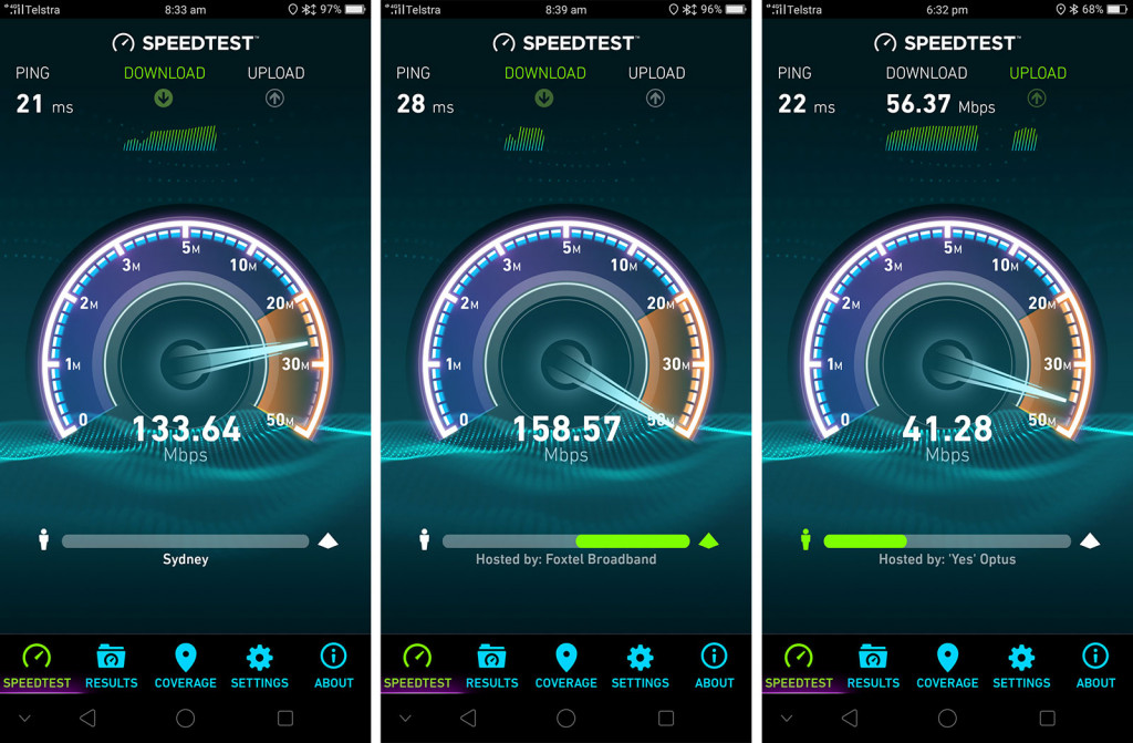
So system performance is decent, and backed up by fairly strong synthetic benchmarks, though mobile performance is also strong, the mobile connectivity providing what we expect is either a Category 4 or Category 6 modem, providing a decent burst of speed altogether.
Camera
With decent performance under an operating system that is desperately trying to be iOS (and yet also not quite), we come to the camera, which provides two rear cameras in a phone that is priced more like you getting one.
Interestingly, the design of those cameras is a little different from the groundwork Oppo made in the R11. While that first edition provided a wide and close view — a standard and zoom mode, so two speak — the Oppo R11s actually provides the same view for each lens, with one sensor for daytime and one for night, but both offering the F1.7 aperture.
We’ll admit that it’s kind of a confusing approach, almost as if Oppo admits its sensor development isn’t necessarily as strong singularly, and so includes an extra sensor for better low-light photography ahead of time.
Strangely, that means that while you can buy the Oppo R11 and expect to get closer to your images, the Oppo R11s isn’t built the same way, and while you can hit the “2X” button to get closer, it’s more or less just blowing up the pixels instead of switching to the closer camera.
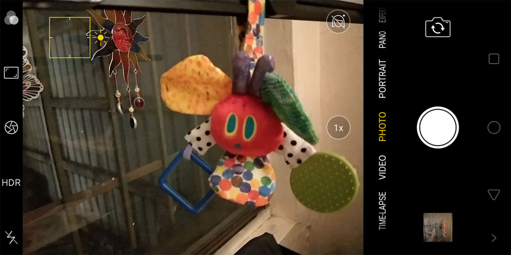
Your two cameras here are about an improved image quality, at least in theory, and one that makes use of a soft background mode for better bokeh, much like it does over on the iPhone 7 Plus, 8 Plus, and the iPhone X.
Except in practice, the image quality doesn’t appear as sharp as what Apple can achieve. While the portrait mode offers a nice soft defocused background, the clarity of the subjects don’t appear as sharp as we’d like.
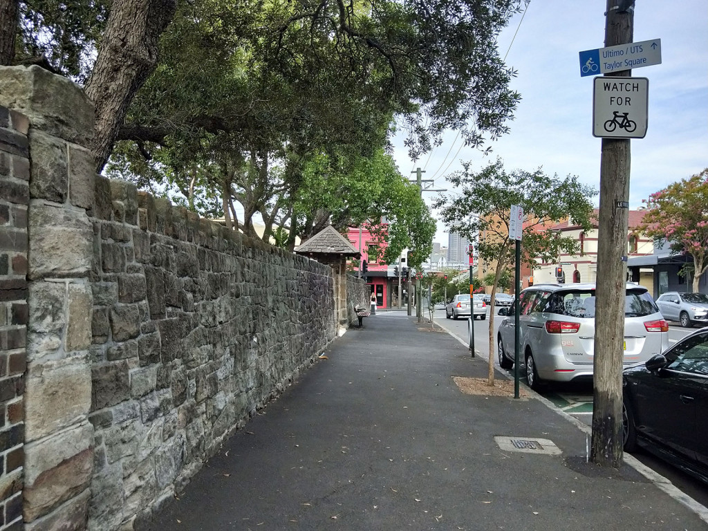
That said, given the $659 price tag, it’s not as dramatic a downplay as you might expect, and the Oppo R11s provides nice images in daylight and decent images at night, though clearly daylight is the superior lighting settings for Oppo’s camera.
Just don’t get super close to those low-light images, though. The moment the Oppo R11s switched over to that bigger 20 megapixel sensor for low-light photography, we found the clarity dropped significantly, with softer images that didn’t quite have the detail you might be after.
At the front, Oppo has another 20 megapixel camera, great if you want high resolution selfies, which clearly some people do.

Our one major criticism the Oppo R11s camera isn’t that the clarity could do with some work, but rather that the camera can come across slow: you’ll press the on-screen camera button, wait a second, and then it will fire. And that’s a fairly consistent feeling from the phone, with the Oppo R11s delivering your shot, but a good half second or so after you’ve pressed the button.
It doesn’t always do it, but we did find that much of the time, the R11s didn’t disappoint in that timing. Just get your subject to hold that smile for a little longer.
Battery
With a passable camera that could need a bit of work, it’s time we draw our attention to the power of the phone, and the battery is one area where Oppo scores points.
In fact, it’s an area where Oppo’s phones continue to do well, and in the R11s, we’re seeing more proof of that work, as the company focuses on what is no doubt a pain point for customers.
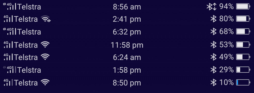
Case in point, you’ll find a good minimum of a day of battery life in the Oppo R11s, though we found as much as two were actually possible.
That’s a good two days of using Bluetooth earphones with music for a couple of hours a day (for the transit times), web surfing, picture taking, messaging, and generally using the phone, complete with a smartwatch connected to the device at all times.
Value
Oppo has always done well with battery life, mind you, so we’re not shocked, and it has always made strides with value, which the R11s achieves things, too.
Sitting at a price of $659, it’s hard not to call the R11s value, because that’s exactly what it is. While it’s only a hundred or two from other phones, the $650 to $780 mark is Oppo’s high range, while other companies are happily asking for at least twice that.
We’re not going to say that the R11s is necessarily as high quality as the phones happily asking for that sort of money, but for the price on offer, Oppo is nailing it.
What needs work?
While the overall feeling of the Oppo R11s is one delivering a phablet with excellent value, we’re still a little surprised at the one thing Oppo continues to go without: NFC.
Maybe it’s a tech journalist thing, or maybe it’s because we always want phones to have the best they can for the price they can deliver, but none of Oppo’s flagships include NFC, and that not only means no easy way of connecting headphones and speakers, but no way to use Android Pay.
Given we’re heading to a mobile phone wallet way of life, Oppo’s continued exclusion of Near-Field Communication is staggering, and super confusing, practically driving folks who want it into the arms of either another manufacturer or a manufacturer of an Android wearable, like an Android Wear watch (because they support it) or a Samsung Gear smartwatch (because they have Samsung Pay, which is like Android Wear yet run by Samsung and works on fewer banks and credit companies).
It is seriously confusing that Oppo continues to play that game where it says no to NFC, even in phones that it would class as its high-end phones — like the R11s — and yet here we are.
Our other issue with the phone concerns the operating system, which while it’s clear Oppo is trying desperately to emulate Apple’s iOS still manages to come out as the weak part of the whole package.
Let’s get this out of the way: making an iClone is fine, but Oppo doesn’t need to do that anymore. It has proven time and time again that it can make one, and Android is at the level where it doesn’t really need to make its best version of an iPhone.
And yet Oppo is continuing to do that, finding what is almost a desperate middle ground between the two platforms for whatever reason, which appears to be to make for a cheaper iPhone-like experience that people can get stuck into for less money.
That’s a totally logical approach, mind you, but it can feel like Oppo’s approach locks the hardware down. In fact, while you can change default apps, it doesn’t always work. This reviewer was driven to check that out from WhistleOut’s Alex Choros, who found out in a different handset that Oppo locked you out of changing messaging apps, a bizarre thing to do given Facebook offers a messaging replacement.
That’s not the only thing you can’t change, and Oppo has littered its version of the Android operating system with elements you may struggle with.
Sufficed to say, Oppo’s version of Android may not be the droid you’re looking for, and that’s not a good thing.
We’d love a version of the Oppo R11s that came with standard Android, or as close to stock as was possible, but we guess that’s where the OnePlus phones come in.
Final thoughts (TLDR)
With full view phones now in their second year of releases, Oppo’s R11s starts the year off nicely with an almost iPhone X made for budgets, but also not quite. There are similarities, but more so this is middle ground for an Oppo trying to find its own way.
And that way includes a very unique camera approach that works in aspects, but on the whole is just another part in a handset that provides a big screen for middle budgets.


