Quick review
The good
The not-so-good
HTC’s phone for 2017 was one of the best of the year, but can the HTC U12+ keep that momentum going?
It’s the middle of 2018, and by now, you may have already made the jump to a brand new phone. There have certainly been plenty, and there’s still more to come, but before the second half of the year’s phones rock up, HTC is ready with its main entry.
For the company that practically started the premium material smartphone with its aluminium handsets, it’s a model that pushes away from metal and continues with glass, attempting to shape smartphones with a renewed focus on touch.
Is the HTC U12+ unique enough to achieve the attention a flagship phone needs, or does it need something more?
Design
A new phone almost always guarantees a new design, but these days, phones can look a little same-samey.
HTC’s designs have always bucked the trend slightly, though, and while a screen and a slick look are pretty consistent across smartphones today, the HTC U12+ still has a few things different about it.
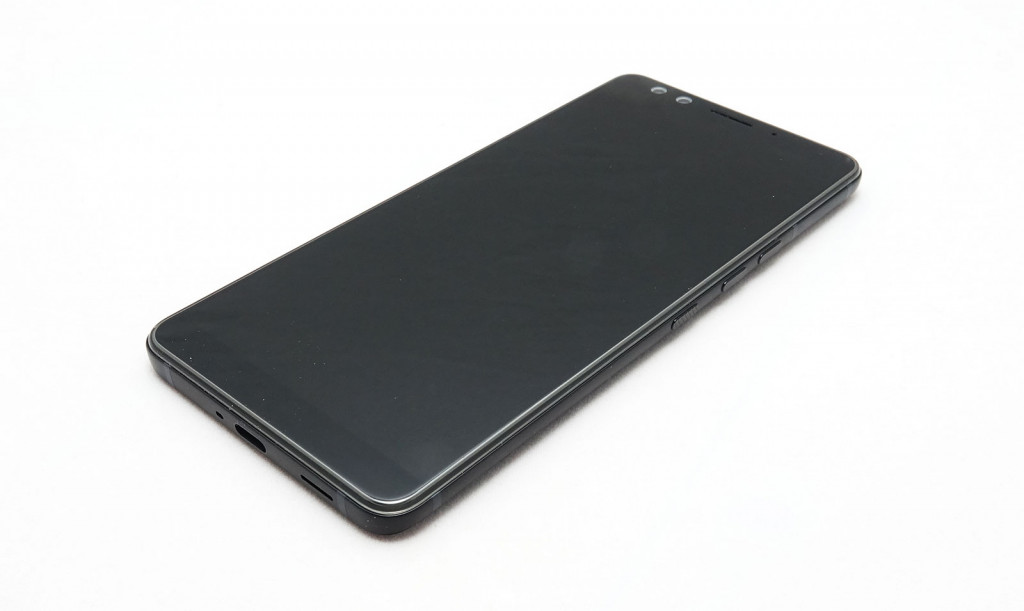
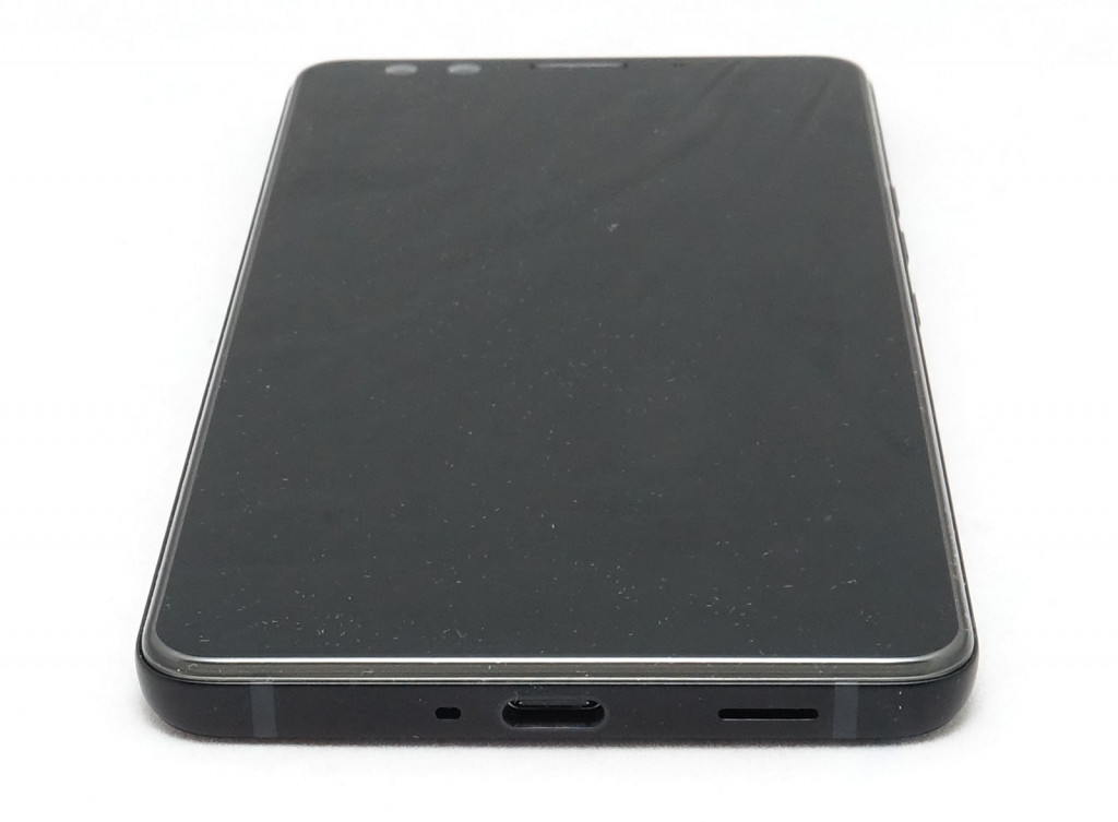
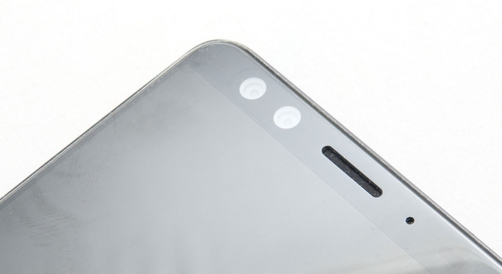
One is that the screen isn’t sporting one of those super-thin bezel designs like we’ve seen from Samsung, Google, and everyone else, and they’re quite noticeable.
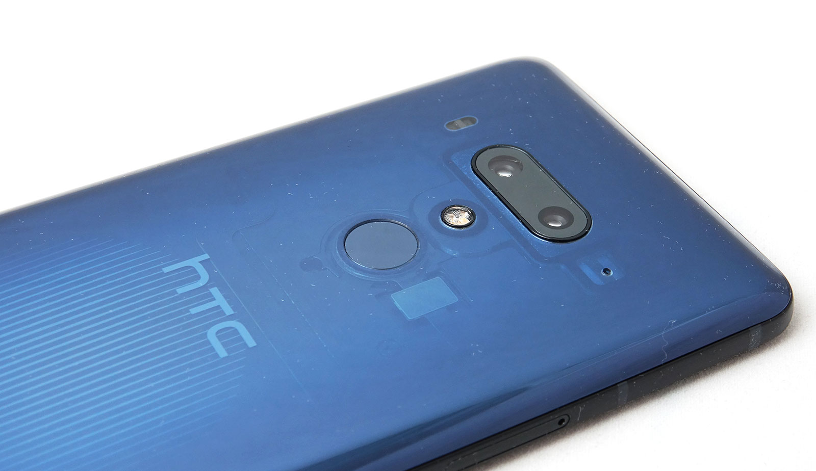
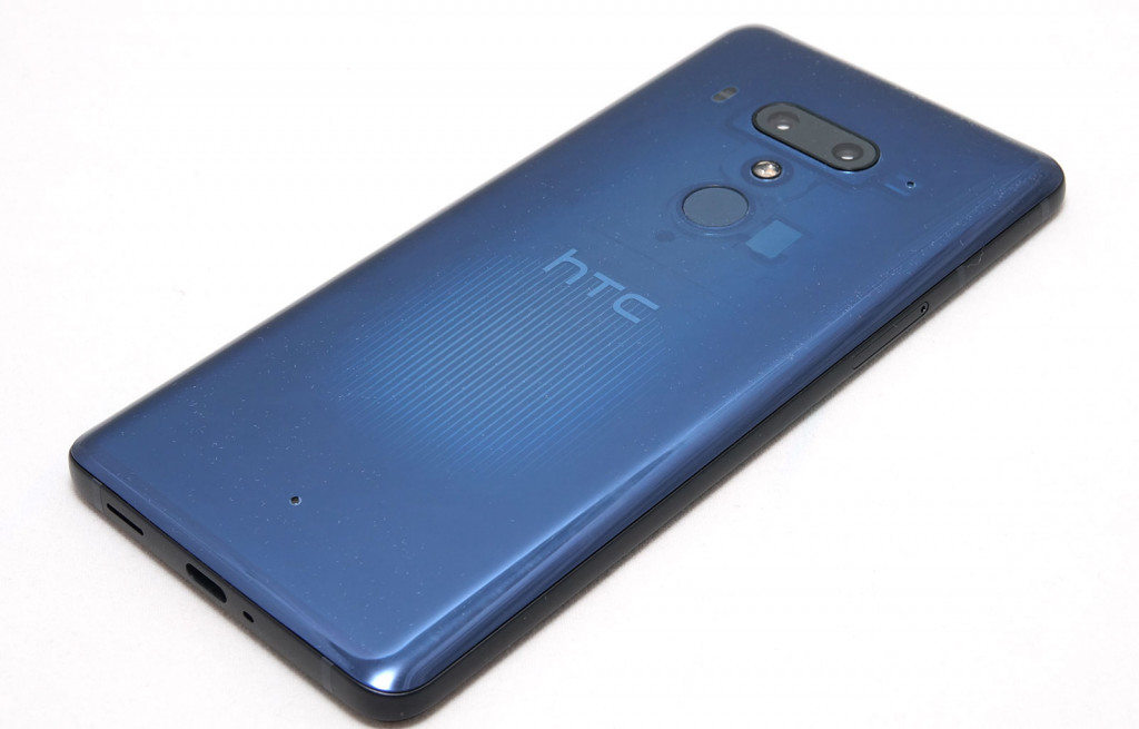
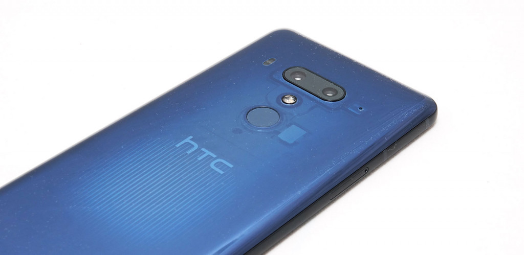
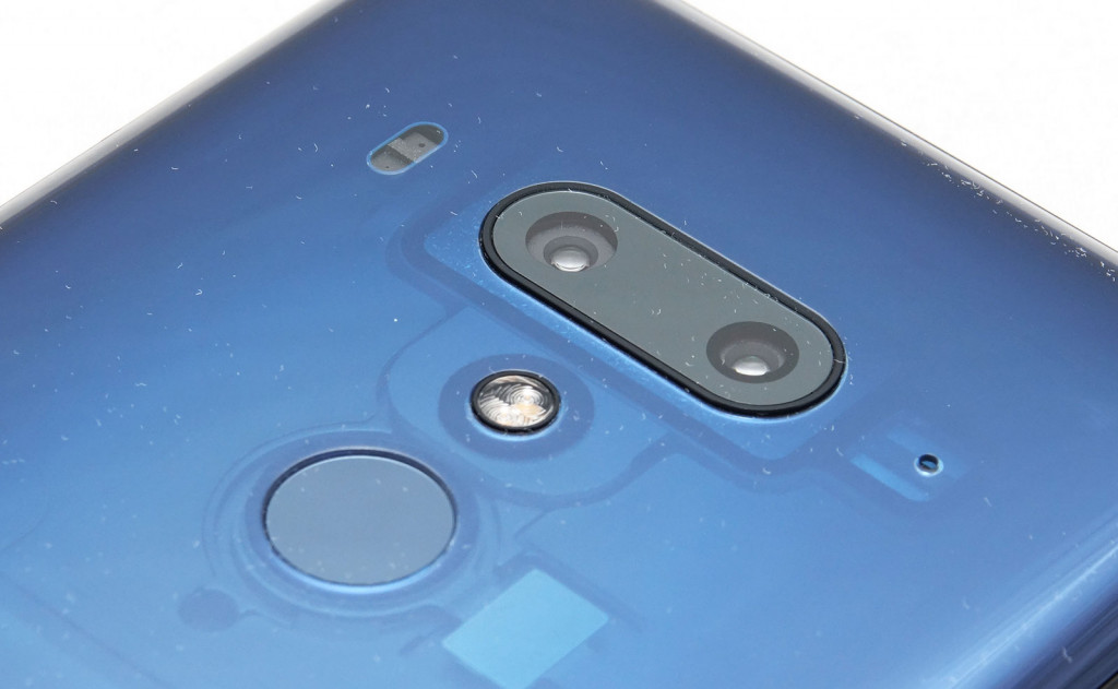
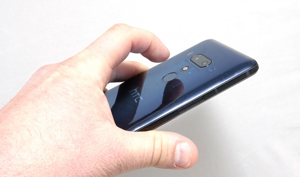
The other is that this glass obsessed design has a back that is almost see-through, with a translucent blue that showcases the inside of the phone. By turning the phone over, you can see a board and chips, with a paint job that is as pleasing to this geek’s eye as it gets, and something we wish more devices had.
Overall, the design is nothing remarkable, and the 9.7mm thickness is a little larger than we like, but that paint job is something very, very special.
Features
While the back may well give you a look at what’s on the inside, it’s no spec list, which reads like a list of what’s expected in a 2018 flagship phone.
That means you’ll find an eight-core processor here, with Qualcomm’s Snapdragon 845 found here, paired with 6GB RAM and 128GB storage, the latter of which can be upgraded with microSD cards quite easily.
Upgrading memory will be your choice, because the HTC U12+ supports either a configuration of one nanoSIM and one microSD card, or two nanoSIMs in a dual SIM setup.
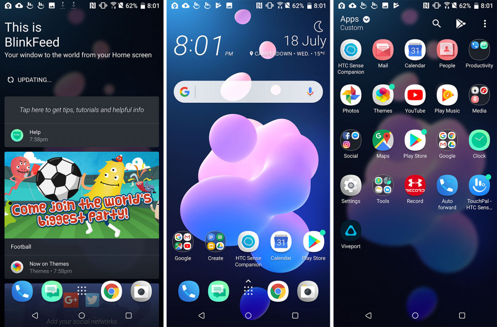
You’ll also find Android 8 here, and the regular staple of flagship-expected connection options, including Bluetooth 5, GPS, Near-Field Communication (NFC), 802.11a/b/g/n/ac WiFi, and 4G, the latter of which supports Category 18 LTE providing a maximum downlink of 1.2Gbps and 150Mbps upload.
There’s only one wired port, though, with USB Type C for charging, data, and wired sound, with no 3.5mm headset jack.
Cameras are also here, with a total of four: two on the back and two on the front.
On the back, you’ll find a 12 megapixel F1.75 standard focal length, while the secondary 16 megapixel camera will get you closer in the telephoto 2X setup, even if it does change the aperture to F2.6.
At the front, your two cameras are a dual 8 megapixel setup, one providing the support for background imagery in portrait photos. Ultra HD 4K capture support is also included.
The whole thing sits under a 6 inch Quad HD 2880×1440 display, sporting a pixel density of 537 pixels per inch (ppi), fitting in a body measuring 8.7mm and weighing 188 grams. There’s also a fingerprint scanner on the back while facial scanning sits up front, providing two ways to unlock the phone.
The battery on the HTC U12+ is set to 3500mAh, and the phone is water resistant with a rating of IP68.
In-use
There’s also something else, though it’s not necessarily needed to be mentioned in the specs. If you’ve ever used a phone from the past five or ten years, using the HTC U12+ offers little difference, except for one thing: the sides.
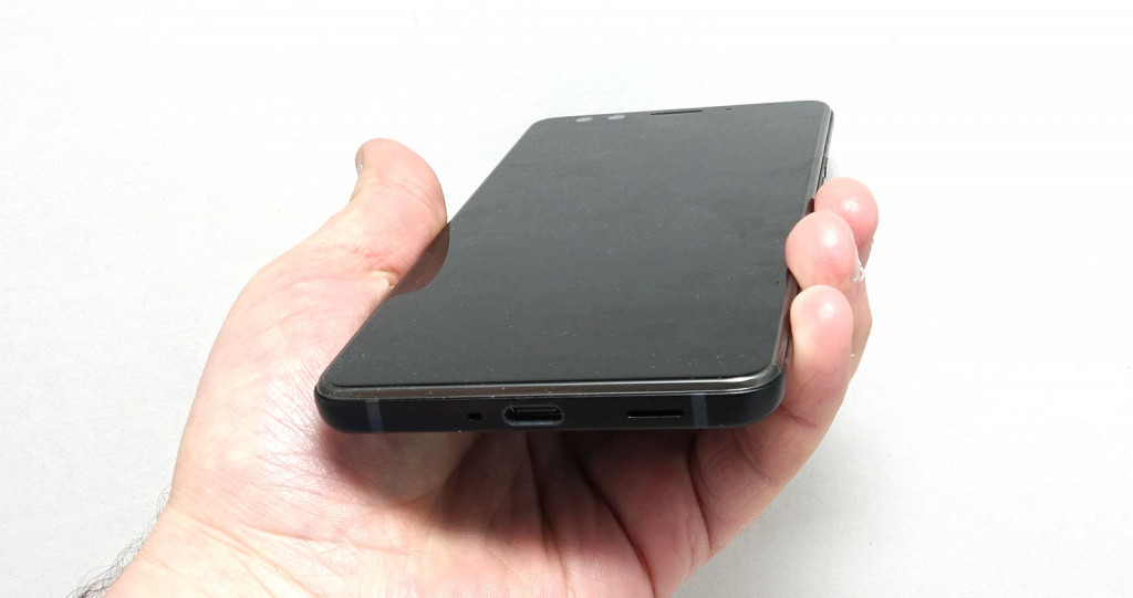
On the front, there’s that big 6 inch touchscreen, and while it offers a touch more bezels thanks to the big cameras and HTC’s reluctance to offer one of those slim bezel designs like we’re seeing so regularly this year, using the phone is also something that requires a bit of thinking on the edge.
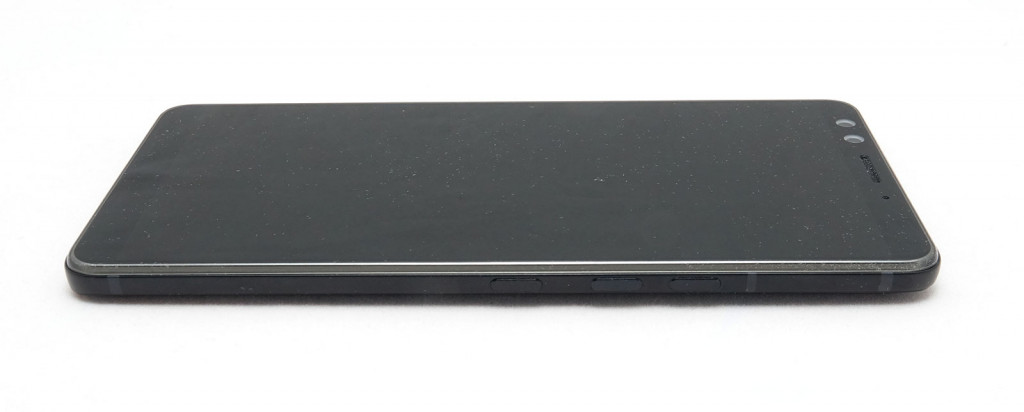
Specifically, we’re talking about the edge of the phone, because the physical buttons aren’t really physical but rather touch buttons, and the edges of the phone below these are touch sensitive, allowing you to squeeze and tap to do various things.
That’s not a massive shift from what HTC orchestrated in last year’s U11, only that it does more and is a touch more sensitive this year, allowing you to double tap in order to shift the screen size to be smaller and more adaptive to the hand you’re holding the phone in, while squeezing can be mapped to something else.
This is a bit of a hit and miss thing (more on that later), as the phone’s squeezing sensors tend to fire off regularly, even if you’re not squeezing super hard. You can change the sensitivity to something you find less sensitive, but all up, we found we didn’t lean hard on the touch sensitivity of the sides simply because it didn’t really add much to the use of the phone.
In fact, when we tried to, we found squeezing the edges often made it feel like we were going to lose grip on the phone, and worried about it dropping to the phone and smashing. True story.
Performance
At least you can be sure that regardless of how you control the HTC U12+, you can be delighted by the performance.
Thanks to the Snapdragon 845 inside and the generous supply of 6GB RAM, the HTC U12+ handles itself with little to no problems, meaning using the phone is as easy as it gets.
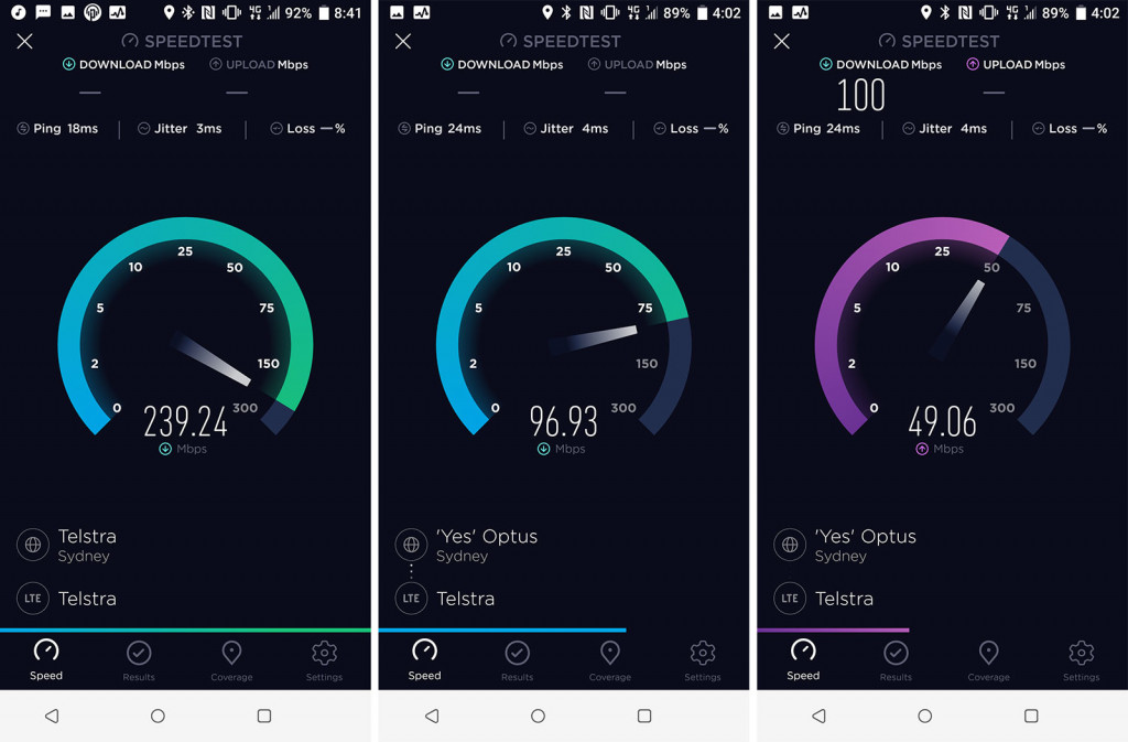
Mobile performance is also solid, and while we weren’t able to push those 4G speeds to their very limit, we did find speeds across Sydney’s CBD pushing well into the 200Mbps, making it plenty fast for folks who need it.
Camera
One area HTC has had to make some serious strides in is the camera, and not because the U11 camera was bad, but rather because it’s what’s expected.
In fact, the U11 camera was actually quite good, but when you’re competing against the multiple apertures of the Samsung Galaxy S9+ or the three-camera support found in the Huawei P20 Pro, “quite good” doesn’t cut it.
To try and beat the big guys, HTC has opted for four cameras, delivering two on the front and two on the back.
The front camera is easy enough, with a dual 8 megapixel setup designed to let you capture portrait mode images using the two to work together, resulting in images that are pleasing and crisp, even if they’re measured at 8 megapixels only.
At the back, the dual camera setup is for getting you both near and far, with a standard length and a low-light friendly F1.75, while the nearness is captured on F2.6, not as lovely for the dark, but still useful enough.
In daylight, those images tend to shine the best, with decent clarity and great colours, providing crisp images with slightly over-exaggerated colours at the best of times.
The low-light isn’t as bang-on impressive as what you can achieve in other flagships, but it’s not bad. HTC can’t quite beat Huawei’s P20 Pro here, and in complete darkness, the phone struggles to pick up much at all, though it is HTC’s best camera yet, with an all-round improvement on what we’ve seen on the U11, which was an excellent model.
However, the U12’s camera does come with a pretty severe niggle we couldn’t shy away from: automatic poor metering.
One of those things that is impossible to un-see when it happens, the U12+ suffers from a camera flaw that often struggles to metre for what you’ve selected, focusing instead on the light balance for the entire scene rather than the subject you’ve touched to focus on.
In one example, we tried photographing our daughter near a TV, only to find that while we had selected her as the very thing to metre the scene on, the HTC U12+ instead picked the TV, darkening the image dramatically. That’s a pretty severe misstep as far as cameras go, and try as we might, we couldn’t shake the metering system once it was analysing the entire picture.
Sufficed to say, the camera comes with niggles that you can’t seem to avoid, and that is immensely frustrating, almost harking back to the HTC M9, which sported white balance and metering issues, last we recall.
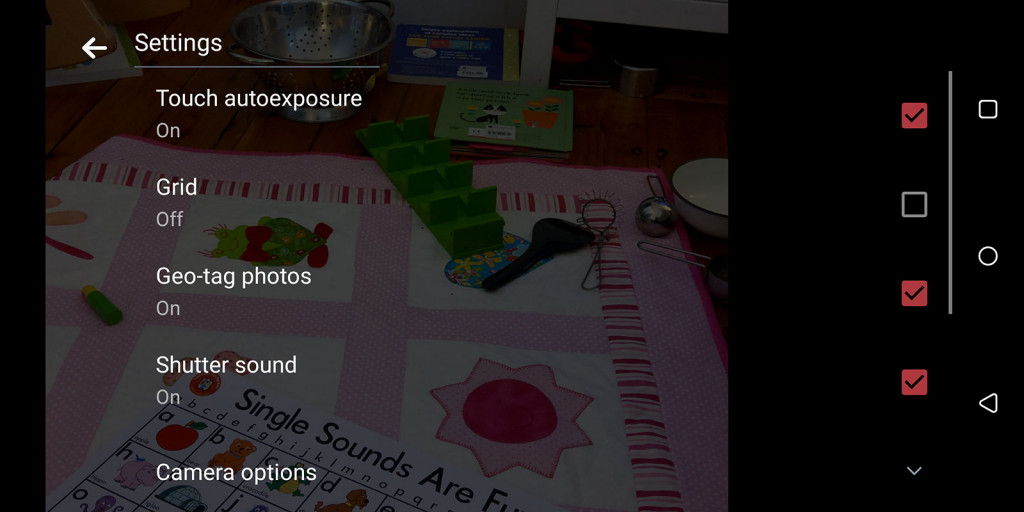
As a point, there is a setting to change this, but by default it is switched off, so make sure to dig this up and switch it back on to at least ensure your exposures come out right.

Battery
Alongside those camera niggles was a battery life that managed a fairly standard 24 hours of life, but not much more.
While that’s not far off flagships from the likes of Apple and Samsung, we hope for closer to two on a phone this big, and sporting a battery this is big enough to hold 3500mAh.
That means you’ll only find a little over 24 hours and not much more from the 6 inch HTC U12+, with that time revealed while web surfing, playing music, making and taking calls, doing emails, using wireless earphones sparingly in the morning and night, and keeping a smartwatch connected to the phone throughout the testing period.
You might be able to make it a few hours beyond those 24 — we hit around 28 to 30 when all was said and done — but we’d probably make sure a USB Type C charger was nearby if you were aiming for the end of the night.
Value
Value is also a bit of a question mark, because while Apple and Samsung are charging a fairly high price for their phones, the major competition for the U12+ is $1099 price point, where players like Huawei, LG, and Sony are all playing.
And yet HTC is going a little over, setting a $1199 price point for its take on what constitutes a flagship phone for the year, and we’re not necessarily sure it’s justified.
Granted, a hundred bucks over the others isn’t a dramatic difference, but it’s enough for us to ask why, especially when its competitors are offering some pretty interesting differences. The full-screen experiences are one of them, as are the cameras, and while they’re not exactly the same, we’re not sure the $1199 price is exactly sound here, especially when it’s not available on any plans.
If it were us, we’d have taken a similar approach HTC made with its U11 last year, and undercut. Last year’s U11 came under the price of many competitors, and given what’s on offer, we think perhaps it should have stayed there.
What needs work?
If you can justify the $1199 price tag, you will get a decent phone in the U12+. In fact, for the most part, HTC’s U12+ is a perfectly acceptable phone matched to many of today’s performance standards, but some of the extra bits that attempt to make the phone stand out feel like they need ironing out.
One of these is the touch edges, which are a touch sensitive — more so than we’d like — and definitely fussier than what we’d describe as useful. The idea is interesting enough, with the U12’s edges even more touch sensitive than what we saw on last year’s U11, where this technology was first introduced.
This year, you can squeeze the edges for a function, and double tap the sides for something else, but they tend to fire off a little more frequently than we’d like. The simple act of holding the phone can trigger the squeeze function, lighting up the screen with its animation telling you that you’re squeezing the screen, even if you didn’t mean to do just that.
The other issue with the sides is that they’re just not that useful as a control mechanism. Aside for almost dropping the phone when we tried using the squeezing and tapping functionality, the number of good reasons we had for this extra usability method can be counted on one hand, and the number isn’t high.
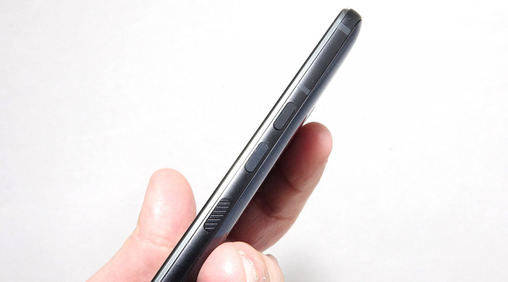
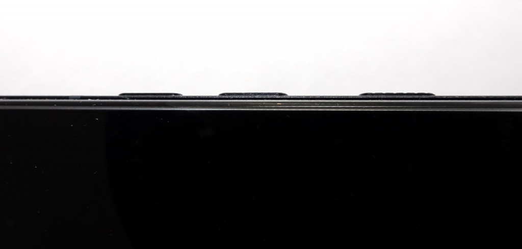
HTC hasn’t helped by making the only physical buttons on the handset not physical at all: the power buttons and volume rocker are actually just touch sensitive bumps, lacking any physical push at all. It’s not a bad shift for a phone advertising a touch sensitive design, but it’s one that doesn’t work as well as HTC would suggest.
There’s texture to the buttons, so they don’t feel as built into the design as the touch sensitive edges, but the lack of push back means squeezing the volume button lacks the satisfying press it once had, and taking a screenshot with the volume and power combination doesn’t even work.
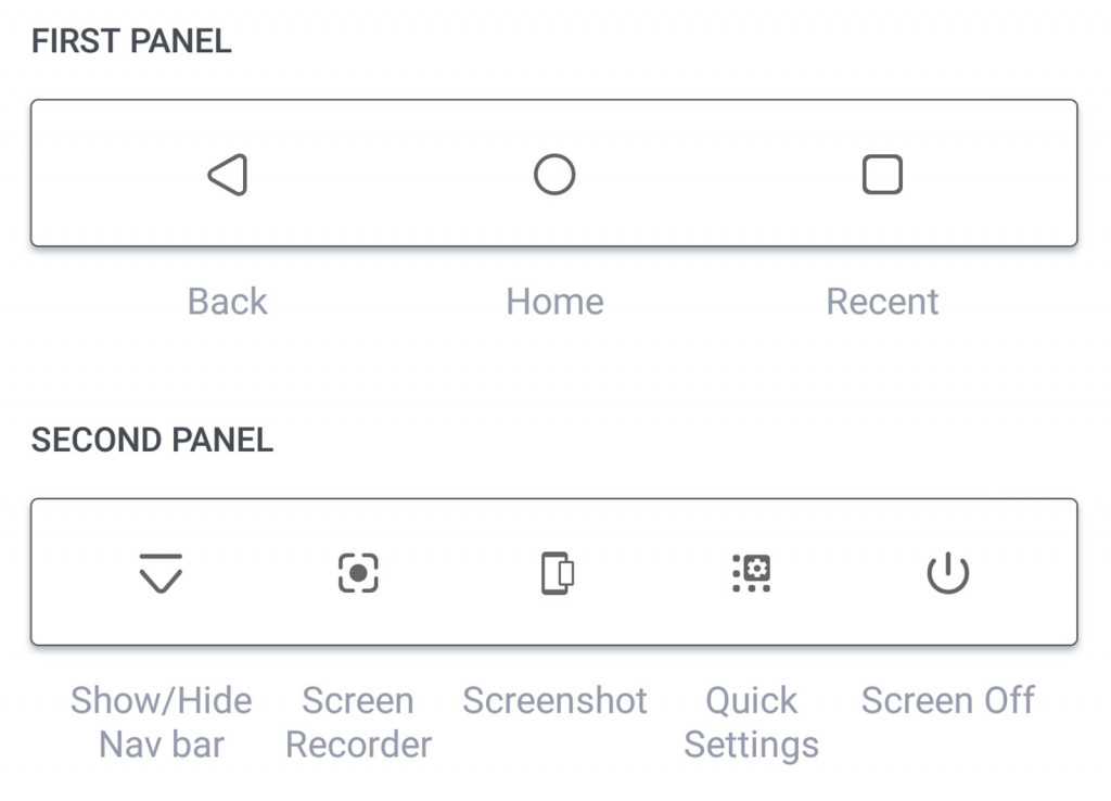
HTC has tried to address this with an Android soft button bar that can be scrolled to the left to see functions like taking a screenshot and capturing screen video, but it doesn’t feel the same.
We can see what HTC is trying to get at with its touch sensitivity, but whether from a lack of usefulness or the familiarity that buttons bring, let alone how reliant we all are on the touchscreen alone, it’s an idea that doesn’t quite succeed.
And when your main point of individuality to stand out is a touch sensitivity, that’s a bit of a problem.
Essentially, the extra touch functionality is a bit of a gimmick. You might find use, but you’ll probably end up using the HTC U12+ just like any other phone, relying more on the touchscreen than anything else.
Final thoughts (TLDR)
It’s not easy making a flagship phone this year, and there’s a really good reason: for it to gain market acceptance, it needs to be pretty special.
The iPhone is the iPhone, and Samsung is Samsung, but for everyone else, the focus needs to be on something awesome. Something so awesome, it’s measured as and in awesomesauce.
Usually this comes down to a feature, and a feature so great that it alone is the reason for someone to pick that phone over another. It could be price, something Oppo plays in, or it could be camera collaboration and quality, something Huawei has delivered.
For HTC this year, it’s touch sensitivity, a feature that after playing with the U12+ doesn’t feel as strong an argument as we suspect HTC would want you to believe. The other features of the HTC U12+ are relatively strong, but the standout feature is that, and we’re not so sure it’s as big a deal, but you’ll need to test it for yourself to see. We don’t doubt that there are power users out there that will adore the edge sensitivity, and will get more out of it than we did, but as for whether it’s the main reason to jump in with the U12+, that’s not something we’re seeing.
In fact, out of all the features we loved about the HTC U12+, it was one that does nothing that won us over the most: the paint job.
Yes, that translucent colouring on the back where the blue fades into HTC’s hardware turned out to be the thing we loved most about the U12+.
Unfortunately, we’re not so sure a paint job should be the main reason to get you to buy a phone, though this should send a sign to other phone makers that translucent designs are always appreciated.
For HTC, though, it’s a positive point of individuality in a phone that struggles to identify other points that do just that.
Sure, it’s a good phone, and it’s a good phone for 2018, but is it one of the best? We’re just not seeing that, and feel like for the price HTC is asking, it could be better.


