Quick review
The good
The not-so-good
The smartwatch world is generally divided into those that are made for Android Wear and those that are made for Apple, but Samsung’s Gear smart watches cut the playing field differently.
Designed with both a touchscreen and a hint of manual ring-based control, they’re a different class of smartwatch and they now work for more than just Android, with iPhones, too.
Is Samsung’s Gear S3 unique enough to be the best smartwatch around?
Features
Samsung is no stranger to the wearable, having decided to get into it even before Android Wear popped up on the scene.
You may not remember those watches, but we do, as the “Gear” name was used for somethat was well and truly gear, at least in the sense of the word.
This time, the name is back, with the watch about attempting to perfect the efforts of Samsung in the past few years, taking the circular S2 smartwatch and optimising a whole lot of things, while giving it that much needed coat of paint and plastic to build the whole thing like a watch.
Inside this watch, Samsung has provided its own processor to push things along, with the dual-core Exynos 7270, a 1GHz processor that works with 768MB memory and 4GB storage, allowing you to add in a fairly large amount of apps (if they exist) and music too, of course.
Samsung’s own operating system “Tizen” arrives on this phone out of the box, different from the usual battle of Android vs. Apple.
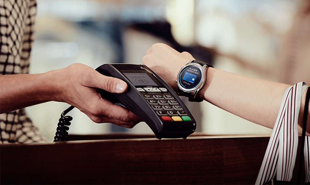
Connecting the Gear S3 smartwatch to your phone happens over Bluetooth 4.2, but Samsung has also provided 802.11b/g/n WiFi, GPS, Near-Field Communication (NFC), and support for Samsung Pay’s Magnetic Stripe Technology which vibrates the right way to trigger the older magnetic payment machines commonly seen at EFTPOS terminals.
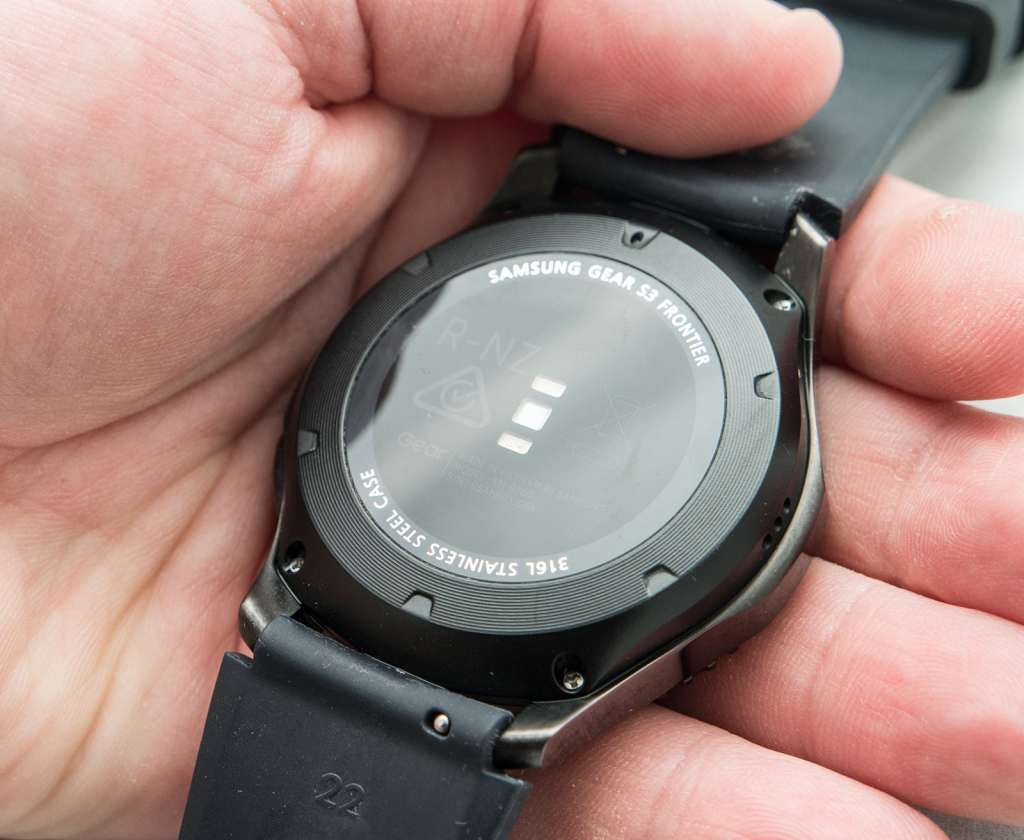
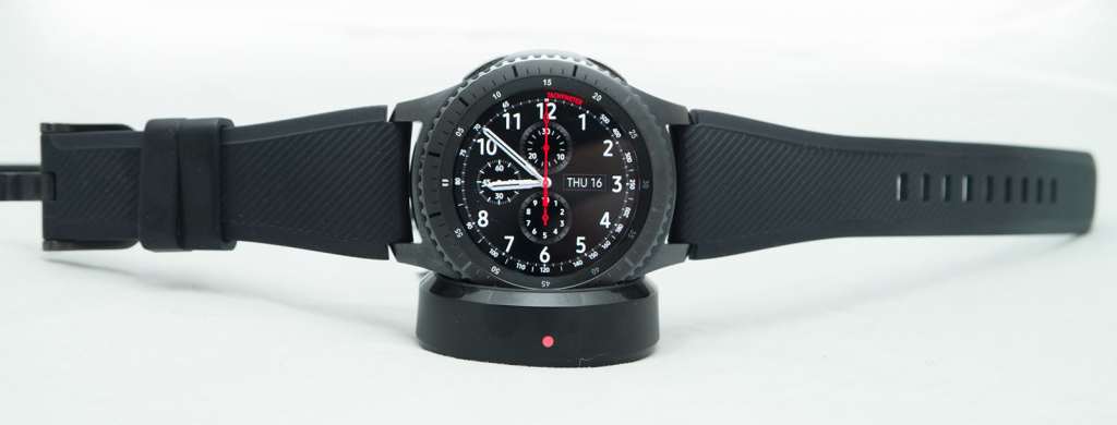
A 380mAh battery is included in the Gear S3 smartwatch, and this is matched with a good assortment of sensors, including gyroscope, accelerometre, barometer, and a heart-rate monitor found on the underside of the watch. Wireless charging is also built in, connecting to the magnetic charger that takes its power from a USB source.
On top of the battery — indeed everything, actually — is a 1.3 inch 360×360 display protected by Corning’s scratch-resistant Gorilla Glass SR+, a variation on Corning’s work that appears to be built to survive the regular day-to-day.
Samsung has also included a microphone, speaker, and small haptic motor, while the Gear S3 smartwatch is not only rated for IP68, it also is approved to military standards (MIL-STD-810G).
Design
With the features all listed, let’s get stuck into understanding the watch, because make no mistake, the Samsung Gear S3 is a watch, it’s just a watch that does something more than your ordinary timepiece.
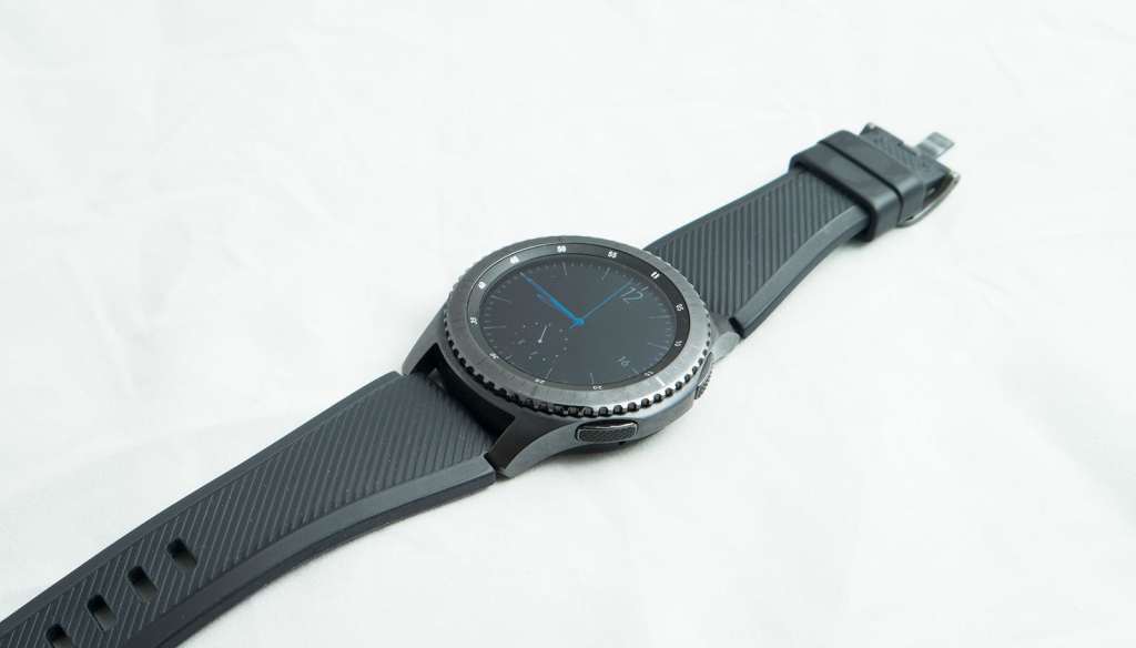
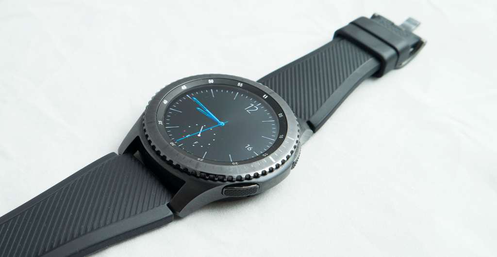
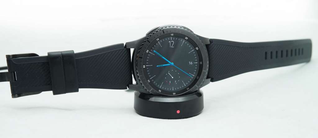
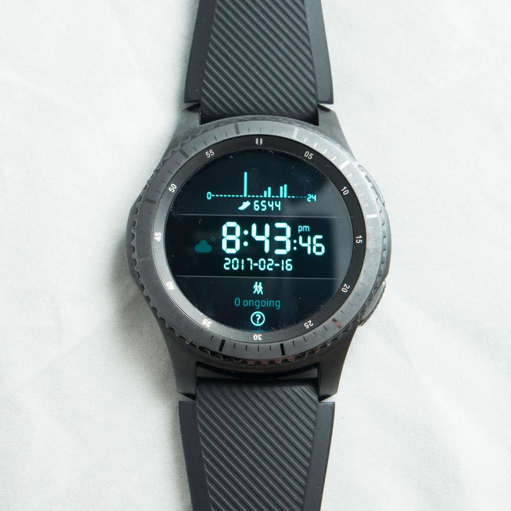
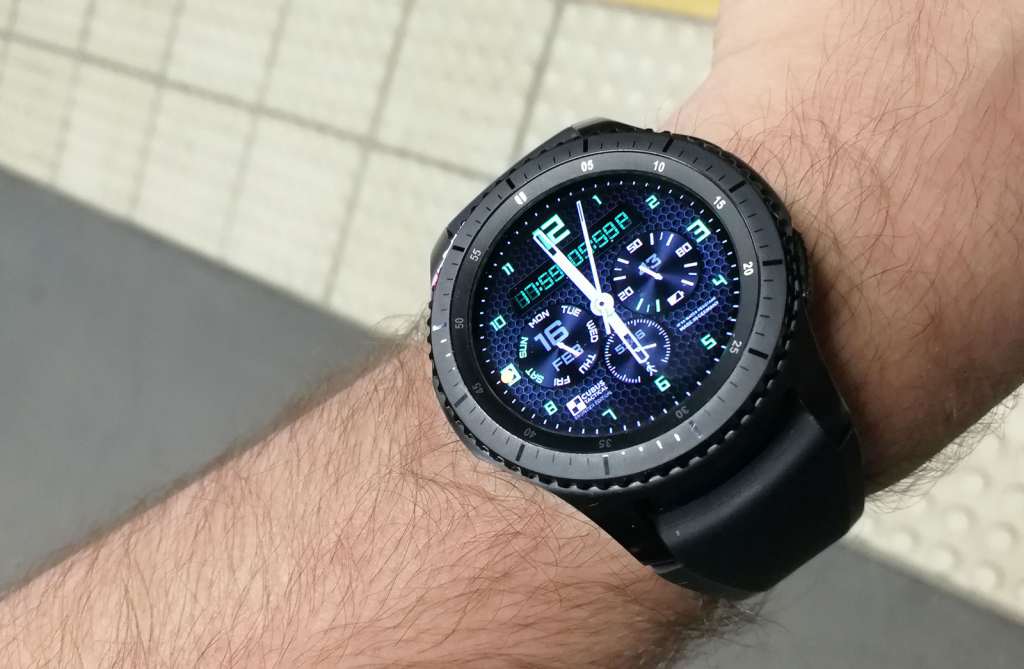
One thing it does, though, is look like a watch. Forget about the squared off designs of the fitness watches, and even Apple’s softened square — the “squircle” as it has become known — because the Gear S3 uses a circular screen similar to what Android Wear has become known on.
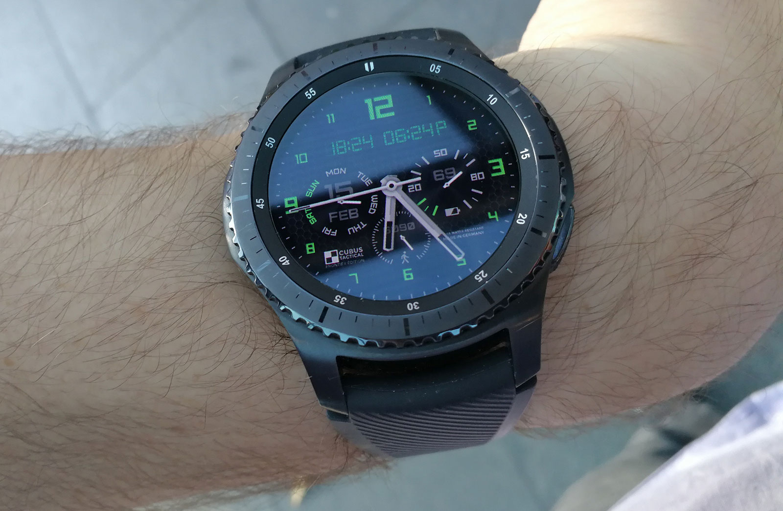
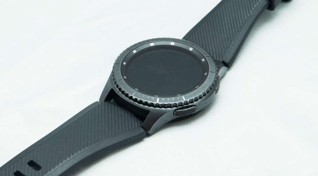
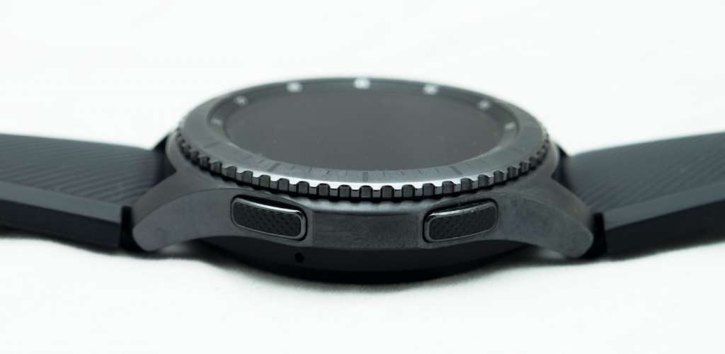
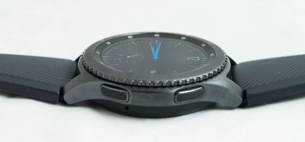
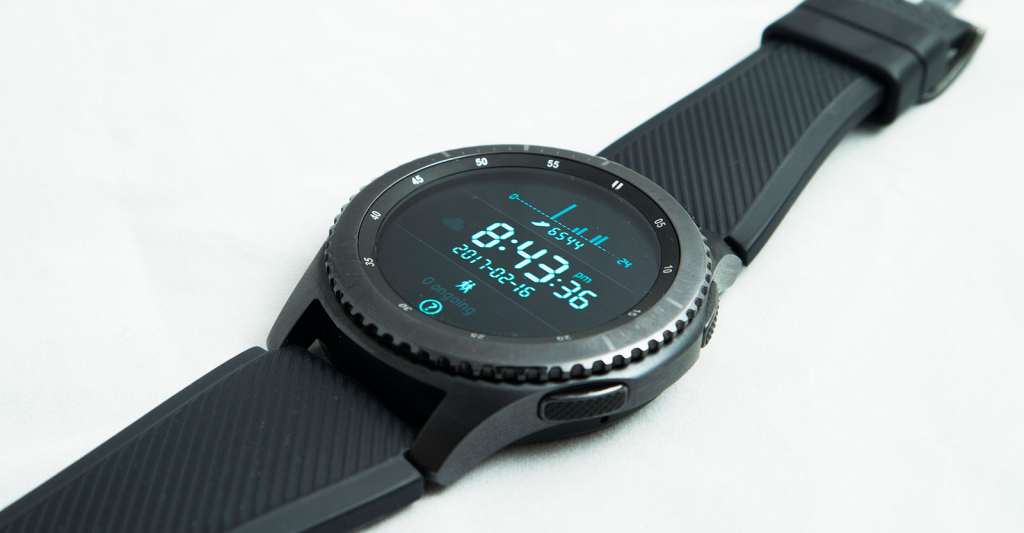
Samsung’s take here on the Gear S3 is a little more watch-like even than what the typical circular screen that Android Wear makers like LG, Motorola, and Huawei provide, with two buttons on the right and a circular wheel on top, making the whole thing feel just that much more sporty and built for adventures.
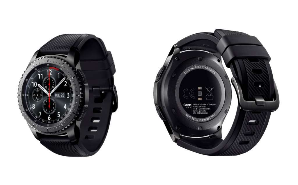
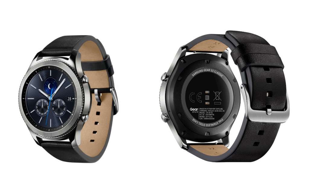
That’s what the Gear S3 Frontier offers, though the “Classic” variation is similar, just with differently accented buttons and a top wheel without any decorations.
Overall, though, the design comes off like what you’d expect a watch to look like.
This might sound like a bit of a non-issue, but few smart watches achieve the target of looking and feeling like the original material, and Samsung’s does which is actually an achievement.
Granted, it’s a little big and bulky, but if you’re used to a slightly thicker watch than the slender Swatch and Skagen, you’ll be at home here, also because the top and sides of the watch feel solid, too.
In-use
With a design that extends itself to looking and feeling more like a conventional outdoors watch, you’ll be delighted to know that Samsung hasn’t made things exactly like the other companies.
For instance, Android Wear is all touch, with everything accessible through a circular or square touchscreen and controlled by touches and gestures. Apple Watch doesn’t stray too far from that logic, but does come with a dial that can do a few things to control, though the affair is mostly about touch.
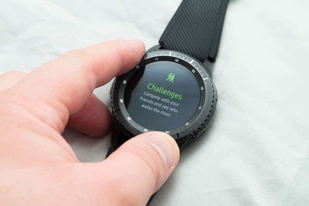
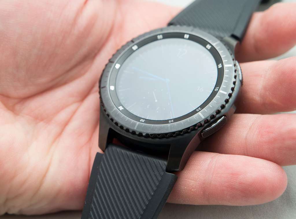
Samsung’s Gear S3 differs by offering a mostly touch interface that can also be controlled using the circular dial up top and pressing the centre of the screen.
This control wheel isn’t a new thing for Samsung, having released it in the previous Gear model, the Gear S2, but it feels more refined in this generation, with little indents as you turn the wheel to make feel like you have a touch more control as you make your way through the operating system.
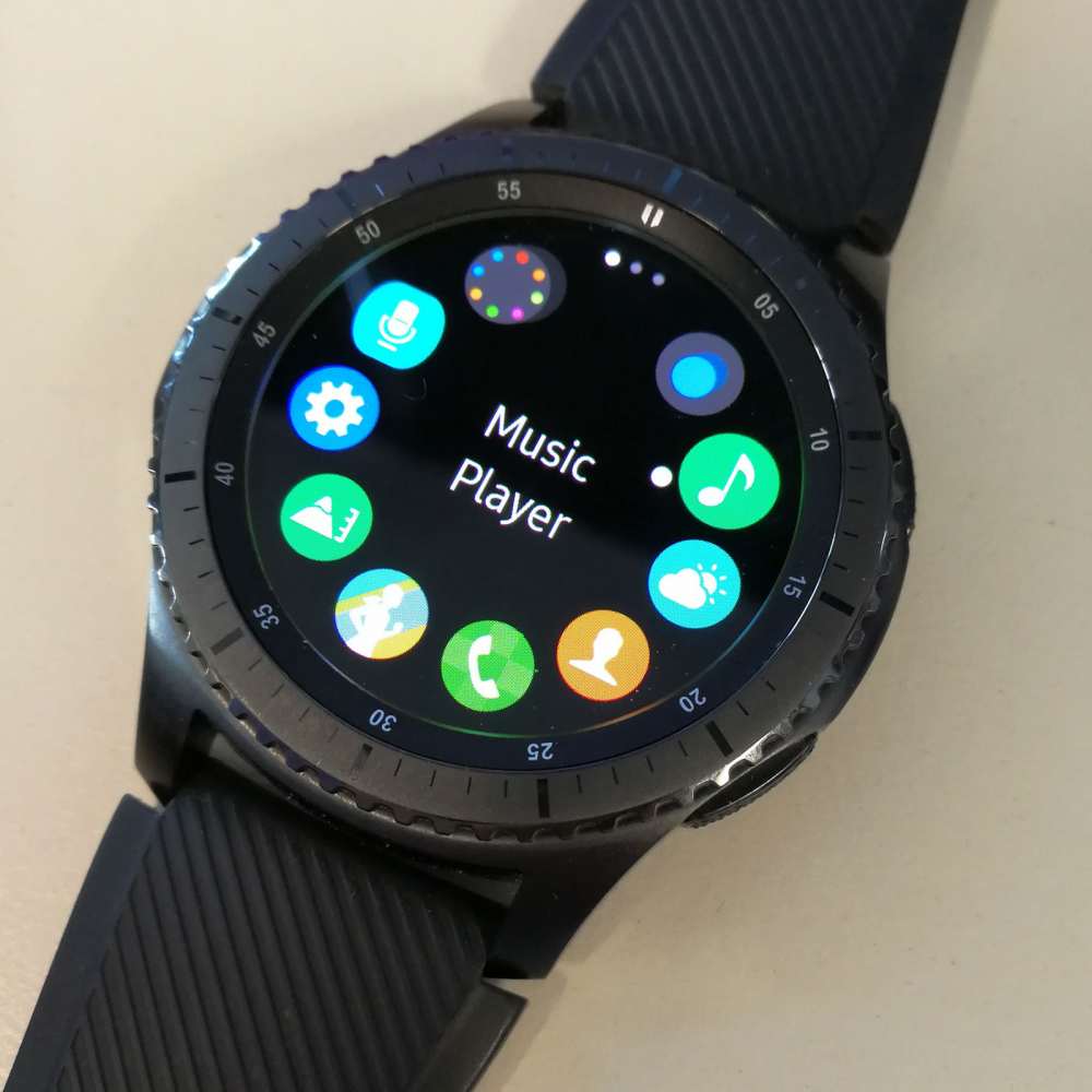
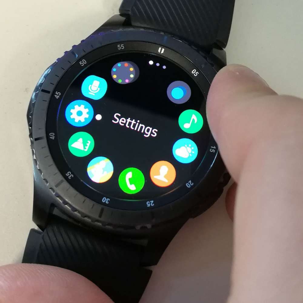
The OS of choice here — Tizen — does quite well to accommodate the control wheel, with a circular interface with icons spread out where each of the numbers would normally be on a clock, allowing you to move quickly through pages of app icons and function shortcuts simply by scrolling the wheel.
When you’ve reached a shortcut you want to run, you simply touch the middle of the screen or — if the setting has been switched on — stay on the icon for a second, and the app will run.
It’s a solution that makes it easier to get around a smartwatch quickly, and even extends quite well to the standard screen, with a dial to the left revealing your notifications (with swiping up sending them to the trash to discard them), while rotating to the right gets you to the quick app shortcuts for things you may use more frequently, such as the music app, the sports measurements, a contact you plan to call, and so on.
Really though, it’s this combination of touch and wheel control that help to cement the watch as very easy to use, because you’re not forced to jump through pages of unnecessary icons, and can just quickly rotate your wheel to get where you need to go.
The two buttons on the side are also handy, with one reserved for going back (the bottom), while the other is a shortcut for an app you may use regularly. Or not, as the case was with ours set to Samsung Pay.
But if you do happen to have use for Samsung Pay, you will find that usable here. Currently there aren’t many banks in Australia that will let you use the smartphone-based magnetic strip technology for wireless payments, but when Samsung and the banks start properly talking, the inclusion of MST could mean that Samsung’s Gear S3 provides one of the easiest ways to bring wireless payments to devices that don’t have support for wireless payments.
Given how many devices are still being released without Near-Field Communication — Oppo, we’re looking at you — this revives that possibility once more, and allows you to take it to more devices later on.
Performance
Once you’ve learned how to use the Gear S3 — and it won’t take long, as the two methods of control are very handy — you get to contend with performance.
Fortunately, Samsung has found a good combination of parts that work with its custom software, resulting in only occasional moments of slowdowns that are very easy to look past.
For the most part, running apps and jumping to various multitasking opportunities have no problems whatsoever. It’s still strange communicating this idea of “multitasking” in a watch, that said, because it’s a watch, but the few times you’ll want to jump between apps, the combination of the Exynos processor and 768MB RAM (which is 256MB higher than what we generally see on other Android smartwatches) as well as that cool wheel interface helps to click everything together, making for a mostly seamless transition.
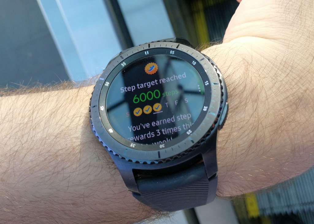
Outside of checking the time, most of the activities you’ll do with the Gear S3 smartwatch are around that of health related — tracking how well you’re doing, running, step climbing, and so on — and taking and making phone calls, with the rest of the time you glance down at the S3 there because you’ve received a notification.
These notifications aren’t just willy nilly everything you get, either, because you can simply tell the Gear app what you’d like to receive, flicking on SMS and Facebook Messenger, for instance, and keeping off UberEats. Unless you really love being notified when that food is going to arrive.
Looking down at the screen, you’ll find a positive lack of ambient display most of the time, but all you really need to do to get the Gear S3 talking to you is raise your arm or receive a notification, and if that doesn’t work, press one of the buttons on the side.
Outside, we even found the screen performance handled its own, with enough brightness from the screen to result in a glance not forcing you to run for the shade
It is easy to spot some misses, however, and these range from the movement tracking to the Bluetooth pick-up.
Let’s go with the movement tracking first, because we find it rather interesting just how easily the Gear S3 is confused by movements.
First of all, we need to acknowledge the good things Samsung is doing by trying to get you to move. That’s a noble gesture, because if you’re sitting down for too long a period — say an hour — it will tell you to get up and to start moving, because, you know, it’s keeping tabs on how you’re doing and how much you’re moving about.
That’s good. We like to be jabbed by our wrist and have a reminder of when we should be getting off our proverbial.
Not every fitness tracker is fooled quite so easily, and many over the past few years will know the difference between a shoulder movement as the body moves up and down from walking, and that of a wrist moving in the air as the hand on the end of it stretches a finger out and touches a display.
The Gear S3 cannot tell the difference, and so if your do get one of these alerts telling you to get up, all you have to do is touch an iPad or a Galaxy Tab, or any other device for that matter. It’ll think you’re a legend, even though all you’re doing is being a modern geek.
Our other critical point for the Gear S3 is with the Bluetooth connection, because that’s how this device connects to your phone.
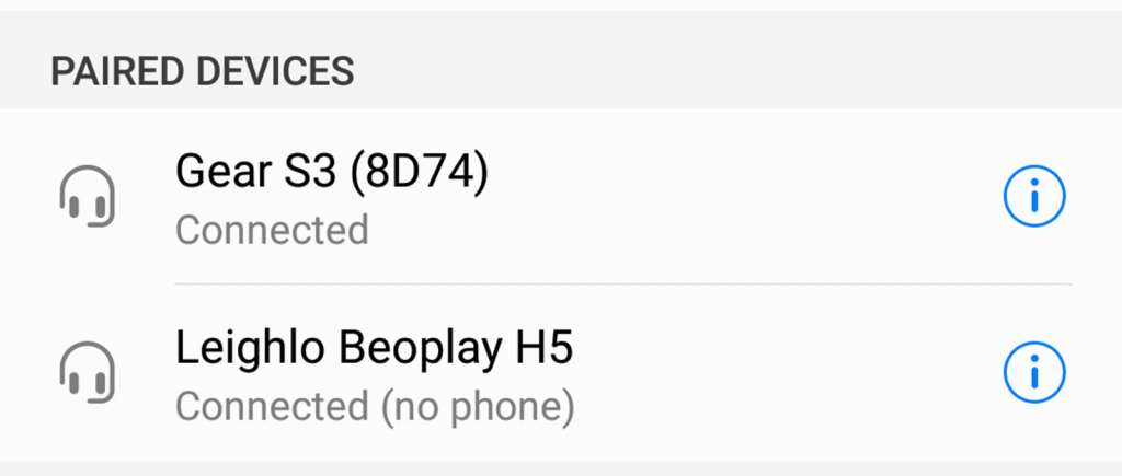
Now there’s nothing bad with that, and Samsung has served up a decent amount of connections so much that you can pair wireless earphones with the watch and even go for a run talking only to music on the watch. That’s cool.
What’s less cool, however, is when the watch automatically intercepts phone calls through Bluetooth and requires you to talk through the watch even when you grab the call from the phone itself.
We can’t work out why this is the case, and it happened on more than one device: Google Pixel XL, Oppo R9s, Huawei Mate 9. You name it: if we’ve reviewed or used it in the past couple of months, the Gear S3 spoke to it, and this would happen on more than one occasion.
More frustrating is that the S3 will always prefer to take the phone call over your wireless earphones or headphones, even bringing up a setting in Bluetooth that would say your earphones were getting “media only”, proved by the simple fact that you couldn’t talk to anyone wirelessly unless you wanted to use your watch.
It’s a strange bug and one we think can be attributed to the Gear S3’s app and the fact that the two things — phone and watch — need to be connected at all times to get the most out of the S3.
Hopefully it’s one that can be fixed soon, too, because as nice as it is that the watch can be used to talk to people, standing and talking through your watch can leave you very self-conscious and feeling like a bit of a knob. Or even a lot of a knob.
We’re fine with the Gear S3 letting us make the phone calls ourselves if we choose to. That’s cool, because it’s a choice. Intercepting the phone calls for us is a different matter.
Fortunately, you can tell your phone to answer it on the handset by hitting the speaker options on your handset, so there’s that.
Battery life
A smartwatch can’t be good if it can’t survive the course of a regular day, and that’s a test few smart watches exceed.
It’s a thing that hardware makers are gradually learning, because as nice as it is to have alerts and calls and notifications and even that thing called the time, there’s a very real chance that you won’t make it back to the charger by the time you get home.
This makes it critical to get in with over 24 hours of battery life, an achievement few smart watches nail.
Fortunately, the Gear S3 is one that truly surprises, boasting anywhere between two and four days of life in our tests, with the number going up when you decide not to really do much with your S3 watch.
Imagine what the world would be like if you didn’t constantly have messages from Google, from Twitter, from email and so forth. If you opt to remove those from the Gear’s notification list, the watch lasts longer throughout the week.
With only the ones we needed switched on, Pickr found a good three days of life without fail, charging the S3 twice per week, as the weekend had us receiving much less for us to check our wrists.
Part of what makes the battery life strong is that screen, and a rather cute but also annoying tweak Samsung has made in order to keep the life strong: no ambient clock.
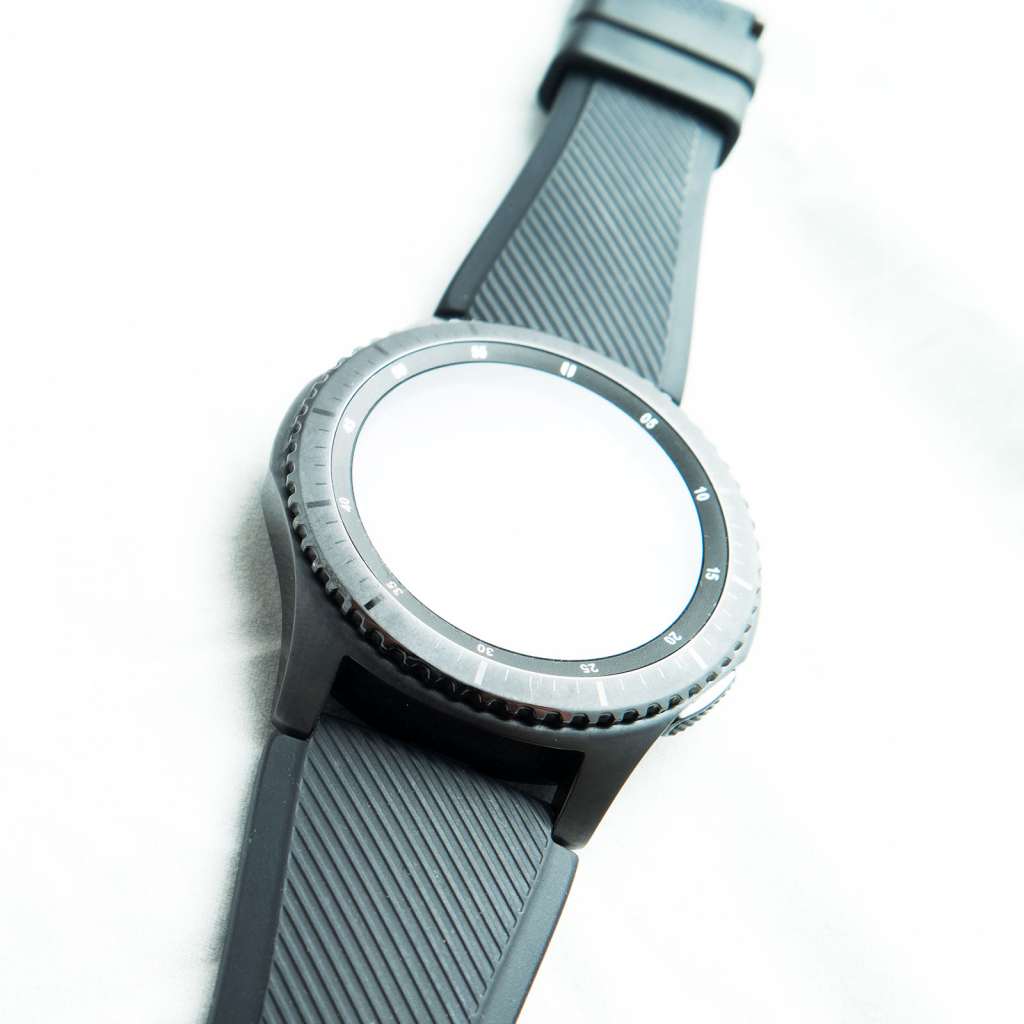
For the most part, when you wear the Gear S3 smartwatch, you’ll look as if you’re wearing a blank canvas, with the screen switched completely off and black, not doing anything until you raise your hand to look at the screen, touch a button, or turn the wheel up top.
To Samsung’s credit, this doesn’t actually end up bothering anyone because it means you’ll only see the time if you end up actually properly glancing at the watch rather than chancing a glance all the time and was wasting battery power unnecessarily.
Durability
After the battery life, durability and sturdiness of a smartwatch is pretty important, because how well it survives your daily life with your arm is a pretty important factor.
We tested the Gear S3 with the “Frontier” edition, which is only different really in how the casing looks and the included band. If you’re considering the Gear S3 Classic, everything about durability should hold, you just won’t get the watch with the ridges cut into the control ring.
As far as durability goes, Samsung has made a winner here, because wearing it for the past month and swinging our arms about and accidentally running our wrists into corners and such didn’t make a dent on the watch.
Meanwhile, going for a brisk walk, a run, or just sweating all over it followed by drowning it under water also proved no problem, thanks in part to the military standards Samsung had the Gear S3 tested for.
Yes, just like its flagship phones, this has an IP68 water and dust resistance rating, but unlike those phones, it’s also rated for “MIL-STD-810G” which is a technical way of saying “life-resistant for drops and things that would make other devices fall apart and reveal their insides”. It’s this sort of rating Panasonic’s Toughbook would receive, and you usually only see it when a device is made to be dropped.
A watch isn’t made to be dropped, but we do tend to put them through a level of life that smartphones don’t often see, so protecting the Samsung Gear S3 smartwatch to a military standard is most welcome.
A question of apps
As much as we love the Gear smartwatch, our biggest complaint is pretty clear: apps.
We’ll say it again just for emphasis: apps.
One more time for the cheap seats? No?
How about instead we go into why this is a problem, because it is a problem, and something Samsung’s operating system of Tizen has never really solved.
Make no mistake, the OS being used on the Gear S3 smartwatch isn’t new, and Samsung has been hawking it for the past four or five years, ever since it started to play with the idea of an Android competitor on phones, and then pushed the platform out to more devices.
You may not realise it, but Tizen is on more than just cheap phones that never come to Australia and the Gear smart watches. It’s also on TVs and fridges and anything else Samsung doesn’t want to put Android on but has a touchscreen controlling something.
Simply put, it’s an operating system that it can secure and control, but it’s not an operating system that has been totally embraced by the development community, and that’s because it’s just not found in abundance, not to the level of the other platforms.
Few developers results in fewer apps, and that’s one of the biggest problems with the Gear S3, which also extends to the Gear S2.
This means that if you have an app you might commonly use on your other smartwatch — say the Jawbone Up or Fitbit app — it won’t be here. You won’t find a dedicated music app for either Google Play Music, Spotify, or Apple Music, forced to used Samsung’s own which can detect the song and skip track, but is a little slow and won’t let you thumbs up, love, bookmark, or do any of those extra things the other apps do.
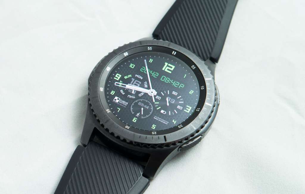
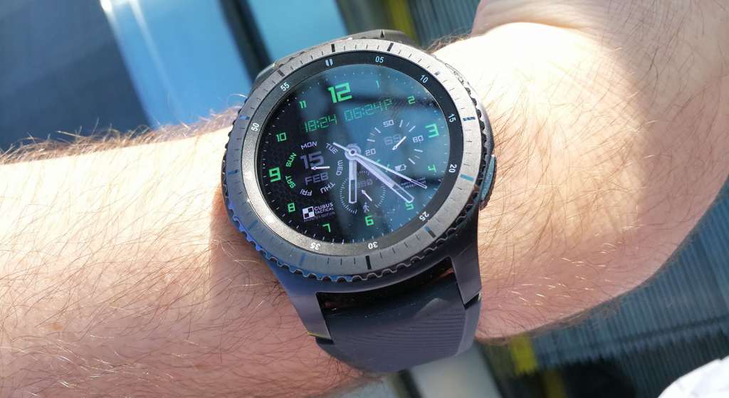
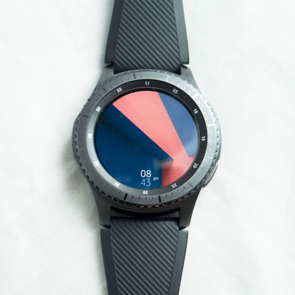
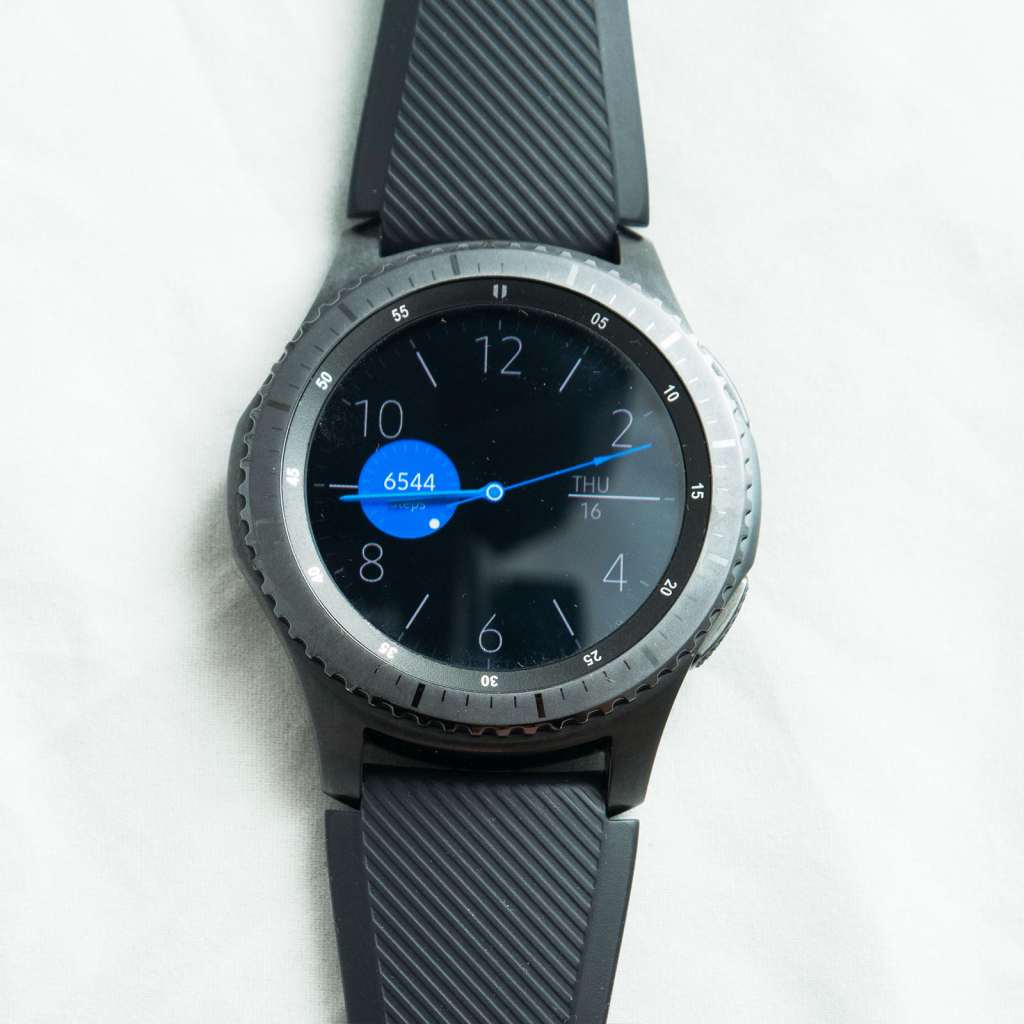
There are plenty of watch faces for you to peruse and purchase, but it’s the lack of individual apps that let you actually have a smaller wrist-sized version of the smartphone variant we found ourselves wanting more of.
So apps are the problem, or a lack thereof. Fix the app problem and most of our complaints go away.
Value
At $599, however, we get pegged onto another issue: price.
Smartwatches are still fairly new, and Samsung has packed a lot into this little thing, with ruggedisation, water resistance, the heart rate monitor, Gorilla Glass, a three day battery, and a feel that yes, this is a real watch.
But as good as the technology is in the Gear S3, it’s hard to come away from the $599 price to think you’re getting amazing value, especially as the smartwatch price wars begin to heat up.
A quick glance at the market today and you’ll find Android watches from $470 to $700, which puts this close to the centre, but while devices in the upper end of this tend to go for an elegant and fashionista metal approach — the proper watch look, so to speak — Samsung’s Gear S3 Frontier is a little more focus on walkabouts with its look for the $599 price tag. If you exchange that for something simpler, the Gear S3 Classic doesn’t quite have the same level of elegance as say Huawei’s W1 which is full metal and comes across like a digital Rolex.
Both Samsung devices cost the same and include the same components, so at least the option of picking a watch comes down to specifically which one you like the look of.
Honestly, our struggle with the price is the realisation that after a good week or two — once the gimmick has worn off — you will more than likely just use the Gear S3 smartwatch as a watch with notifications, and then just a fitness tracker, and that makes it expensive for what it does.
The question of apps is where the Gear S3 loses its value, because with both Google’s Android Wear and Apple’s watchOS offering a pretty vast library, the gimmick of using a second screen on your wrist can be extended almost indefinitely.
But if you don’t have as many apps — if the watch is basically just a circular fitness tracker that looks more like a time keeper — the value is less pronounced, especially since it’s a good $300 more than Samsung’s most recent fitness tracker running a similar OS.
There is one very strong positive, though: Samsung’s Gear won’t keep you locked to a phone, which is easily one of the biggest problems with Apple’s Watch.
Right now, if you want to switch to an Android, your expensive watch will not work. Samsung’s will, joining Android Wear as supportive of both major platforms (sorry Windows Phone users, it’s not you… it’s your operating system).
Final thoughts (TLDR)
Still a fairly new thing, the smartwatch is in that rather critical part of its life as a category as customers try to work out whether it is merely a gimmick or something actually usable.
A second screen experience for your wrist, the smartwatch rarely adds anything to the watch-wearer’s experience, outside of maybe delivering notifications and tracking fitness.
That’s a problem every smartwatch maker has to deal with, from Apple to Sony to Fitbit to Garmin to LG to Huawei, and yes, even to Samsung.
For Samsung, the Gear S3 still faces that same struggle to make the smartwatch more than a gimmick, and it’s something we’re not sure it has succeeded with simply because of the lack of apps and the lack of connection with your smartphone outside of notifications and alerts, and outside of time checking and fitness monitoring.
Despite this question mark, Samsung’s Gear S3 manages to come away as the best smartwatch we’ve reviewed yet, and there’s a great reason why: battery.
That’s one of the biggest question marks facing smartwatch customers, because like a real watch, you want the battery to survive. You don’t want to forget to get to a charger nightly and have your watch die. Rather, you want it to live, to survive a few days so you don’t need to remember after that drunken night out that the watch needs to go on the charge, just like the headphones and phone and everything else in your life.
Many of us live in our watches, and like a wedding ring, they rarely come off. There aren’t many smartwatches — if indeed any at all — that can lay claim to that, but Samsung’s Gear S3 gets close.
Indeed, Samsung’s Gear S3 proves that a smartwatch can start to live on you like a real watch. A real survivor, it’s one of the best around.



Comments are closed.