Quick review
The good
The not-so-good
The humble phone is the centre of our lives, and it can do so much more than make phone calls. It can text, surf the web, let you visit friends around the world on social media, take photos, play music out loud, act as a way of demonstrating video and content, and generally be that all-in-one device you know it needs to be.
There’s no point in denying that convergence has really played a role in making the phone smarter, a word that makes up part of the category’s name.
But for all its convergence, we still carry extra gadgets because the phone will only do so much to complete its task of the all-in-one device. When we need reach, we carry an extra camera. When we want bigger sound, we know to carry a speaker.
What if your phone could do all of these things simply by changing the phone into one of these gadgets, if the metamorphosis between phone and gadget was just as simple as snapping the extra gadget to the back?
Design
The first time you glance at Motorola’s Z, you get the feeling the company wants to try something different.
True innovation isn’t found very often these days, but it feels like Motorola is closer to it in in the Moto Z than any other company, because while Apple’s continued evolution of the iPhone is an incremental thing, and much the same is happening across the Android landscape too, the Moto Z harks back to the idea that convergence can be a serious thing.
So here’s that serious thing: a phone that can do more than what a phone should be able to do.
That’s been the idea of the smartphone for ages now, and thanks to the level of convergence we already have, the camera industry has had to come up with new reasons for us to buy cameras, simply because the compact is well and truly irrelevant unless you need zoom (but interchangeable lens cameras are still awesomesauce).
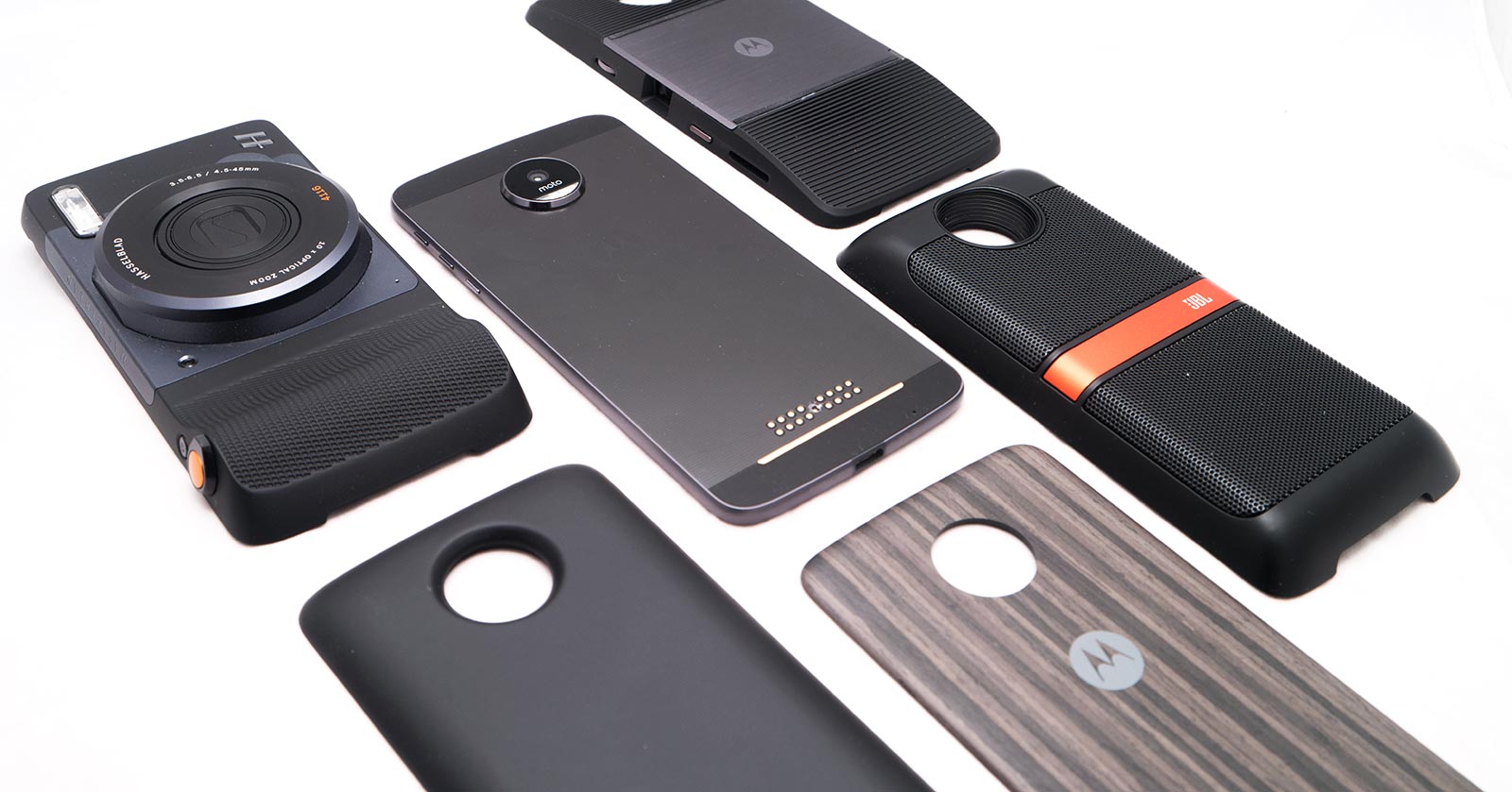
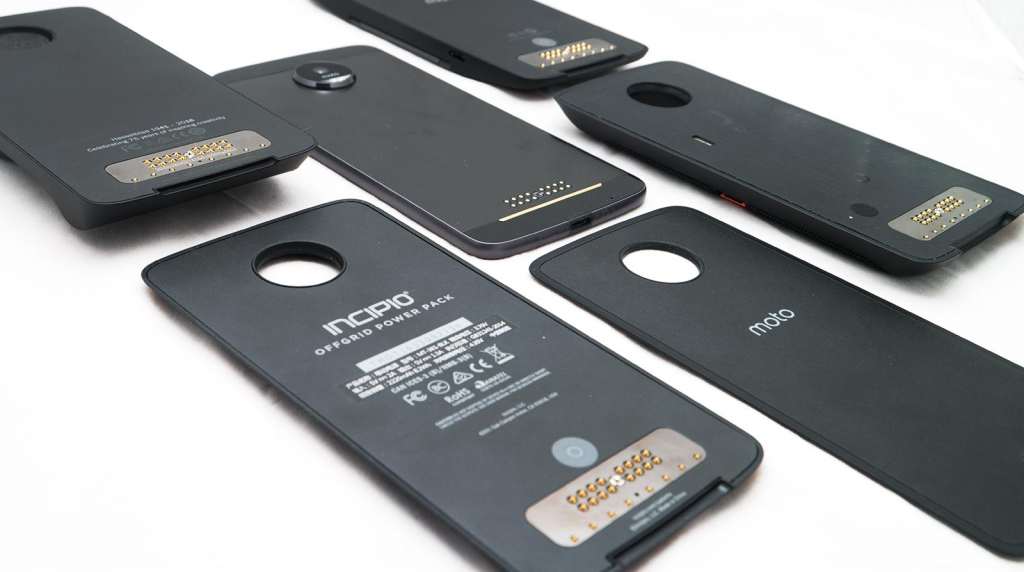
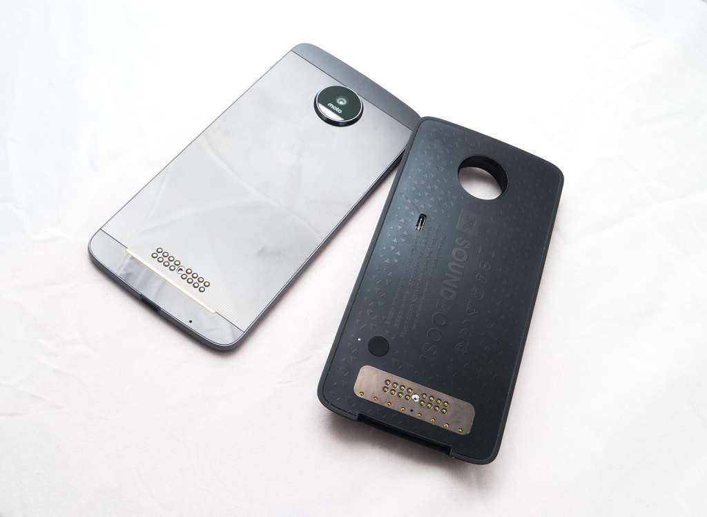
Motorola’s new definition of convergence involves a slight change to the design, throwing in extra metal contacts on the back to allow you a degree of modularity, slapping on extra bits to change not just the phone’s functionality, but in essence what the phone is.
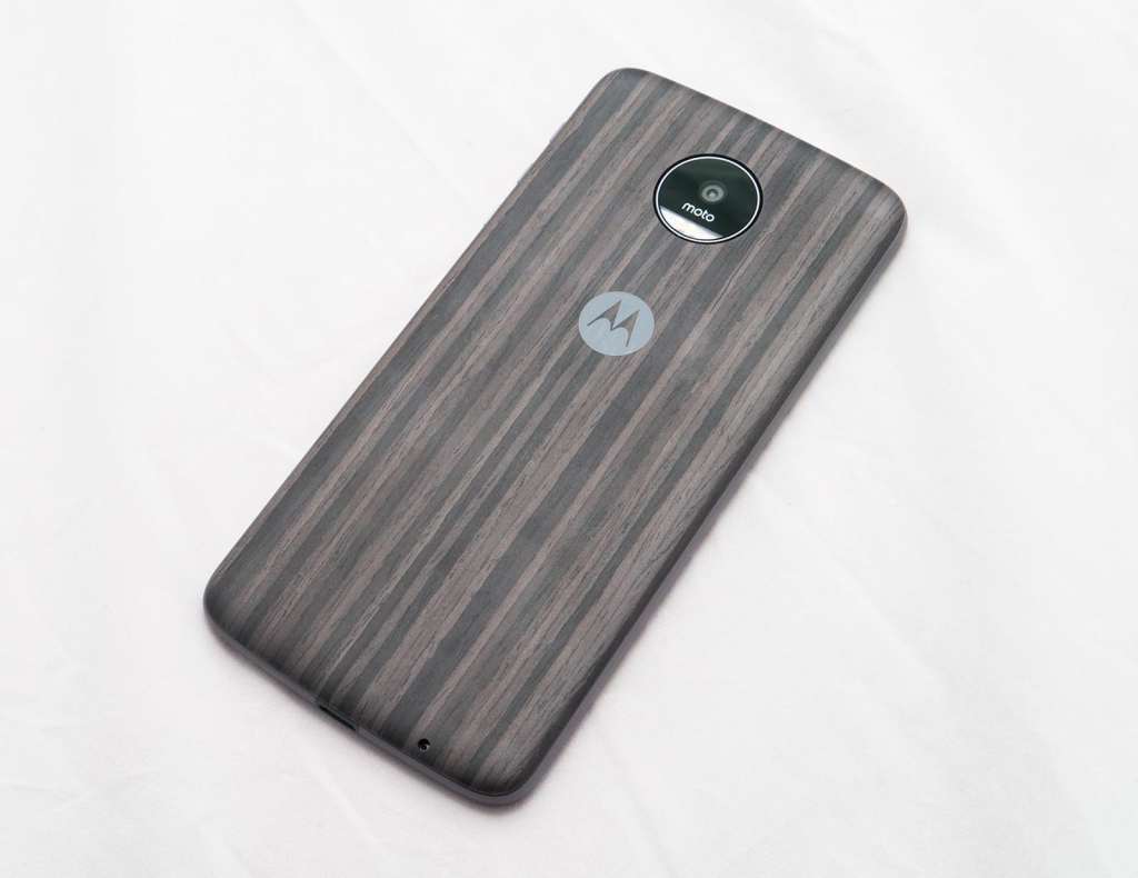
We’ll get more into it later, but this is why there is a naked Moto Z and a clothed Moto Z: the naked Moto Z is the phone by itself, but if you own one, there’s a good chance you’ll leave it clothed with the Moto Z Style Shell attached to the back, an accessory that is either a bit of wood, plastic, or metal that covers those contacts and makes the naked Moto Z look more like another phone.
Features
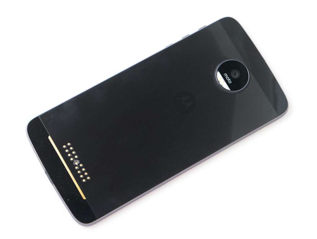
Take that off, however, and you get the phone at its barest, exposing the metal contacts, the glass back, and the insanely thin 5.19mm thickness.
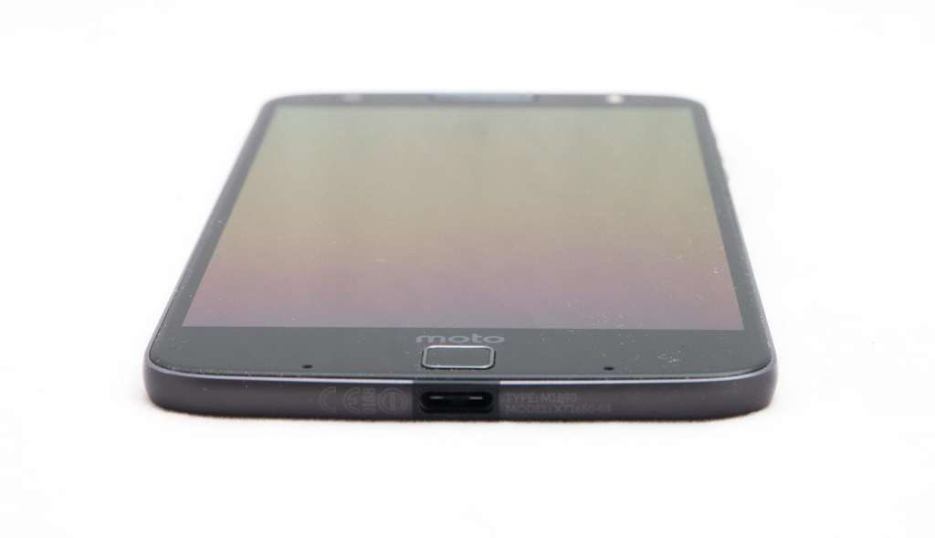
To get the phone into that size, a few things have had to change, namely the omission of the 3.5mm headset jack, with the only port on this phone being the USB Type C port at the bottom, though Motorola does include a converter in the box.
While there’s no headphone jack, Moto (and parent company Lenovo) hopes you won’t need one, providing Bluetooth 4.1 LE (Low Energy) for wireless sound, with 802.11a/b/g/n/ac for the rest of the WiFi tech, as well as GPS, Near-Field Communication (NFC) technology, and Category 6 4G LTE, providing speeds as high as 300Mbps down and 50Mbps up (network dependent, of course).
Motorola does shake things up here a little, because this ia flagship with two SIM slots, allowing one to work either as 4G and the other as 3G, or both as 3G, or just skipping the extra SIM and upgrading the storage with microSD.
You may not need to upgrade the storage, mind you, because the 64GB inside is pretty spacious, with the rest of the system including a quad-core Qualcomm Snapdragon 820 processor and 4GB RAM, as well as a pretty stock Google Android experience, keeping things simple and clear.
Cameras on the Moto Z check in with a 13 megapixel rear camera supporting f/1.8, laser autofocus, optical image stabilisation, and two sets of LEDs for the flash, while the front facing camera is a 5 megapixel camera complete with a flash. The Moto Z will capture 4K Ultra HD video, though only from the rear camera (because you need a minimum of 8 megapixels for 4K).
And all of this sits under a 5.5 inch AMOLED Quad HD display, running the 2560×1440 resolution underneath a layer of scratch-resistant Gorilla Glass, and providing a pixel clarity of 535 pixels per inch.
The battery is rated at 2600mAh and is not removable.
Performance
Switch the Moto Z on and that crisp 5.5 inch Quad HD AMOLED display lights up, providing a fairly clear display for you to get working on, with Motorola feeling like it’s moving on from LCD to the more colour capable AMOLED technology, because that sort of thing matters when you’re making phones more like cameras.
Outside of this, performance of the phone is pretty much where you’d expect a flagship 2016 phone to be, even if it’s one that has arrived in Australia a touch late.
We say that simply because while the Snapdragon 820 is no slouch, the chip isn’t the most recent there is, beaten by the marginally faster 821. It’s kind of like comparing two types of apples, because while both are the same fruit, one is different. In the case of the 821, the newer chip not in the Moto Z is marginally faster and better for power optimisation.
Despite this difference, the Motorola Z is no slouch, championing through operating and really having no issues regardless of what you throw at it.
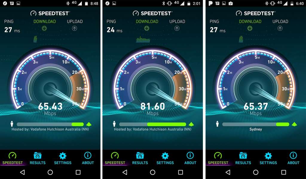
Mobile performance is equally strong, with support for Category 11 4G LTE, though topping out at around 80 to 100Mbps in our tests on Telstra’s 4G network in Sydney’s CBD.
Sufficed to say, you shouldn’t have too many problems with this handset, as the world’s thinnest mobile proves thin technology can have more going for it than just slender looks.
In-use
Using the phone is also a fairly seamless experience, and with Google once owning Motorola, it’s not hard to imagine that Motorola continues on with the idea that this is a pure Android phone.
It’s not technically a “pure Android” experience in the way the Pixel is, so let’s get that out of the way. You’ll receive your updates from Motorola and not Google, and so when Google has a new operating system out, you still have to wait for Motorola to give the green light and roll it out to more devices.
Case in point: while Android on the Moto Z is pretty much just the way Google made it, with no extra overlays at all, the operating system differences are there with the Pixel and Nexus phones both on version 7.0 “Nougat”, while our Moto Z review unit was stuck on “Marshmallow” with no new updates listed at the time of publishing.
When Moto does eventually roll out the Nougat update, we’ve heard the sweet operating system change will also support Google’s Daydream View VR platform, but right now, there’s just nothing.
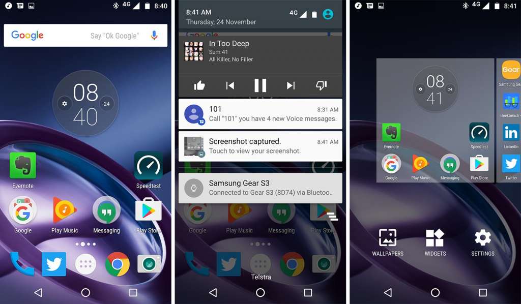
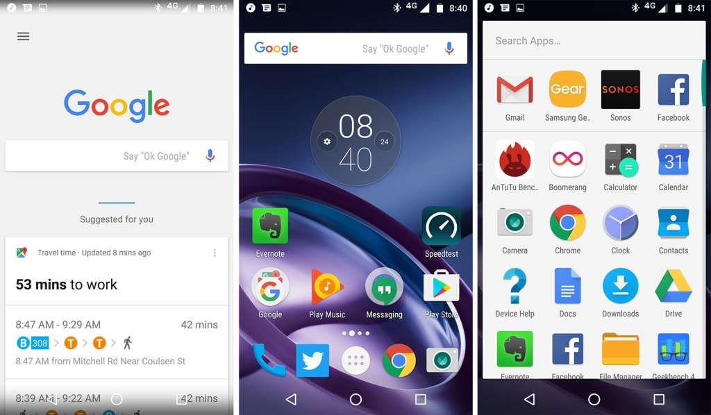
Outside of this, however, everything you expect Android to have is here, complete with the Google Now screen on the very left, the three soft buttons built into the display that change based on what you’re doing at the time, multiple widget-friendly homescreens, and a drop-down notification bar.
Yes, this is Android, and it’s Android the way Google created it, with no extra things added.
Save for one, actually.
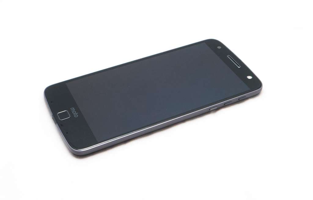
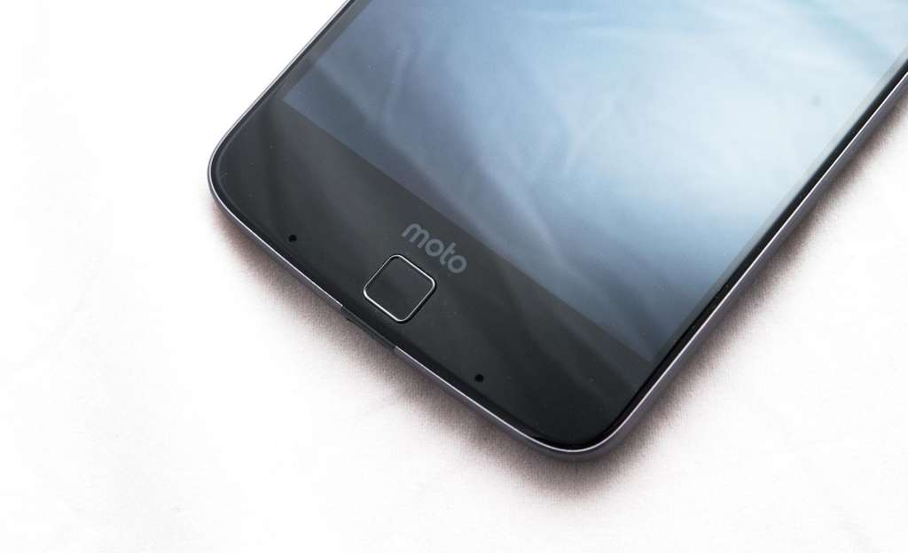
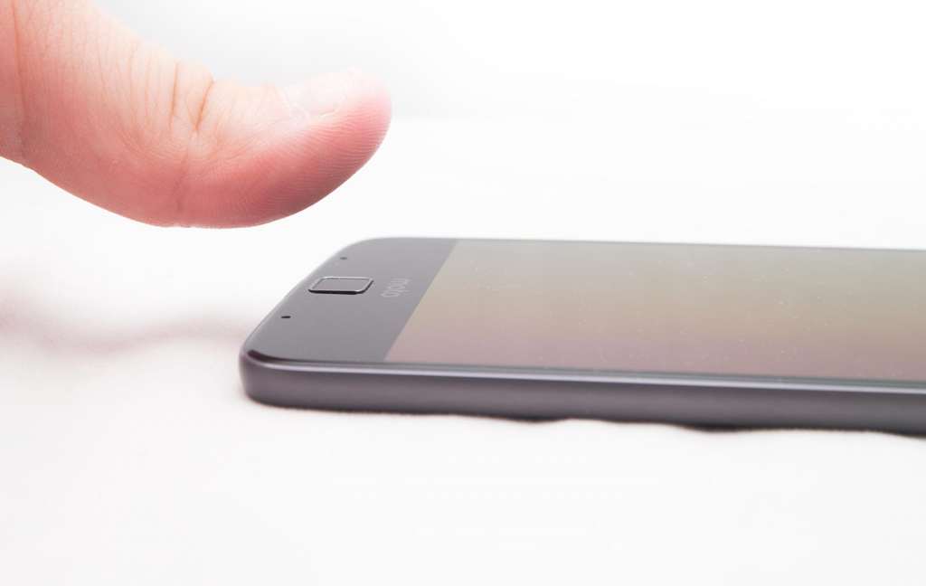
At the bottom of the screen, Motorola has included a fingerprint sensor, with a small squircle sitting roughly where you might put your thumb, allowing you to unlock the phone by touching this with a registered digit.
Strangely, this only works as a fingerprint sensor to unlock the phone, or even to switch it to standby, with no other functionality offered. It’s not like the home button used by Apple or Samsung with the fingerprint sensor underneath, nor is it like the power button used by Sony with the fingerprint sensor used there, either.
It’s more like what Google, LG, and Huawei have been doing on the back, except it’s a different shape and sits there in a rather unsightly fashion on the front.
This is one of the changes Motorola added to its phones in the middle of the year, and Australians first saw it on the new fingerprint-enabled Moto G, so it’s not surprising to see it mage an appearance on the flagship Z.
That said, as unsurprising as it is to see the sensor in this position, it’s still hard to get past how it looks like a button, and how it should feel like it would act like a button, but that it doesn’t respond like a button at all.
In fact, if the fingerprint sensor were a button, it would be one that turns to phone on and off, because that’s all it does.
If Motorola had made it into a button, it would be an awkwardly placed button on a device mostly without buttons, and a move that puts it squarely in old-school Android camp, as well as that of the iPhone and Samsung’s Galaxy range.
So we get it — we understand why Moto has placed this odd button-that-isn’t-a-button here — we just don’t like it much. It feels like it needs to be a button, and one that handles more than just power on and power off, and yet that’s all it does, which is a genuine shame.
Cameras
The cameras at least make us a little happier, and that’s because they’re good, but let down a little by the software, though you do have some exciting room to move.
For starters, Moto’s Z has one thing on pretty much every phone we’ve seen this year: a front-side flash.
While other companies are simulating the flash using the LCD screen, Motorola has just gone and added the flash to the front camera. There’s also one over on the back, and each camera handles the job quite well.

The 13 megapixel camera on the back produces images that are sharp and crisp with nice colours, while the front-facing camera takes a good selfie, too.
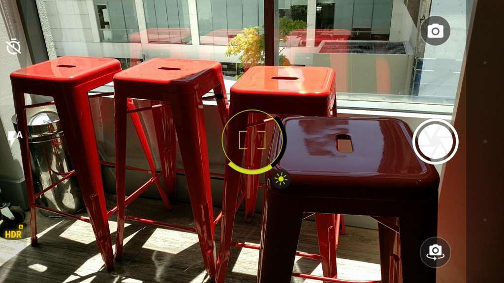
Motorola’s software is where things get a little trippy, and we use that term specifically because it’s easy — too easy — to trip the camera up and get it to fire a blurry shot instead of a sharp in-focus one.
Whether the laser autofocus is struggling to work with lines and shapes or the software just hasn’t been optimised properly we’re not sure, but we have found these issues in random places, such as on a sunny street where it should have been easy to acquire focus, and yet produced blur, and accidental blur at that.
When we tried to recreate the problem, it was fairly easy, giving us a clue that perhaps Moto’s software needs to be better optimised to handle light.
You can get sharp photos without trying on the Moto Z, however. That’s a point we need stress, and it’s not like you’re going to end up with blurrycam for every photo, it’s just that it’s also very easy to watch the camera fire off a miss, so make sure to watch the screen and not take photos haphazardly.

Battery
In the battery department, Motorola’s Z responds like most phones, but doesn’t nail the top-end like others.
Tested throughout the course of a week, you’ll find pretty much a day of life without fail, but only a work day, not a full 24 hours day.
Off the charge at 7am and on before midnight seemed to be the general go here, and that was consistent every night, with the 2600mAh only good enough for that work day.
Fortunately, there are ways you can improve it, though you may have to spend a little bit of money.
The Z Factor: Mods
Easily the biggest feature of the phone is that of the “Moto Mods”, additions that take the humble smartphone and turn it into other things.
Want your phone to be a camera with zoom? How about a proper speaker so you don’t have to carry around a Bluetooth speaker? What about a projector, so you can watch movies while you’re out, projecting them onto a wall?
Moto Mods make it possible thanks to a degree of modularity, with the Moto Z (and its sibling the Moto Z Play) sporting a set of metal contacts on the back that allows the phone to talk to peripherals, effectively turning the phone into something else.
Each of these is an optional cost (of course), but can change phone into something else.
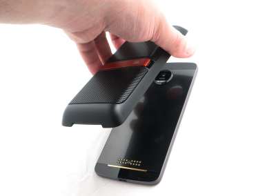
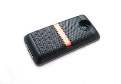
For instance, JBL’s SoundBoost plugs into the back with ease, the metal contact talking to the back and held in place with a magnet to turn the phone into a stand-up speaker with a battery included, charging the phone while you blare sound out, something you can even do upright thanks to a kickstand built into the body.
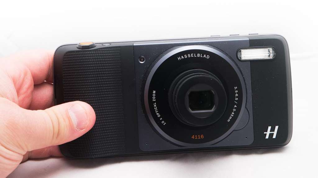
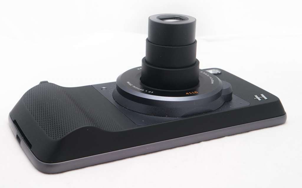
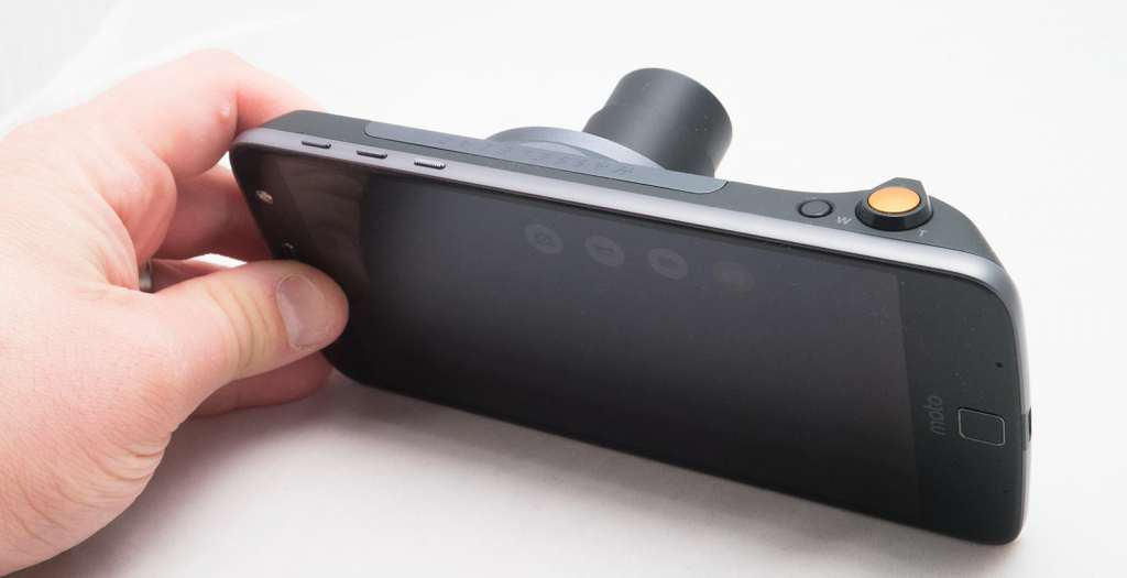
If you feel like you need a little more zoom than the no-zoom that the in-built camera has to offer, the Hasselblad-branded “True Zoom” camera technically delivers 10x zoom on a 12 megapixel sensor and a degree more control, allowing you to get up, close, and personal, and a fair bit more than pretty much any other currently available smartphone camera (except for that of the relatively old Samsung S4 Zoom and K Zoom cameraphones, which handled the exact same range.
While Hasselblad’s camera is a cool concept, it’s a Blad only by name, not by quality, with a relatively slow shutter speed to fire off those images, and a quality that doesn’t exactly chime with what Hasselblad normally suggests.
What makes the True Zoom truly useful is that you don’t really need a compact when you have this, allowing you to get a little closer than the phone normally would get.
Sure, it’s not mind blowing quality, but for $300, you can skip the camera altogether.

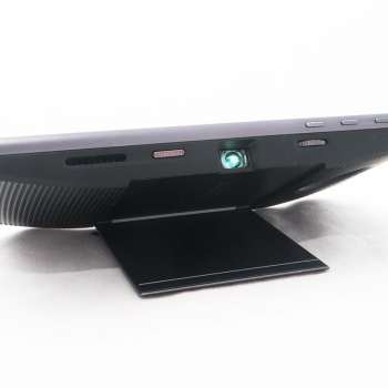
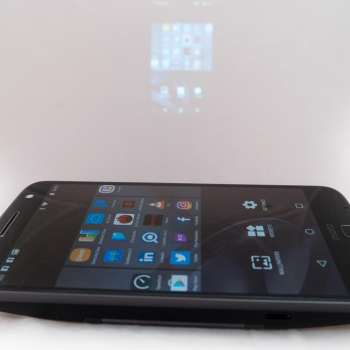
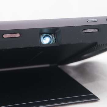
The one accessory that actually made us believe in the power of the Moto Mods concept was Motorola’s pico projector, which snaps onto the back using the pin connectors and allows you to transfer whatever is on the screen of the Moto Z to a projection.
You’ll want to turn the lights down low for this one, but all up, it’s a relatively impressive experience, simply because in the space of 15 seconds, you can turn an otherwise slim phone — one of the world’s slimmest, no less — into a projector, just like that.
It’s almost magic. Almost.
What needs work
As good as the Moto Z is, we can’t help but feel this would be better in a second generation, and we seriously hope there is a second generation.
It’s worth noting that the Moto Z isn’t even the first modular phone this year, with LG trying a different type of modular design in the G5, though it has already discontinued the concept, which we’d bet won’t sit too well with the G5 owners who spent on LG’s “Friends” modular peripherals this year.
At its launch, Motorola said that it was already working on the next generation of this technology, so that should provide some level of comfort to Moto Z owners for this year, but you have to wonder if it will keep the same form-factor.
In fact, the more we used the Moto Z modular design, the more we liked it, with unseen magnets snapping the accessories into place with ease, but we couldn’t help but feel the whole thing would have been executed a little better if Moto Mods didn’t need the massive amount contacts on the back and could work on some easier principle, namely one that works through the magnets themselves.
What if the back was flat and magnetic, and the two elements worked near each other, operating via something like Bluetooth, making it an easier phone to carry because you never had to take off the wood or plastic cover on the back.
That cover makes the phone feel like a phone, but it can become a bit of a pain to keep removing it, storing it in a front pocket or on a desk when you’re not using it.
That’s only an issue if you use the back, because if you keep the phone backless you’re officially carrying the thinnest phone in the world as well as not having to deal with this issue, though it does manage to feel strange in the hand when there’s no back.
You may also find the lack of a 3.5mm headset jack a little disconcerting, though a USB Type C to 3.5mm converter is included in the box and if you’re using Bluetooth headphones, you’re set.
Really, what it feels it needs is some of that top-end goodness we’ve seen this year, because while the mods concept is good, we’d love a bit of water-resistance, and if you don’t use the mods, you basically just have a good thin phone that can’t nail a full 24 hours of battery life.
That’s the biggest dilemma with the Moto Z, because if you don’t use the mods, the phone is good, but not amazing. It really is at its best when you buy accessories to use with it, like the projector or the speaker or the battery pack or the camera.
Without these and it’s just another phone. A good phone, sure, but until you buy the extra bits, not one of the best.
Final Thoughts (TLDR)
There’s a lot to like about Moto’s thinphone, the Z with its remarkably curious concept of taking convergence to the next level.
While we all wait for Google’s Project Ara to start and then consequently finish early, dabbling in the idea of mobile modularity before the project was stalled and killed so no consumer could try it out, Motorola has actually figured out how modular designs could work in a way that isn’t super inconvenient, not like LG’s awkward and now shuttered G5 from earlier in the year.
Tough news for those customers because there’ll be no more “Friends of LG” phone mods, we’ve heard, though Motorola has at least hinted to Pickr in the past that it is working on several iterations of where the Mods go next, which is at least good news for customers of the Z series of devices.
That means if you own the Moto Z, you have a future, and one that could be very exciting, bringing convergence to a whole new level.
But you have to buy the Mods to make this happen, otherwise what you own is just a phone. A thin phone, yes, but a phone.
With the Mods, Moto’s Z is fascinating, and a brilliant look at what phones can be when companies think outside the box. Without the Mods, and it’s just another phone.
That is, in essence, your choice: use any of the Mods and the phone is brilliant, don’t and it’s just ok. If you have a need for the convergence options of this phone, you’ll have not just something interesting, but a talking point for you and your friends, as it was with us.
Curiously recommended.


