Quick review
The good
The not-so-good
Not everyone needs a smartwatch, but if you’re interested in one, there’s a good chance you’ve considered the Moto 360. Designed in the circular style that has forever been recognised as a wrist watch, it takes the analogue and makes it digital once more.
Forget about the square or rectangular form, because this one isn’t interested in angles, or many of them, and now a new model is changing a few things, with the 2016 update leaving what Motorola got right and updating what it might have, well, not.
That means you’ll find a new design supporting easily replaceable bands, a new set of innards to pull the watch more in line with what other smartwatch makers are doing, and even a few more watch faces, because you shouldn’t be locked down to a bare minimum.
Google’s Android Wear is still the operating system of choice, and it will send notifications to the watch that your phone would normally receive, allowing your wrist to be a semi-permanent vibrating fixture in your life, and at least granting you a bit of joy since you don’t have to check your handset every ten seconds to see, that, you didn’t, get, a call, or email, from someone. Yay.
There’s a little more here in the 2016 Moto 360, an update that we’re glad Motorola has done, because sometimes it’s nice to see a slight refresh, especially when we’re close to two years into a product’s lifecycle.
But as per this writer’s style, this is a long one, folks, so if you need the quick summary, jump down to the final thoughts, which is our “too long, didn’t read” analysis.
(Hint: It’s a good smartwatch, though it’s about on par with every other smartwatch, and that’s partly thanks to the maturity of Android Wear).
Specs
The next smartwatch could be a device you wear on your wrist, brandishing it around not just to show the time, but because a family member sent you a note worth sharing or you’re keen to thumbs up a song that the home stereo system is playing.
More than just another gadget you buy for the hell of it, the smartwatch has already become something more, with the device no longer just being responsible for the time, but for a host of notifications also, as these gadgets do more than the basics.
There are certainly quite a few of these gadgets out in the world today, and while the Apple Watch may have the notoriety, the numbers of different models are definitely on the side of Android which sees products from a variety of vendors.
One of the first providers was that of Motorola, which has only offered one type since it launched back in 2014. Two years later and with a new owner to the company, Motorola is back, and alongside owner Lenovo is building a slightly updated smartwatch for a today expecting something newer and better.
While it’s quite clear the aesthetics would have changed, the guts are what interests the specs section, and so that’s where we’re working here.
Wireless is also supported with 802.11b/g WiFi, which should offer an alternative way of keeping the watch online if your phone isn’t nearby.
Corning’s Gorilla Glass protects the screen providing a certain level of scratch resistance, while water-proofing is there in some way thanks to an ingress protection (IP) rating of 67, which means it’s dust-proof and water-resistant down to a maximum of 1 metre, making it fine for the shower but not really for swimming.
That screen, by the way, also comes in two size variants, and these change the screen resolution marginally, with a 42mm model for men and women providing a 1.37 inch screen with 360×325 resolution offering 263 pixels per inch, while the larger 46mm model provide a 360×330 resolution on a 1.56 inch screen with 233 pixels per inch.
If that’s merely a set of numbers and a dumbfounded look, know that we’re not exactly talking Retina resolutions here and you may spot a pixel or two as you’re looking at the watch.
Regardless of which size you go for, however, you still get the same sized battery, with a 300mAh cell under the screen.
Design
While the specs might have changed from the previous model, the design has not, with a couple of refinements here and there, and some knowledge that might have been gleaned from at least one other smartwatch release in the year since the first 360 arrived.
That knowledge is quite specific and relates to sizing choices, because while the original 360 came in one size, the Moto 360 for 2016 will arrive in two, with a large 46mm model with a leather strap, while a smaller 42mm model will be made available with a metal strap.
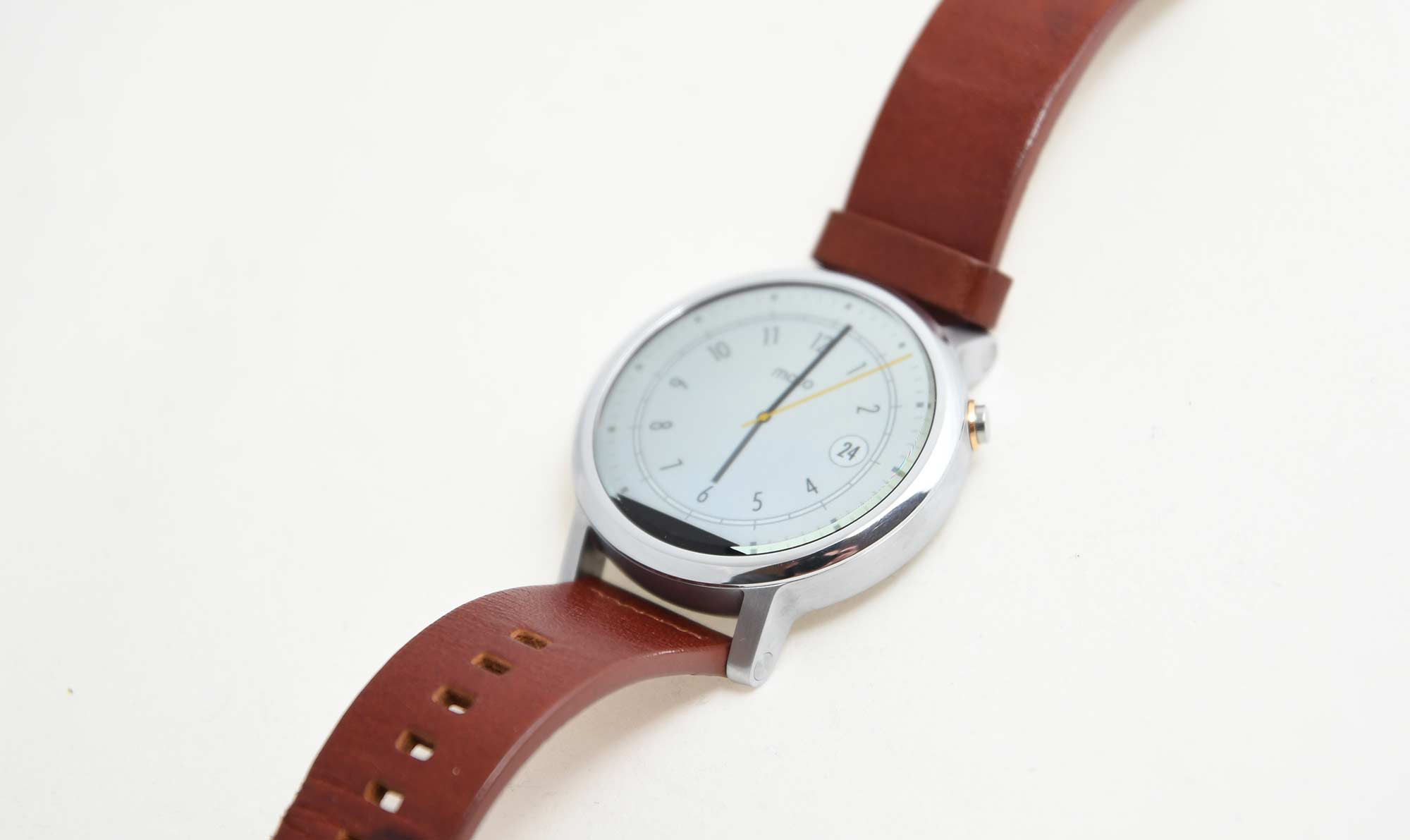
A size change isn’t all that’s new, with a couple of design tweaks that help make the new Moto 360 look more like a watch, complete with a design that holds the watchbands in place much like you see on regular watches.
That means you can pretty much replace the Motorola 360 band with anything you find, provided the strap matches the size of the version you go for. It’s not as seamless a change as the magnetic holders used by either the Apple Watch or the Samsung Gear S2, but more like a real watch, with a pin slider on the underside of the watchband that you can maneouver out with a teensy bit of prying (in truth, getting them out is easy, but getting them back in requires a little effort).
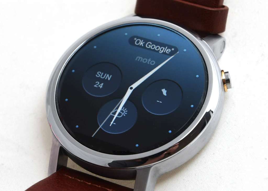
Outside of this, though, it’s still the same basic idea, with a virtually rimless design holding in a circular screen, with a relatively thick metal body.
The button on the side has changed, though, and now feels more like a button and less like the crown on a watch. It’s still metal, though, so it’s nice to see the attention to premium aesthetics hasn’t changed.
Performance

That’s not a huge shock given the specs working under the hood, but it’s still nice to see all the same.
In fact, perhaps the best change to performance hasn’t come from a better set of internals, but from Android Wear itself, and the very fact that it has grown since its initial launch in 2014.
A growing time of around two years has made Android Wear into more than just a basic notification system for apps, with support for actual apps made for the operating system. You can stick fitness apps like Up onto the platform, add custom launchers to change the way these apps are launched, and even throw in an assortment of watch-faces not supplies by the smartwatch manufacturer, something Apple still has yet to allow on its variation on the platform.
And the new Moto 360 offers some fairly solid performance regardless of what you’re running, and that’s thanks to a fairly tried and trusted set of system specifications that have appeared on quite a few other Android Wear smartwatches.
It’s not that the previous Moto 360 with a TI chip was bad, but the Qualcomm Snapdragon powered variation is better, and out the gate, it’s a fairly seamless smartwatch experience, much like any other models we’ve seen.
Battery
Motorola had one major job with the 2016 edition of the 360 watch, and that was to increase battery life. Unfortunately, the first 360 reached a dismal one day of life, and that was if you were over the gimmick of having a circular screen on your wrist.
If you received notifications like the popular person that you were and constantly swiped up to see what was going on, you may not have even hit the full day of life. The first generation Moto 360 was just charming that way.
It was like you were wearing a piece of the future, but it also happened to be a time machine, and the sort that removed time rather than let you explore it.
This year, the hope was that you’d be able to pull more life out of the watch… and the good news is that you can.
The popular people will see a full day of life without fail, while those of you over the whole gimmick of a smartwatch will see closer to two, which is what we found in our weeks with the watch.
That puts it on par with what the LG G Watch R was going, which isn’t a huge surprise given what’s working under the hood.
What needs work
On the surface, it might be quite difficult to see what has changed, and in fairness to Motorola, the bulk of the 2016 360 follows the philosophy of “if it ain’t broke, don’t fix” which is quite fine.
Really, it’s about tightening up what worked while replacing what didn’t.
The problem with this, however, is that it might not be enough to stick with Motorola, especially when the hardware isn’t so different from competing offerings. Under the hood, Moto’s new 360 is exactly the same as the LG G Watch R and Urbane, while also being identical to the Huawei Watch, Watch Jewel, and Watch Elegant.
And that’s just the circular watches, because both the softened square watches from Asus — the ZenWatch and ZenWatch 2 — feature the same innards.
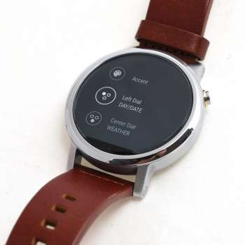
Really, you’re talking about buying the new Moto 360 because of how it looks, and that might not be enough.
If perhaps we had seen a new processor — properly new, not almost two years old and purporting to be “new” — and a battery life capable of hitting past two days, we might be looking at a very new watch.
Instead we just have a new variant of the Moto 360 from when Android Wear first materialised, and that may not be as big a deal as Motorola believes.
Indeed, there’s even the flat tyre part of the design, meaning you don’t get the full circle, only a mostly circle, like a circle that has suddenly realised that instead of rolling, it would be easier to cut its feet off so it could stand there like every other shape.
Not a big deal, especially since it’s where Motorola stores the sensors, but it’s still something you can complain about.
Our other quibble is one in relation to quality, because with Motorola going to the trouble to include world-renowned leather from Horween and glass protection from Corning, you have to hope for good things, with a strap that won’t feel cheap and a watch that doesn’t give off the impression that it would break all too easily.
Unfortunately, after several weeks with the Moto 360, we can tell you that it might still need some time in the durability testing department of Lenovo’s Motorola department, giving off the exact opposite set of impressions altogether.
The Gorilla Glass protected screen that saves your watch from getting scratched in all the wrong ways? We found a scratch and we’re not even sure how it managed that. We certainly never dropped the watch or smashed it into anything, and yet there is one that we’re unhappy with.
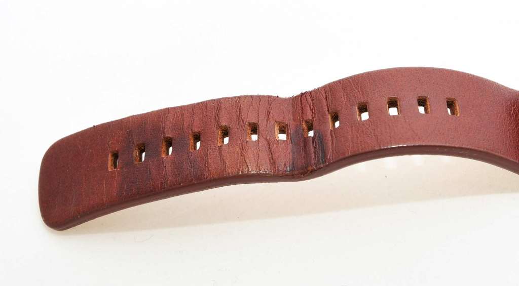
That lovely Horween leather? After three weeks we noticed it was buckling, a sign that the strap would wear in all the wrong ways where the tightening holes were. This was a complaint we had with LG G Watch R, and Motorola has followed in the same footsteps.
And sure, it can talk up the quality of leather, but the point is that if the strap looks like it’s going to break, it probably won’t last as long or look as professional and schmick as Motorola believes.
Value
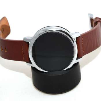
Simply put, the smartwatch world is definitely way more lucrative since Apple decided to step in, because while the $329 price tag of the original Moto 360 wasn’t too expensive, it is still markedly less expensive than this new model, close to the tune of $150.
Yes, the new Moto 360 — which shares the same internals as other smartwatches out on the market today — fetches a recommended retail price of $479, which makes it about on par with Apple’s Watch, but still very costly in comparison to even the previous variant Motorola offered.
That’s a good hundred or so more than LG’s G Watch R which is basically a less stylish (this writer’s opinion) version of the 360, but also a hundred less than the heavier Huawei Watch, making this middle ground for the circular Android watches, though still hard to swallow as it is.
As a result of this, we’re not sure a value target is really reached here, but given it faces off against the Apple Watch, we can see what Motorola is getting at. (Sort of, because it’s still a little too pricey in our opinion).
Final Thoughts (TLDR)
It may not be a total update, departure, or evolution of the smartwatch, but Motorola’s second-generation 360 watch in many ways tightens the good thing that Motorola had working for it the first time around, and that makes it into a better thing.
Owners of the previous generation may not see it as a solid upgrade, but anyone looking for a surprisingly simple yet still watch-like smartwatch will be at home here, and until we have better battery life overall, it’s more of the same, albeit a slightly more fashionable version of that.
