Quick review
The good
The not-so-good
Apple’s regular-sized premium phone delivers so much, with the iPhone 14 Pro being a stand-out star. It’s almost perfect, save for a handful of things. Is it your next phone?
Several generations into the iPhone, it can be difficult to remember where we came from. The iPhone launched a good 15 years ago back in 2007, and it has seen many, many variations. They’ve had buttons, smaller screens, and things that have even gone away — recessed earphone jack, we’re looking at you — but they have always, always been premium.
In recent years, the “pro” model has been the most premium of the bunch, and has where all the really exciting cool technology has gone. Sure, it might trickle down to all of the models later on, but if you wanted to be ahead of the curve, the Pro is where you wanted to be. The Pro is where it would be at.
Last year, the Pro offered a super fast ProMotion screen and some impressive cameras that also worked in low-light, and this year, Apple may have just turned it up a notch.
While 15 years is a long time for phone development, the latest Pro iPhone model shows that premium is still where Apple does tremendous work, and if you don’t mind spending up big, you could get something truly tremendous.
Design
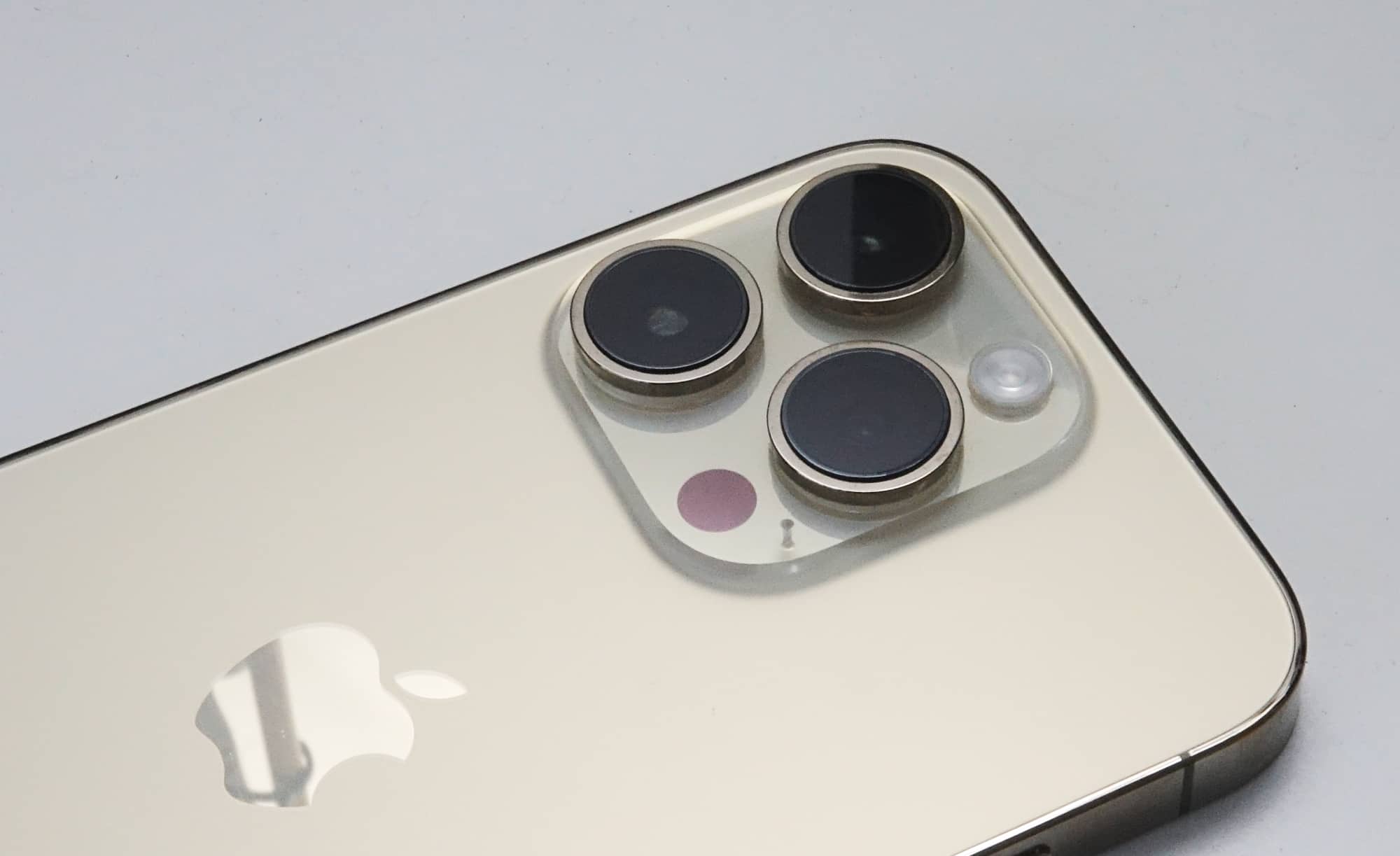
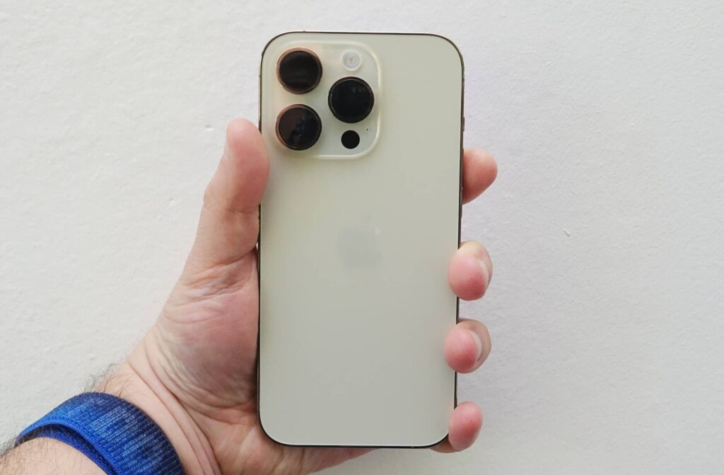
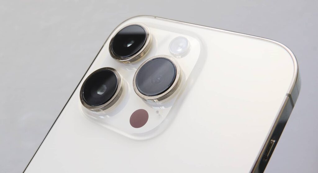
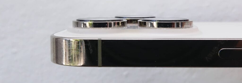
With a design that evolves the already excellent designs of the iPhone 12 Pro and iPhone 13 Pro before it, the iPhone 14 Pro borrows the stainless steel frame of the previous models, the strengthened glass on the front and back, and the three cameras in a slightly raised configuration.
We learned when trying to match old cases to the new phone that these designs don’t line up perfectly, but they’re pretty close. That’s thanks in part to a slightly different thickness and camera size, with the new phone being marginally bigger on both counts.
Design-wise, though, the iPhone 14 Pro looks as good as the iPhone 13 Pro before it, minus the lovely blue shade which has been replaced with a purple one.
Features
Inside Australian iPhone models, you can expect to find Apple’s latest processor, the A16 Bionic, which comes with a 6-core CPU, a 5-core GPU (graphics and games and such), and a 16-core Neural Engine for the all the machine learning love you might have apps throw its way.
That chip is specifically new to the “pro” iPhones in 2022, and it’s not alone.
Apple has updated the camera system in the pro line-up, with a newly developer 48 megapixel main camera sporting an F1.78 aperture and sensor-shift optical image stabilisation, sitting alongside two other 12 megapixel cameras, one handling ultra-wide at F2.2 while other does 3X telephoto at F2.8. There’s also a new flash along for the ride, as well as a heap of features helped along by the chip and software, though more on that in the camera section of this review later.
The front-facing camera is also new, though you mightn’t realise it. The 12 megapixel size is still the same, but the camera now supports autofocus, so you can focus on your face a little better instead of being forced to move the phone back and forth to compensate.
Outside of this, much of the iPhone 14 Pro will look the same both inside and outside.
You’ll find support for Sub-6 5G in Australia, with backwards compatibility for 3G and 4G, as well, while closer to home, there’s support for Bluetooth 5.3, WiFi 6 (802.11ax), Near-Field Communication (NFC), and Ultra Wideband, the technology used on the AirTag. GPS still makes an appearance, and interestingly, it’s similar to what’s used on the Apple Watch Ultra, with dual-frequency precision GPS. It even includes the crash detection tech from the watches, as well.
Wired connections are few and far between, though, with only the one Lightning port at the bottom. Meanwhile, the sides are still decorated with buttons, the left supporting volume up and down plus the ring silencer, while the right offers the power button.
There’s support for wired charging over that Lightning port, wireless charging through Qi charging pads, and of course MagSafe charging if you have a MagSafe charger, which can get you up to 15W of fast-charging compared to the 7.5W available through regular Qi wireless charging pads.
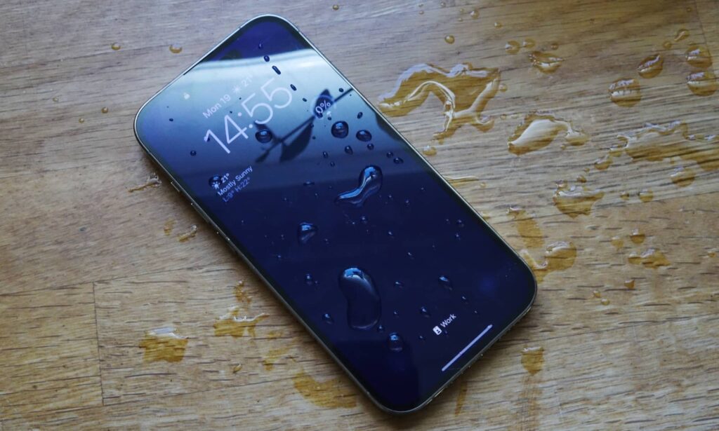
It all comes in an IP68 water resistant body made of glass and stainless steel, and featuring a new 6.1 inch screen.
Display
Switch the iPhone 14 Pro on and that new display is the first thing you’ll see.
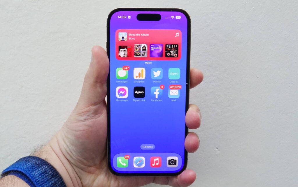
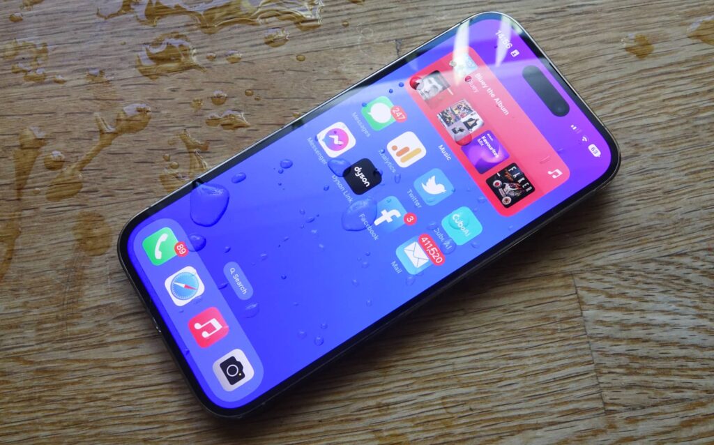
Yes, it’s a new screen, evident by the pill cut-out being very different from the notch we’ve seen on iPhones since the iPhone X back in 2017. That new style may also play havoc with old screen protectors, so consider your choices carefully.
It’s a good lock, one that makes the even feel more expansive and futuristic, because now the screen is closer to going edge to edge, and doesn’t have this notch sitting in the way up top.
However, the new pill cutout screen is only one part of what makes the 6.1 inch 2556×1179 OLED display of the iPhone 14 Pro new. There’s also an updated ProMotion screen that can operate as fast as 120Hz for super slick scrolling and animation times, and drop as low as 1Hz for an Always-On Display.
In-use
While the screen has changed, using the 2022 iPhone 14 Pro is exactly like using the 2021 iPhone 13 Pro and the 2022 iPhone 12 Pro before it.
With the screen being largely an all-screen design, minus the slim bezels, there are no obvious buttons except on the side for power and volume, plus the silence switch. As such, using the phone is your regular combination of gestures, with Apple’s Face ID letting you log in, which now does a better job with masks thanks to an update earlier this year, handy if you still wear one. Thanks coronavirus.
There are also a couple of minor differences in how you use the iPhone 14 Pro over time that are new to the iPhone package, though, and they’re thanks to that new screen.
Dynamic Island is the new punch-hole
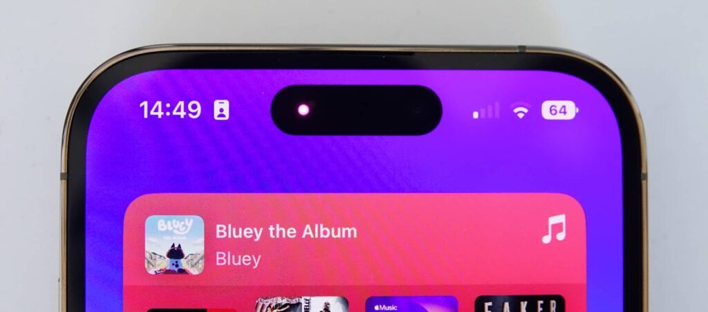
One is the Dynamic Island up top, Apple’s take on the punch-hole camera design that really goes above and beyond the punch-hole design we’ve seen on many an Android previously.
If you’ve seen any Android phone for the past two years, the camera has been found in a single hole either dead centre up top or in one of the top corners. Sometimes it’s two cameras, but typically it’s one circular hole, almost like a punch hole. And that’s what it is on Android, a black hole punched through the top of the screen, stuck there regardless of what you do.
In the iPhone 14 Pro, Apple has crafted something similar, but then made it a part of the interactivity of the phone. This isn’t just a punch-hole, but a part of the user interface, as Apple thinks about the whole user interface and user experience to make the punch-hole a part of what you do.
You can see the physical cut-out on the screen as a pill, which is where the camera and True Depth Face ID tech sits. Easy, right?
Apple has also created an animation system around that pill cut-out that will expand and contract, basically always keeping the pill on-screen, but making it a part of the user experience. Called the “Dynamic Island”, it’s a neat bit of design that comes together to make a part of the hardware design seem like it should be there, rather than just a dot you need to convince yourself doesn’t matter.
And it pops up quite a bit.
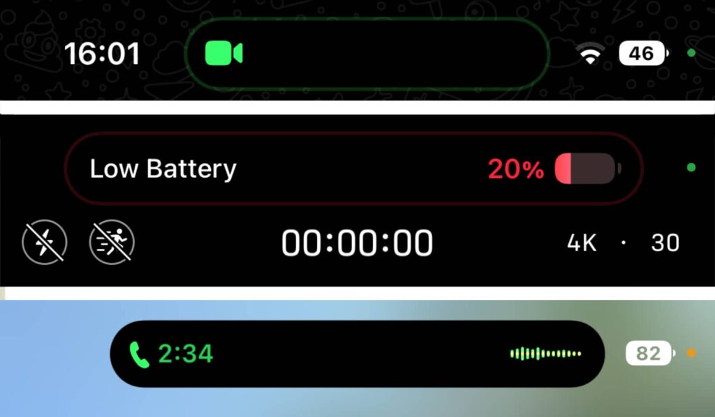
While the Dynamic Island is largely just a pill cut-out most of the time, when you’re on a FaceTime call, a dot will light up next to the camera to point you where to look.
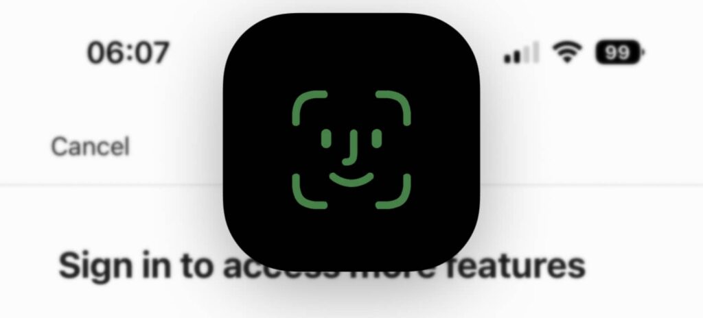
If you switch out of a call and go back to the Home Screen, the island will expand to show a bar waveform of your call, expanding to a greater width as a sign that you’re in the call. Logging into websites will turn the Dynamic Island into a square to remind you where to look for Face ID, and switching out of YouTube will show a small preview of the video you’re watching in an extended version of the Island.
You might think of the Dynamic Island as smart and snazzy marketing fluff to disguise the front-facing camera, but it works. It works better than it should. And weirdly, I like it.
Is it weird that I like the Dynamic Island more than I expected I would?
It all leads you to believe that Apple’s Dynamic Island needs to be there, that it should have been there from the very first moment. That Apple doesn’t need to go down the route of the under-screen camera we saw in the Galaxy Z Fold 3, because Apple has found a way to make the camera inside the screen a part of everything you do.
Apple’s approach to always-on display will set the trend
The other feature new to the iPhone Pro package is an always-on display (AOD), and it is vastly different from the AOD options of Androids before it.
Previously, an always-on display was a limited set of text — typically a clock and weather — plus any notifications you might have sitting atop a black screen. It was as if the off screen on your phone had a little imprint on it that always kept you aware of the time, weather, and notifications.
In Apple’s approach to the always-on display, it’s a mirror image of your standby screen, complete with the image you’re running. That can change dependent on your choices and focus mode, also features that are new to iOS 16, but it will stay like that on your screen even on standby.
To do this, the iPhone 14 Pro drops its ProMotion variable refresh rate down from the slick 120Hz speed to 1Hz, which means the refresh rate is so slow, it’s refreshing one time per second, compared to the 120 per second at 120Hz and the 60 times for 60Hz at other times. Operating at a much, much slower refresh rate for the always-on display means an iPhone’s always-on display can look like your regular screen if you want, with a very slight cost to the battery life.
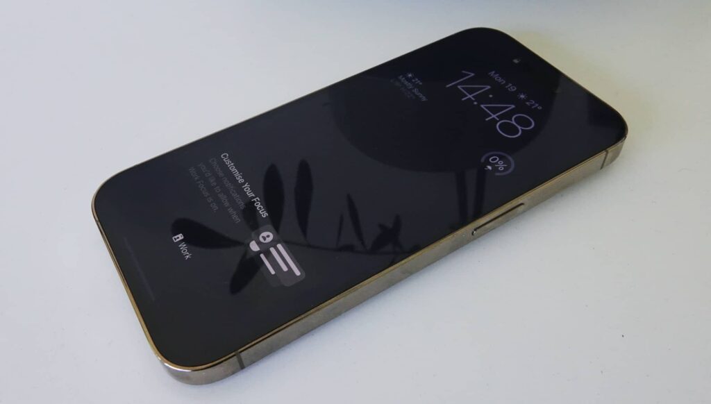
The result is an effect which can look great, because your screen is never off. You get the time, a picture, and some notifications. Importantly, you can tell with a mere glance whether your phone needs to be picked up and checked without having to don a wearable of some kind. It’s handy, though it needs some tweaks.
Apple’s always-on display is very much a version one feature, and needs support for more apps or custom screens. It would be great if you could change positions and really customise it, rather than simply having an on and off switch for the AOD. But it’s a start, and it’s a great one, doing something we’ve never seen on any other phone before.
Performance
Armed with the new A16 Bionic chip, the system just flies.
You don’t really need to think about the system spec in any iPhone, but the combination of memory and chip capability make the 14 Pro a force to be reckoned with.
Comparing it against the previous iPhone Pro models, and it's pretty clear this is the best iPhone chip yet. Though that's something you could have guessed.
However, it's not just fast against other iPhones, either. The iPhone 14 Pro is also fast against some of the best and brightest from Android.
Comparisons aren't always entirely accurate in benchmarks alone, but testing CPU speed and graphical performance against the likes of Samsung's Galaxy S22 Ultra, the current Google benchmark that is the Pixel 6 Pro, and even the fast gaming phone that is the Asus ROG Phone 6 Pro shows Apple out in front.
Granted, the year's not entirely over and the comparison between graphical benchmarks always gets murky when comparing the Metal graphics tests used for iOS and OpenCL/Vulkan on Android, but it's still very interesting all the same.
In the world of 5G, you'll also find some very speedy performance on offer, network dependent, of course.
Tested on the Telstra 5G network in Sydney, Australia, we found speeds on the iPhone 14 ranging between 80 and 350Mbps, though if you're closer to a strong antenna with greater reception, you should see speeds over the 1Gbps mark at times. It'll vary, of course, but there's strong 5G performance here.
Camera
It's not only the raw performance inside the body; there's also a new camera, though you might not realise it looking at it. The three cameras on the back look just like they did on the previous models, even on the iPhone 11 Pro Max before it. Three cameras have been fairly normal for Apple's high-end iPhone models for several years now.
Where the iPhone 14 Pro is different is in the sensor size, opting for a 48 megapixel main wide camera that downsamples to 12 megapixel, plus an ultra-wide 12 megapixel with macro support and a 12 megapixel 3X telephoto, too. And there's even what the chip is doing to help propel those cameras, driving performance and processing.
In short, the iPhone 14 Pro camera package is more or less the excellent camera system from the iPhone 13 Pro, but with four times the pixels in a bigger main sensor, more guts processing the pictures, and more capability in the video mode, too.
While the obvious point is that you get a higher quality image due to the downscaling of the image -- something plenty of players have been doing for years -- Apple has also brought back the 2X mode between the 1X and 3X telephoto choices, zooming by cropping in on the 48 megapixel sensor for what would equal 2X. It's a concept that isn't totally new -- Nokia did this years ago -- though it feels like Apple's approach just works better. Much better.
Versatility is the name of the game, with a 1X wide, 2X middle length, and 3X close mode for portraiture, while the 0.5X, 1X, 2X, and 3X offer different lengths for regular stills. It's almost like you're being offered a 13mm, 24mm, 48mm, and 77mm lens kit to work with in the one phone, and it really does deliver options with solid results.
The last three are interesting, because it's like being given a 24mm, 50mm, and 85mm lens setup for portraits, given all three work there with the background focus controls and F-stop emulation.
As such, portraits look excellent, with depth control still very much a part of the package, while regular images are crisp, sharp, and offer plenty of colour day or night.
In fact, when the lights go out, the low-light image stacking delivers solid results that look lovely, and while you'll almost always get a 12 megapixel image, Apple also offers the flexibility of the full 48 megapixels if you're happy to capture in RAW.
Professional photographers are still very likely going to lean on a DSLR or mirrorless body, but the iPhone 14 Pro shows that versatility and quality can exist on a device you keep in your pocket.
It is just so impressive how versatile the cameras on this phone are.
The chip is also helping that along, processing images as part of something Apple calls the "Photonic Engine", which is basically a combination of all the processing steps needed to make your images pop. Deep Fusion, HDR, image stacking, brightness, contrast, sharpness, tone mapping and so on and so on, with all of it coming from that bigger 48 megapixel sensor and running trillions of processes per second.
It all adds up and it helps you produce some of the most stunning images from a phone to date.
Video also keeps up the feature set, because you'll not only find the support for Dolby HDR which just absolutely shines, but also an improved cinematic mode which offers more resolution for what is ostensibly the portrait mode in video. That's one of those very cool features we've grown to love that first popped up last year, and now works even better, which is great to see.
There's also an action mode for stabilising the camera, which you can trigger with an on-screen button. It's easy to do and does the job of an automatic gimbal, but it's only really useful in daylight, struggling indoors when the light is down compared to the sun of a crisp day. We guess you're meant to use it outdoors given the "action" it's built for, but it very much feels like a version one that will improve over time.
That minor quirk doesn't damper the camera experience on the iPhone 14 Pro at all, though. All up, it is a very impressive camera combination for any phone, not just an iPhone.
Even the selfie mode stand out, which now offers autofocus on the front-facing camera, giving you just that little bit more future-proofing from the optics tech.
It's rather obvious that the latest camera on the latest iPhone Pro will end up being the best iPhone camera yet. That doesn't need to be said. This goes beyond that statement.
This is one of the best camera systems on any phone you can find, period.
Battery
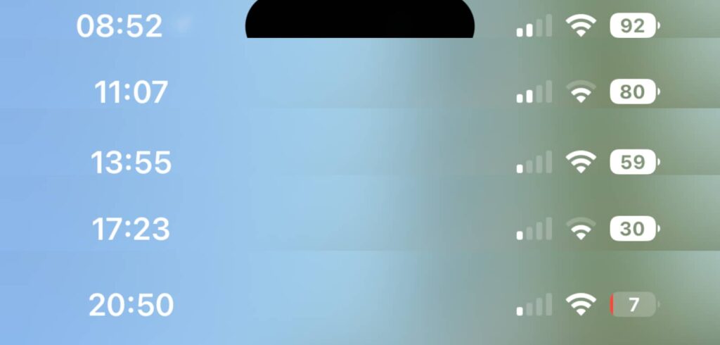
While the camera is excellent and incredibly versatile, the battery is anything but. Rather, the iPhone 14 Pro needs to be charged nightly, not quite making a full day.
We found 18 to 20 hours was more or less the maximum you could get on the iPhone 14 Pro for regular use with always-on display left on, though cut back on screen use significantly and you might see a little more. We found around 4.5 hours of screen time just about killed the iPhone 14 Pro battery, so if you want to reach the end of the day, try not to go over three or four.
Overall, it's not super compelling in terms of battery life, with this being the one area that really lets down the overall package. It hasn't changed dramatically from last year's Pro model, but if you're genuinely thinking of buying an iPhone 14 Pro and need better battery life, you may want to consider the bigger model simply because it comes with a bigger battery.
Value
The price is also a serious consideration, as the iPhone 14 Pro is not an inexpensive phone.
Priced from $1749 in Australia, the iPhone 14 Pro is an expensive mobile locally, with that price getting you the 128GB entry model.
You can add more dollar bucks to get more storage, with the 256GB iPhone 14 Pro costing $1899, 512GB for $2249, and the whopping 1TB model fetching $2599 in Australia at the time of publishing.
That's not a cheap phone, but it is also a very good phone, with Apple more or less bringing the best tech of any phone to one place, except for maybe the battery life, which could be better.
What needs work?
The battery life may end up being the only major problem outside of the price, because it's not stunning.
We couldn't hit 24 hours in any of our days with the iPhone 14 Pro, and it needed a nightly charge. Turning off the always on display could give you a little bit more, but by and large, the Pro 14 churns through battery life rather frustratingly.
There's another factor worth noting: there's no USB Type C. This isn't a huge issue, just one with noting, especially since the EU is expecting every device manufacturer to switch to USB Type C for charging by the year 2024.
Apple already includes Type C charging on many of its devices, ranging from the MacBook Air to iPad Mini to iPad Pro and others, but in the case of the iPhone 14 Pro, it's still a Lightning device. It's not a major issue yet, and Lightning will continue to be useful and usable for years past the Type C 2024 deadline, but it's just one of those things we'd like to see.
We're guessing the short turnaround between the June EU announcement and the launch of the new iPhones a few months later in September was too short for Apple to rebuild with Type C instead of Lightning, but it's worth noting all the same. Maybe next year, Apple. Maybe next year.
Final thoughts (TLDR)
One of Australia's priciest phones in 2022 is also easily one of the best, as Apple genuinely provides a tour de force. The iPhone 14 Pro is a triumph, and it will deliver for most owners.
The battery life could be better, but everything else about this handset oozes premium. It's distinct from the approach to technology other manufacturers may take, whereby you might get the swankiest new foldable technology with less impressive cameras such as in Samsung's Fold 4.
While we don't think it's an upgrade path for everyone, there is a lot to love here. If you own an iPhone 12 or iPhone 13, the upgrades may not be truly significant, but if you own anything older, we can see the logic and reasoning.
The iPhone 14 Pro is one of the best phones of the year and one of the best to date. If you can live with a nightly charge and love the more regular 6.1 inch phone size, the iPhone 14 Pro is a phone that will live your day to day and plenty more. Recommended.
