Quick review
The good
The not-so-good
HTC hasn’t quite had the flagship race in its hand for a while, and after trying the metal phones for a few years, now it’s time to tackle something else.
So forget about the metal curved back designs of the One M7, M8, M9, and HTC 10 (M10), because it’s time to push on to something different.
Is the U Ultra different enough to compel itself to your wallet, and can it live up to HTC’s otherwise excellent expectations?
Design
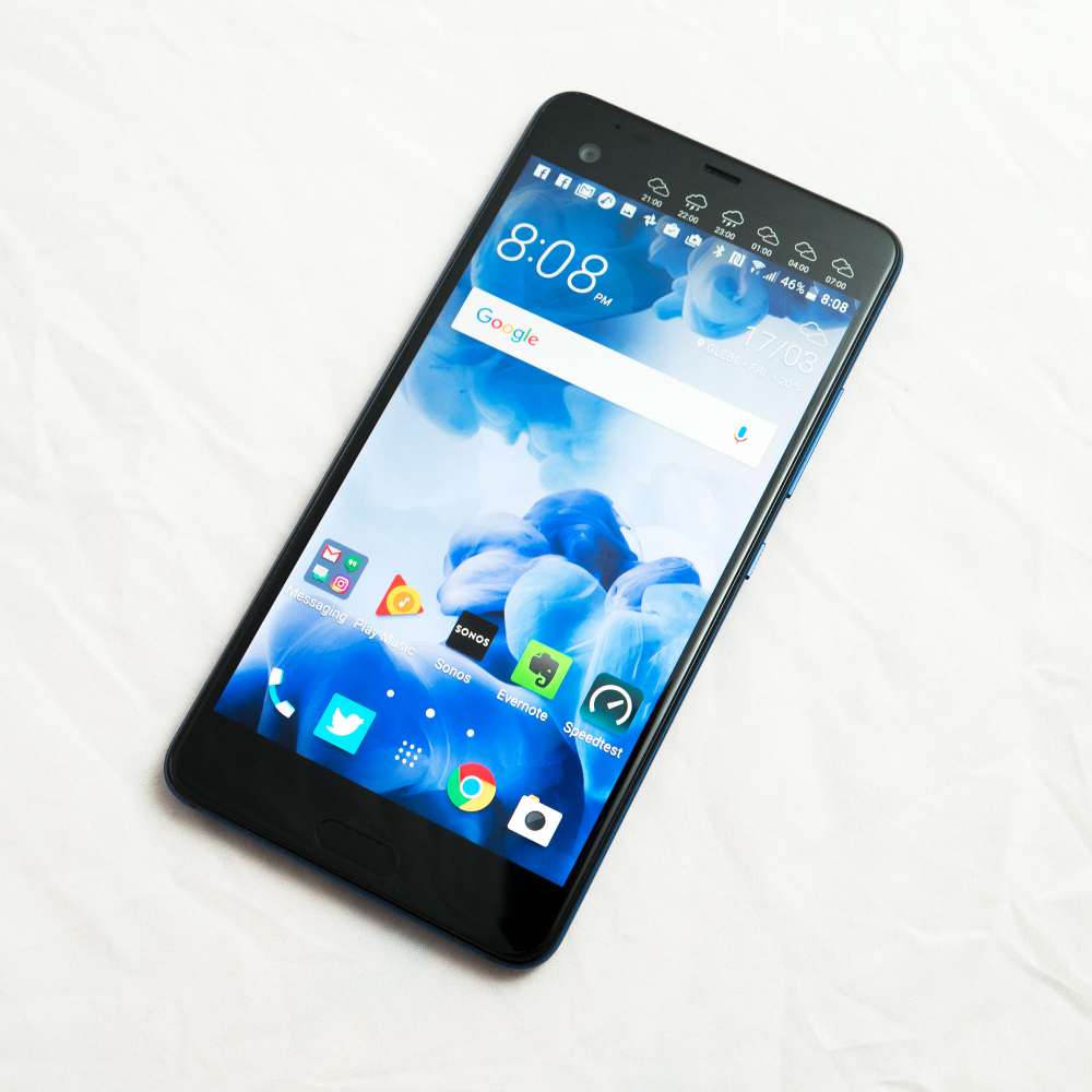
For the latest in HTC’s smartphones, the company has ditched the previous design language of metal casings and phones that nestle in the palm of your hand, and gone with something decidedly more fluid.
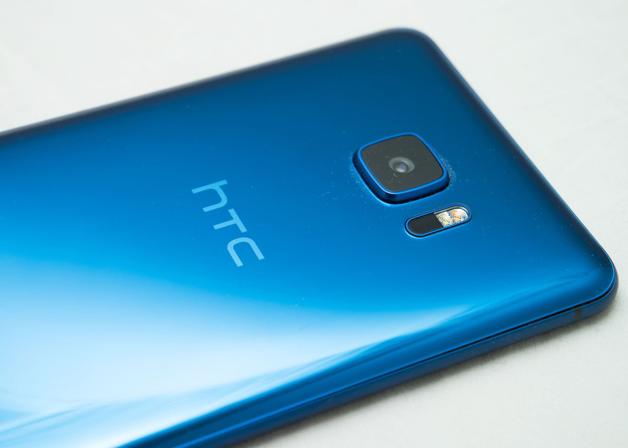
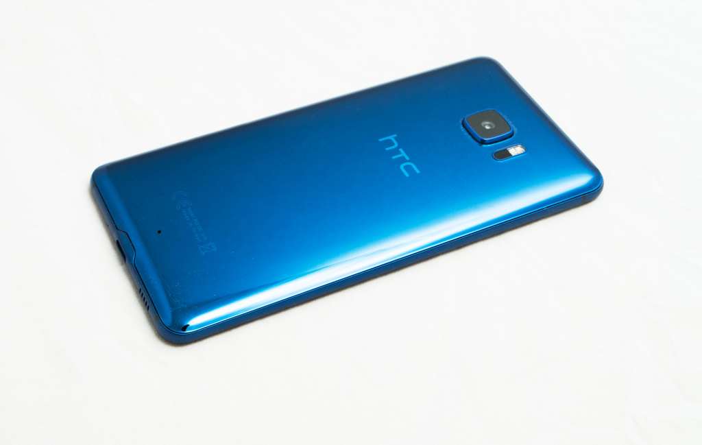
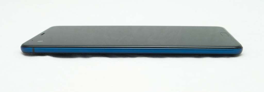
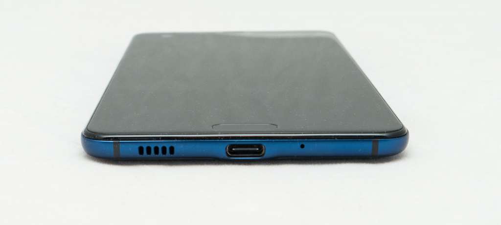
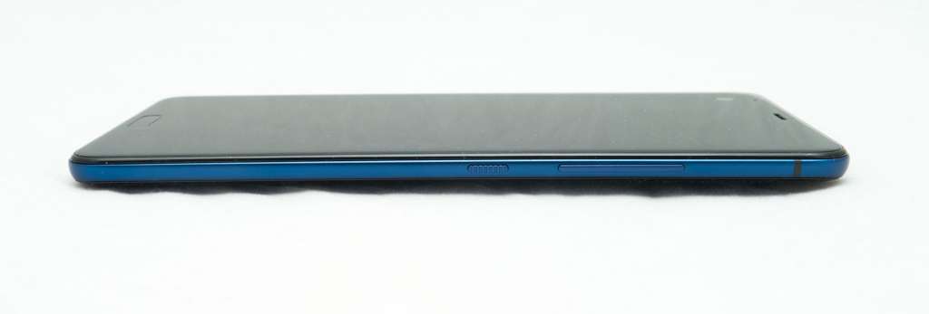
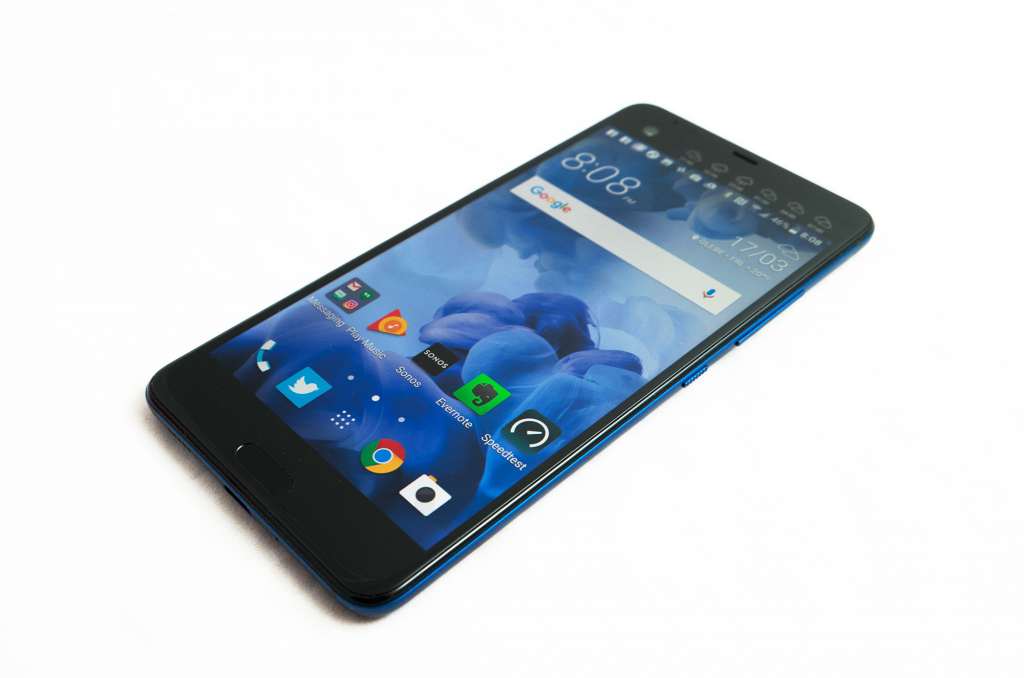
As tends to be the trend right now, the HTC U Ultra is made from glass, with each side of the phone a slick soft slab of glass held in place with an aluminium frame coloured the same as the rear glass plate.
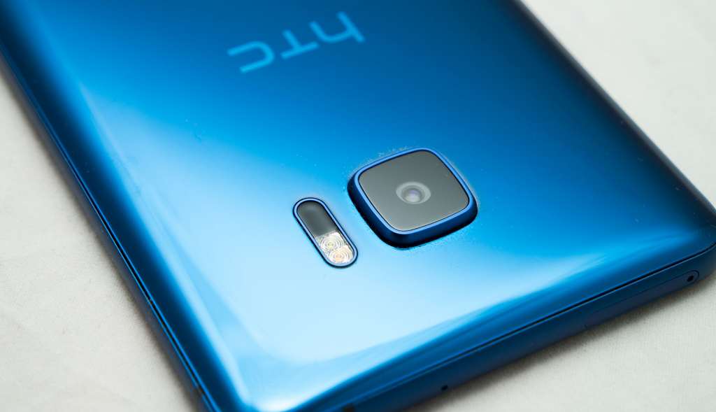
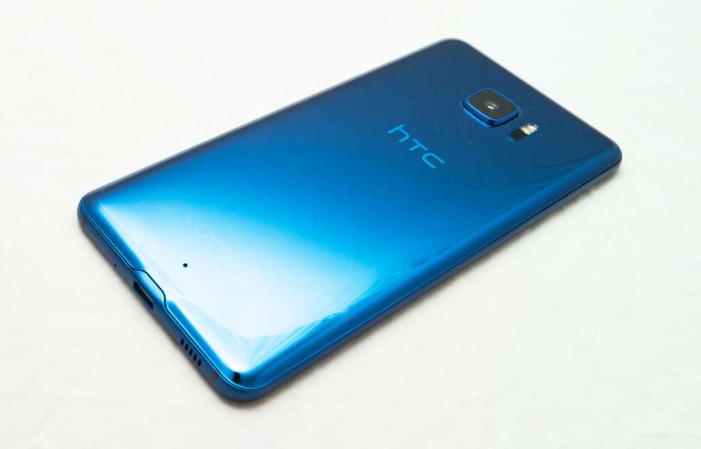
In our case, the U Ultra was blue, a super shiny blue on the back that was easy on the eyes and very pretty, schmick as it is though quite clearly a fingerprint magnet.
HTC includes a cleaning cloth with this phone, and there’s a really good reason: it is next to impossible to keep clean.
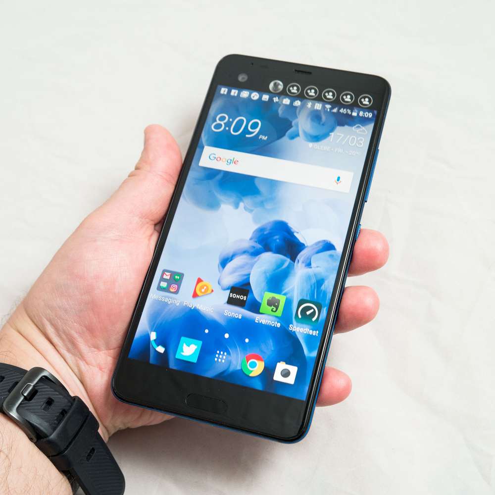
It’s also a touch slippery, thanks in no small part to that massive plate of glass that comes off looking elegant and liquid, but lacks the curvature to form to a hand.
There is an abrupt stop to this design, however, and that’s the camera: a squircle (softened square) of a camera bump protrudes from the back bit of glass and just hangs there, an oddity in the otherwise simple shape HTC has gone with.
To say it’s strange is a bit of an understatement, and you’ll look at this phone and wonder why HTC didn’t try to flatten in more, or thicken the back to account for it. At the very least, if the back had been fattened just a little, the company could have included more battery life.
Features
Under that cover of glass, plastic, and glass, HTC has equipped with it a feature list that doesn’t read as modern as we’d like, though it still should be enough to claim a “top dog” position on the mobile feature list.
As such, you’ll find one of the slightly older Qualcomm Snapdragon 821 four-core processors, running alongside what HTC claims is 4GB RAM and 64GB storage, the latter of which can be upgraded to microSD out of the box.
We say “HTC claims” however because our tests indicate that the HTC U Ultra only arrives with 3.7GB of RAM. That may not make a big difference, and we don’t expect anything severe to happen, but it’s interesting that you only get 3.7GB in the storage settings compared to the 4GB you’re supposed to have.
Outside of this discrepancy, the phone appears on track with the feature list, and also includes Android 7.0 “Nougat” out of the box also.
Cameras are quite varied, with a 12 megapixel– sorry, “Ultrapixel” camera, using one of those high-end sensors HTC has been developing for some time, while the front facing camera is both a 16 megapixel standard sensor that can switch over to a cropped 4 megapixel Ultrapixel sensor.
In connections, there is one less of those in this phone, delivering only the Type C USB port for charge, data, and wired sound, with HTC going with the trend Apple and Oppo started, offering no 3.5mm audio jack.
Wireless connections are, however, very normal, with 802.11a/b/g/n/ac WiFi, Bluetooth 4.2 with A2DP and LE, Near-Field Communication, Category 11 4G LTE offering speeds at a maximum of 600Mbps down and 50Mbps up (network dependent, of course), and just for a change, this is one of the few Android phones boasting support for Apple AirPlay, something HTC first brought to Android phones last year with the HTC 10.
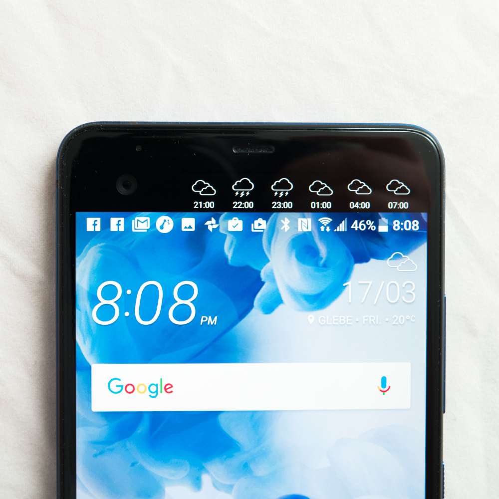
And all of this sits under a 5.7 inch Super LCD 5 display boasting that WQHD resolution of 2560×1440, as well as an extra screen on top offering 160×1040, all of this protected by a layer of Corning’s highly-resistant Gorilla Glass 5.
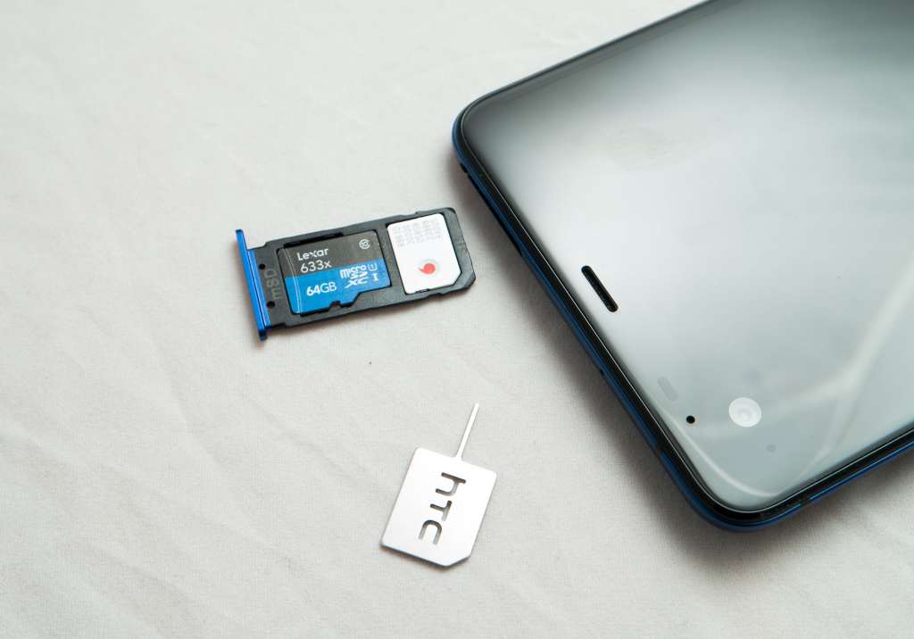
Along the top of the phone and in the metal frame, you’ll find you can upgrade the phone via the microSD slot on the same pin electable tray as the nanoSIM.
Meanwhile, the HTC U Ultra includes a 3000mAh battery that is built into the phone and cannot be removed.
In-use
Switching the phone on, you’ll be presented with a bright and shiny Super LCD with a lovely Quad HD display of 2560×1440, a screen size that isn’t unknown to HTC, but is nice to see all the same.
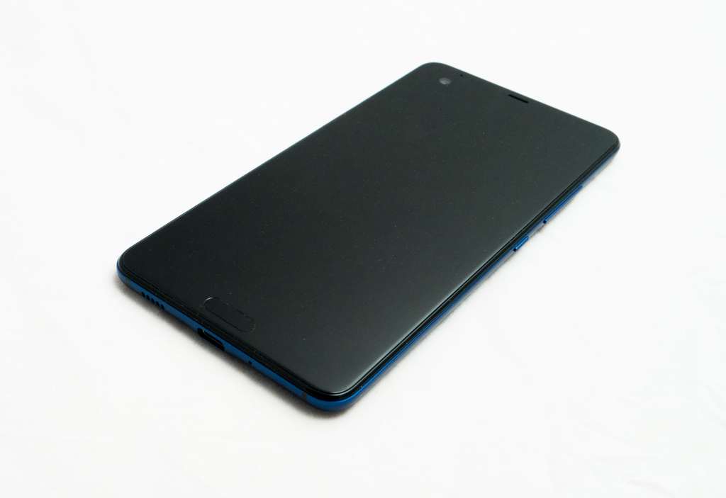
HTC has also kept the front-facing fingerprint sensor that works as a home button, flanked on either side by light-up soft buttons for back and multi-tasking, so little has changed on that front (the literal front, no less).
That sensor now feels faster, too, offering an easy way to get into the phone quickly from the lock screen simply by holding your finger down on the not-quite-button. We’re still of the point of view that the back (Google, Huawei, LG) and the side (Sony) make the best points for a fingerprint sensor, but at least HTC has provided a fast sensor, so that’s nice.
Performance
One area that shouldn’t disappoint is that of the performance, and while the Snapdragon 821 processor is right out of Google’s Pixel/Pixel XL handsets from last year and the memory amount isn’t quite as large as being advertised — 3.7GB instead of 4GB — it still handles its own fairly well.
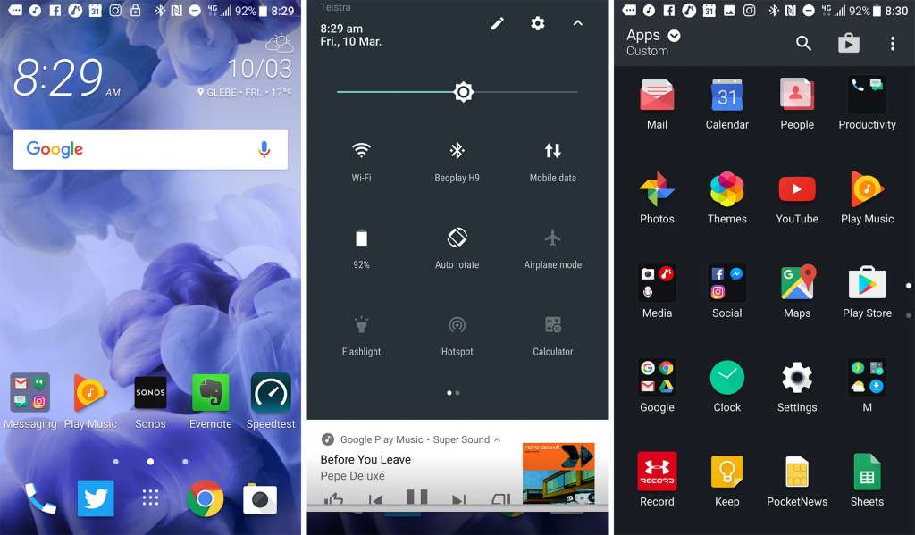
As such, good luck looking for lag across the latest edition of Sense, HTC’s skin for Android that now keeps the same drop-down notification bar for Android, but does away with practically everything else, skinning the menu, the home screens, and bringing that sense of home screen theming HTC brought in last year’s 10.
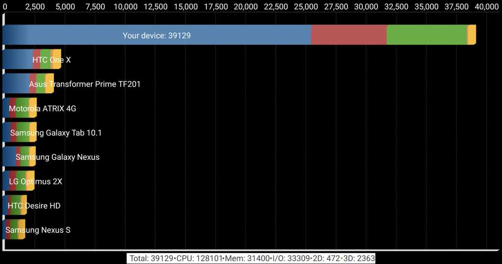
In testing, benchmarks handle their own, and while not lightning fast like Samsung’s Exynos processor, the system is plenty capable, with only a skerrick of lag here and there, hardly noticeable as it is.
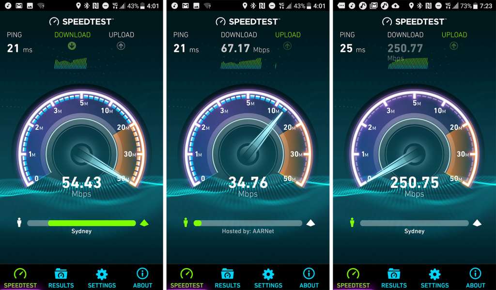
Mobile performance is also very impressive, hardly surprising for a Category 11 4G device, which should provide amazeballs download speeds as fast as 600Mbps down and 50Mbps up, dependent on your network and proximity to towers, of course.
So performance handles itself nicely. What next?
Camera
Then there’s the part that’s becoming the decider for so many buyers: the camera.
HTC has always used its “One” flagship phones to push camera technology, and it was here we first saw our glimpse of a bigger sensor, which HTC introduced as an “Ultrapixel”. While not technically a real term, the original Ultrapixel concept was a 4 megapixel sensor that could handle low light exceptionally well (for the time), thanks to a bigger than average sensor.
Back on the HTC One M7, this was a big deal and pre-empted much of the technology in smartphones, but these days it’s altogether quite commonplace. Every manufacturer uses larger sensor sizes in flagship phones, so the technology has to be pretty impressive to make a dent.
In the HTC U Ultra, Ultrapixel returns, and for a nice change, it’s in both the front and the back.
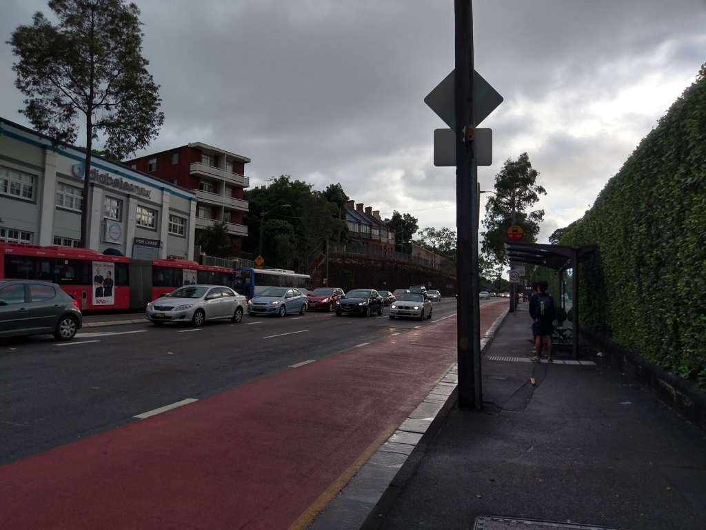
On the back — the main camera — it’s a generation of the technology running as a 12 megapixel camera, and for the most part, the imaging capabilities are nice enough, offering crisp colours and relatively sharp detail, with acceptable low light. We’re not going to say it’s the nicest camera out there, but it’s definitely not bad at all.
It lacks a solid focal distance, however, and we found it struggled with macro imagery, not allowing us to get all that close to a scene, one of the main ways we judge a camera’s lens.
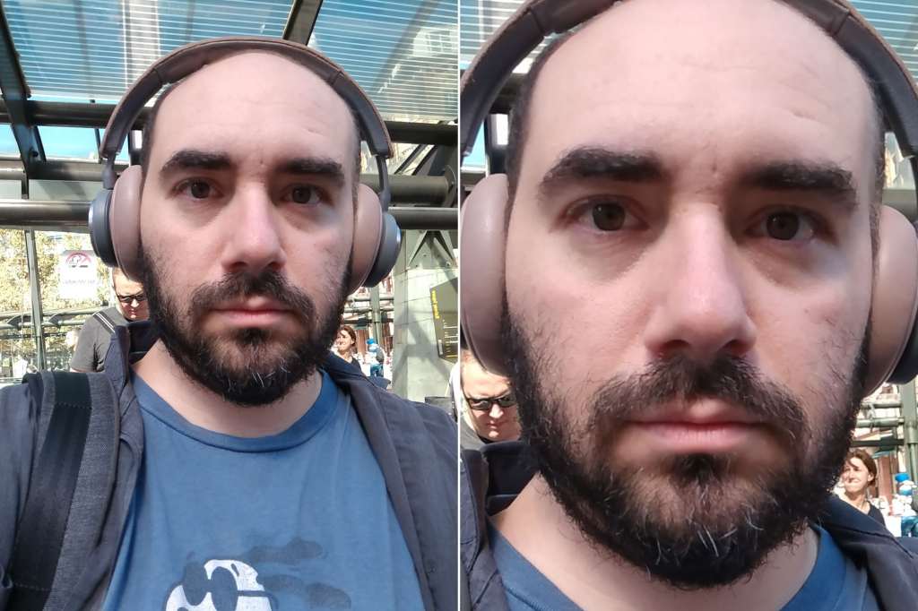
At the front, the camera is actually more interesting, with both a standard 16 megapixel selfie camera and a 4 megapixel Ultrapixel variant which can crop the sensor down and get selfies in a lower light.
The idea here is simple enough: if you’re amongst friends, go with the wider 16 megapixel mode. If it’s just you or you and someone else, stop it down and go for the better sensor in lower light with Ultrapixel.
We’re not sure if this technique is one that works well, simply because switching between the modes isn’t necessarily as cut and dry as one might think, though the software can also do this by itself.
Overall, the camera isn’t a bad effort, though it lacks the sense of colour equality Google was about to get out of HTC’s hardware in the Pixel XL, and in many ways has spoiled us moving forward.
Battery
At least the camera is capable enough, but the battery is the one area that truly bugs us, barely surviving the full work day.
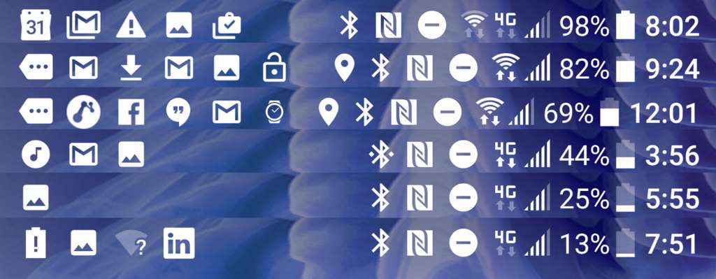
Testing a few times, we found moderate usage with wireless headphones and a wearable could only survive a good 14 hours before the battery uttered a giant nope and switched itself to a low power mode.
Technically, that’s enough of a low performance for us to call this a 12 hour phone, and that’s something you can likely thank with the 3000mAh battery, a relatively low power amount for a screen of this size.
Use the phone a little lighter and you might see closer to 18 hours as we found in subsequent days, but overall, it’s not the most impressive result, not like what you might be expecting from a phone carrying a price tag this high.
That second screen
The second screen is another feature that doesn’t exactly live up to all the promises, and while it might seem cool, it can come off like a bit of a gimmick.
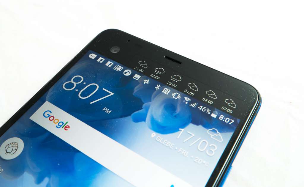
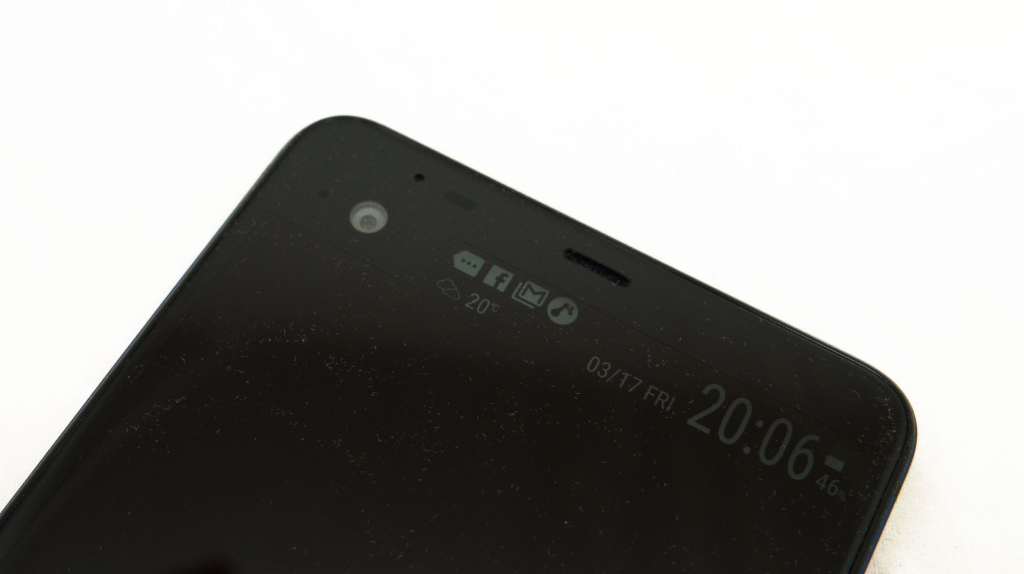
HTC’s idea for the display is still very cool: instead of just offering shortcuts and weather information, it also acts as an intermediary, sending alerts and notifications that would typically land on the home screen and interrupt your viewing to that specific bar.
It’s an idea that makes a lot of sense and actually turns that extra screen into something quite useful, especially since you can flick things away just as easily here as you would with your phone. Received a message on Facebook? That won’t interrupt you watching a video, and you can see it on the top screen, flicking it away it to see something else.
You can also use this to control your music and call people directly, but there are some catches here.
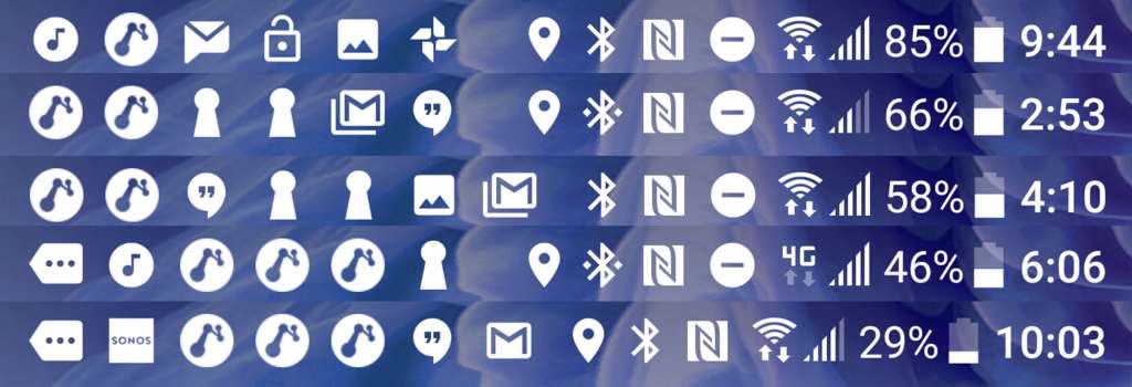
For instance while you can control Google Play Music and Spotify, they’re the only two services that work natively here. Do you have a Sonos system you’d like to control from the top screen? Tough luck for now. Same with anything else that doesn’t support the screen yet.
The flaw in HTC’s top screen is that the apps have to be built as hooks into the top screen, and it wont run widgets, even though both of those respective services — and they’re just two off the top our head — have widgets that will work on the home screen.
There’s also a relatively odd lack of customisation here, and you can’t change the type of clock, the type of notifications, and only have a modicum of control.
And for some reason, every so often a news listing will pop up on the screen that you may not want there. You might be like “where did this come from”, and there’s a really simple answer, and one that’s a touch concerning: bloatware.
Bloatware
Yes, for some reason, after releasing the HTC 10 relatively bloat-free, the HTC U Ultra arrives filled with bloat.
Do you like apps that you don’t want anything to do with your phone for the delivering of news updates? GREAT WORK, TAKE TWO.
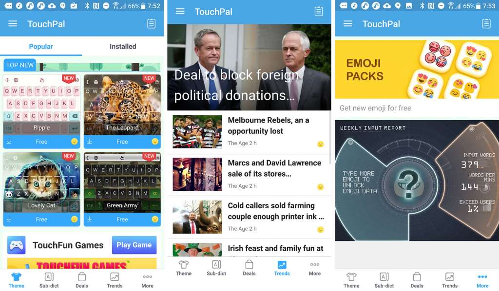
With HTC moving on from its own keyboard, it now includes the TouchPal keyboard, which staggeringly also comes with a news headline page inside its settings window. Seriously.
We’re not sure what a keyboard has to do with a news feed, and we’re guessing this is a bit of a way for a company to make a bit of extra money when you click on affiliate links, but that extra bloat is frustrating enough. Not helping it is a keyboard that offers odd discrepancies, such as some of the strangest gesture typing spelling suggestions, as well as a gesture typing mode that only works on US English, but not UK English.
If you don’t want that news bloatware, there’s yet another built in, with News Republic.
Yep, it’s a second bit of news and headlines bloatware, and this one will even send news to that top screen until you go in and switch the sucker off.
It’s frustrating to see extra crap like this roll out to unsuspecting customers, especially since it’s built in when it doesn’t need to be. Especially when HTC includes a left screen that you can thankfully switch off which also does the same thing.
So there you go: three ways of getting news and headlines, and that’s before you even mention the inclusion of Google’s own news and weather finding resource that is built into the phone.
Talk about doubling up in bloat.
And how about a little more: HTC’s Sense can also do this, fulfilling a little bit of what Google Now/Google Assistant does, while also feeling like it doesn’t do much of anything except to tell you to charge your battery and that there are places you might want to eat nearby.
What needs work?
Unfortunately, the muddling battery, the mediocre camera, and the gimmick of the second screen don’t help the HTC U Ultra in setting itself up for a positive review, and there’s a solid reason: this phone feels like yesterday’s news, and an overpriced edition of that, no less.
Stunningly, there’s also no water-resistance, what will no doubt be a continued main feature of high-end phones this year. Sony had it first. Then Samsung. Now Apple.m Why doesn’t HTC?
We were told it was a design compromise, but that doesn’t seem right at all: we’ve seen glass and metal phones that had water-proofing, and Samsung released several last year.
Even the audio feels like HTC has shifted things too aggressively, because while this is an area HTC normally dominates in, it’s hard not to see they’re lacking just a little.
Take the audio jack, or rather the omission of that 3.5mm headset jack. That’s not so unusual these days, as Apple and Motorola have kind of popularised that trend, something Oppo dabbled in first.
But every phone manufacturer that has removed the jack has provided a way of converting the charge and data port back to 3.5mm in the box, a sort of easy friendly accessory.
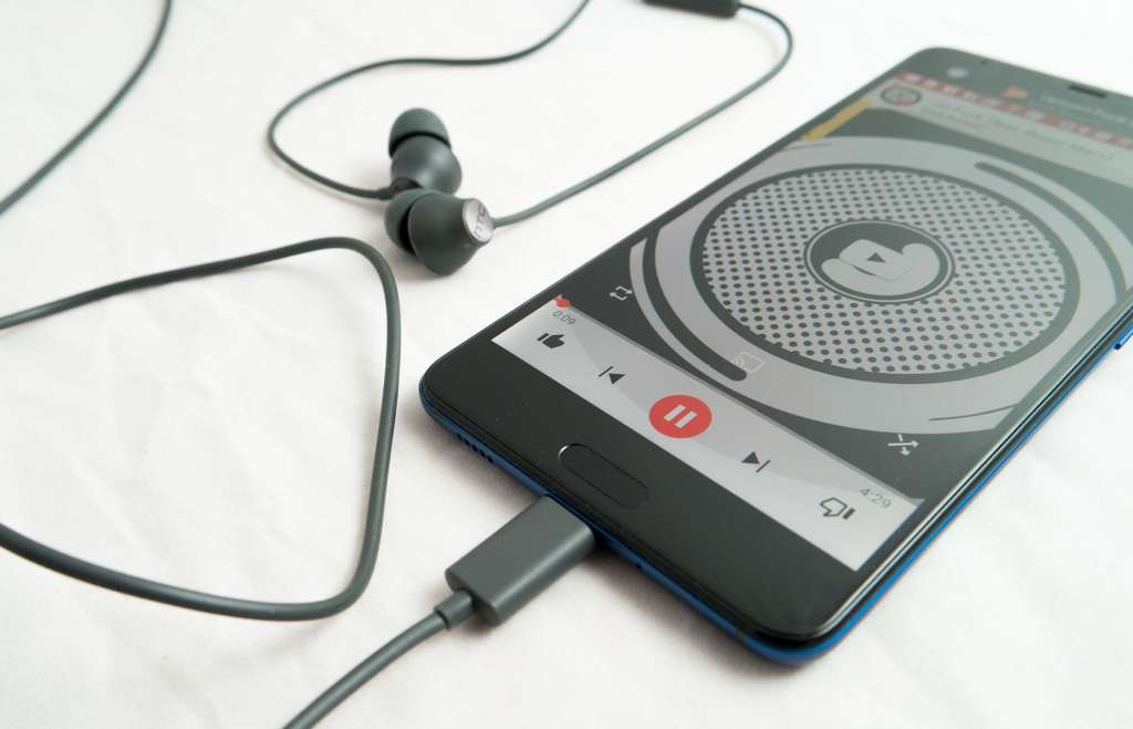
Not so with HTC, which does not include a USB Type C to 3.5mm converter in the box at all. It does include a pair of decent earphones, and they are decent, but tough luck if you want to bring a better pair.
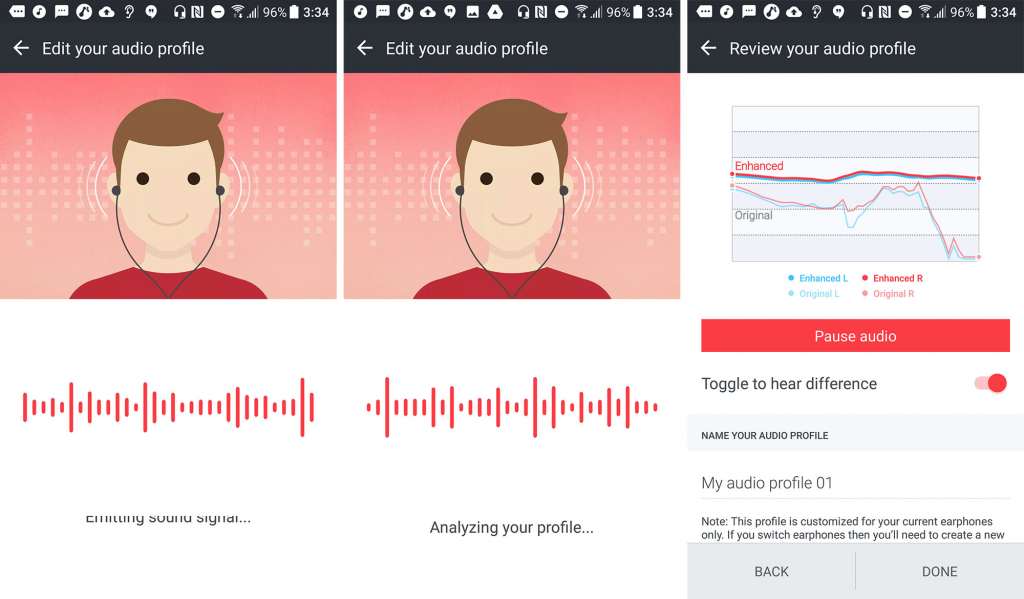
HTC’s decent earphones are decent too, and even rely on a neat audio trick to balance the audio for your ears by testing sounds in your ear canal to measure acoustic properties, but these only work for the included earphones, and so feel like a bit of a miss altogether, providing a rather gimmicky feature for the one inclusion. In fact, the HTC 10 provided an audio balancing featuring that allowed you to profile your ears manually through what you heard, and that appears to be missing here, and it worked on every earphone.
And just to add insult to injury, HTC’s decent USB Type C earphones will not work on any other mobile handset. Yep, you heard that right: the only earphones included in the box only work on that HTC U Ultra as it, something we were surprised about and had to test for ourselves.
It’s a bit of a “one step forward, two steps back” approach in audio, and the same can be seen with speakers, because after wowing customers with dual front-facing speakers and causing other companies to follow in suit, HTC’s U Ultra has thrown those out, now adopting one at the top front and one on the bottom edge. That’s hardly the stereo presentation we’ve come to expect, though it does have a bit of software to help it along.
However it’s not an HTC design trait, and there are two other companies that do this, and the U Ultra is a clear sign that HTC is following these into battle: Apple and Samsung.
There isn’t even support for any of that virtual reality goodness you may come to expect out of a high-end smartphone, you know like the Samsung Galaxy series and the Google Pixel, and this coming from one of the leading suppliers of virtual reality for the desktop world, HTC.
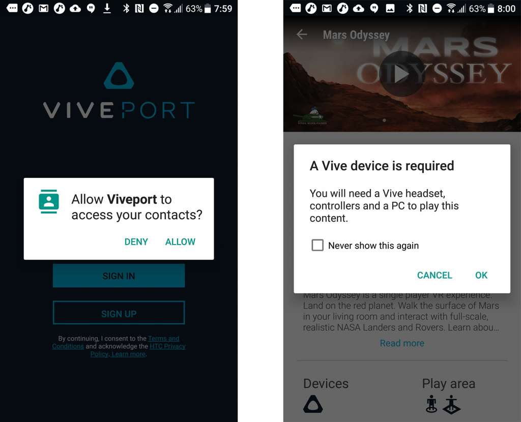
Yes, HTC makes the Vive, one of the headsets setting the world on fire, and for some reason, HTC also includes a bit of bloatware on the U Ultra that advertises the Vive VR headset: Viveport is an app designed to let you explore and purchase apps made for the specific VR headset that plugs into a PC.
Upon first glance, we were like “WTF, maybe this phone does indeed support VR”, but no, HTC’s people confirmed that it does not, and so we’re led to believe the inclusion of Viveport is as an app designed to sell VR in a different device.
Given how mobile VR is trying to transform edu- and entertainment, it’s astonishing the HTC U Ultra doesn’t support it, especially since HTC is one of the massive investors and backers of the technology.
Final thoughts (TLDR)
It might come off that we’re being particularly mean or aggressive to HTC, but the reality of the smartphone game is this: it’s hard out there.
Manufacturers are competing more aggressively than ever to get you to hand over something for your hard-earned dollars. Consumers make decisions based on how a phone feels, how it performs, what a camera handles like, if it takes a good selfie, and if that blasted battery can survive more than a typical work day when a wearable and headphones are connected.
And when you charge over a grand for the privilege of these things, the expectation is high.
Unfortunately for HTC, the U Ultra does not deliver on that expectation, especially in comparison to some of the products the company has released in the past.
The most unusual thing for us is just how far away from the trend HTC has gone, delivering something that should have been amazing, but doesn’t quite pull it all together.
This was the company that made Google’s excellent Pixel and Pixel XL, working with the search engine giant to produce an outstanding handset that is hard to move on from simply because it’s so good and always up to date, the latter of which is next to impossible to find in the Android world.
And yet despite doing that last year, the HTC U Ultra is not the phone to do that for HTC this year.
Bizarrely, we need to go out on a ledge and say this is not HTC’s best phone yet, which smacks in the face of the typical trend you’d expect a brand new flagship phone to achieve. You’ll see reviewers each year typically brand each new phone “the best yet” from the respective manufacturers, partially because it’s an easy statement to make, but also because it’s usually true.
But that’s not the case with HTC’s U Ultra, and we know the company can do better, just look at the Google Pixel XL.
If HTC lowers the cost, perhaps this would be a better option, but for now, it’s just a “ho-hum” offering that doesn’t encapsulate a 2017 phone the way we’d like.


