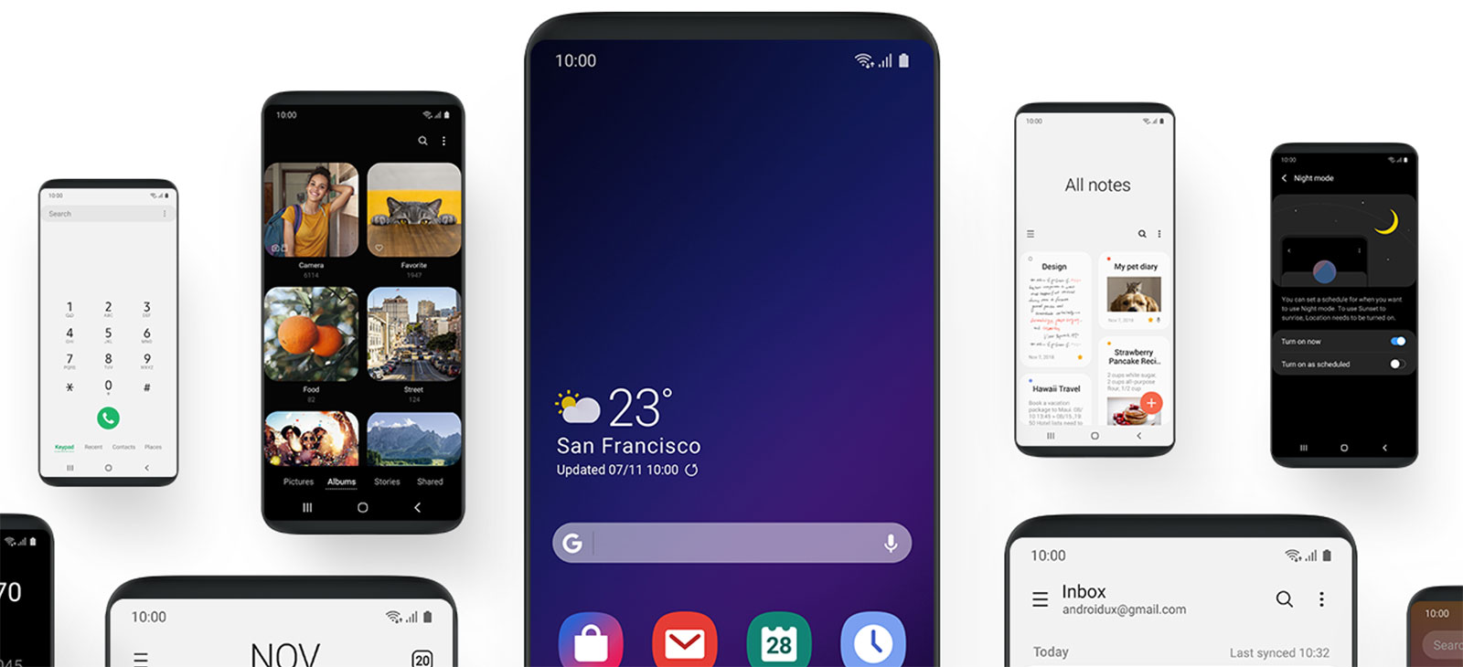
Owners of Samsung’s flagship handsets for the past year get a bit of a surprise this week, as the update to Samsung’s Android experience has arrived in the cleaner, slicker, Samsung One UI.
Even though many Android phones can come off largely the same in specs and design, there is certainly one area many still differ in, and that’s the look and feel of Android.
One of the most customisable parts of the Android experience, the look and feel of Google’s mobile operating system isn’t locked to the way Google envisions it. While Apple’s iOS is clearly locked to pages of icons sitting in a way Apple mostly chooses, Android is completely different.
In fact, it can look however you or a manufacturer wants. Over the years, we’ve seen numerous iPhone clones from variations of Android, such as Oppo’s ColorOS, while Huawei’s EMUI has lately tread middle ground and offered both an Android and iOS-like experience for its handsets.
Unsurprisingly, Google offers the most Google-like experience on its Pixel handsets, though devices with “Android One” get a pure Android experience as well without being made by Google.
And then there are the other brands doing their own takes. HTC still runs a variation of its “Sense” user interface, while LG’s is kind of like Google’s, but with more customisation options.
Of course, you can always download your own change to the Android launcher, too, if none of this suits. Popular ones at the moment include the Nova Launcher which is very customisable, the Rootless Launcher which is basically Google’s stock launcher from the Pixel made to work on other devices, and Microsoft’s Launcher which offers a more Microsoft-designed approach complete with Cortana and Windows integration of sorts.
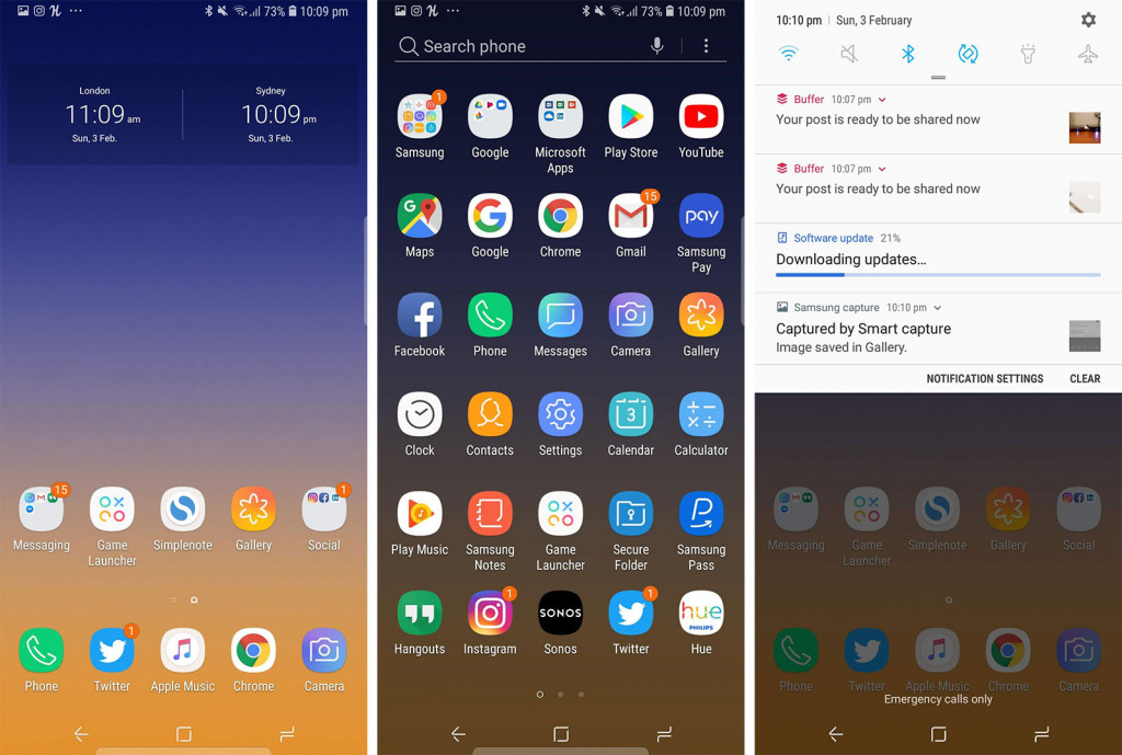
Samsung has been dabbling in improving its phone experience for quite some time now, and while we’ve improved drastically from the origins of Samsung’s TouchWiz to it’s clearer Samsung Experience in the S8, it’s time to move on once again.
The next generation of Samsung’s look and feel for Android is something its calls “One UI”, or One User Interface, given “UI” stands for “user interface”, and it’s a design made to be minimalist and simple, while still presenting you with the information you need.
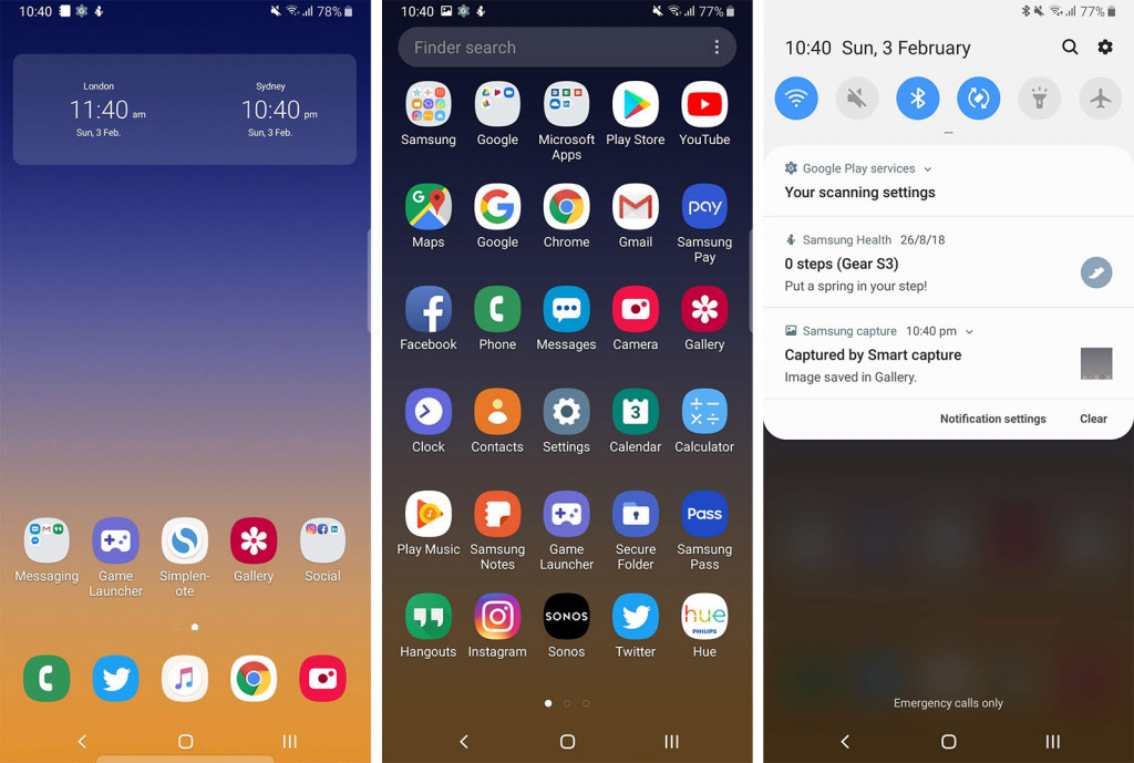
The menus are a little clearer, with the titles a little more obvious and the design feeling like it’s bigger and sharper, offering more clarity. We particularly like the new lockscreen, which seems less cluttered than it ever has, and makes it feel like Samsung’s design team has woken up to the modern age and is doing just that: providing something modern.
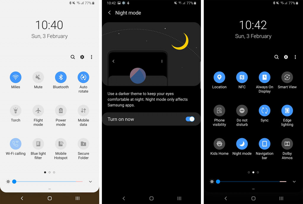
Samsung One UI is rolling out with Android 9.0 “Pie”, and that means it can take advantage of some of the things Google built, like a night mode.
A night mode is exactly what it sounds like, with a mode optimised for darkness, similar to what you can find in MacOS’ Mojave, with darker screens, a darker keyboard, and so on and so on. It only works properly with Samsung’s apps at the moment, and we’ve found a bug here and there with the keyboard jumping from the clear dark keyboard at night to a bright white keyboard randomly, but it’s a good start, and one that could have you using your phone while someone sleeps, and helping your eyes adjust.
For folks keen to try Samsung One UI, you will need one of last year’s Galaxy S9 and Galaxy S9+, or Note 9 handsets, as the official rollout has begun on those, though there are betas for the Galaxy S8, S8+, and Galaxy Note 8 handsets, as well.
You can also expect Samsung’s One UI on its next phones, which are only a few weeks away, with an announcement expected in late February.


