Announced only a few weeks ago, the next version of iOS is on its way, so what’s it like? On the iPad, it’s almost like MacOS, as Apple gets its tablet closer to a laptop than ever.
The next time you look at an iPhone or iPad, you might be looking at the next generation of MacOS, or something close to it, even, as Apple’s next mobile operating system begins to take a shape that feels like the company is shifting things in that direction.
That’s the feeling that is next to impossible to ignore with iOS 11, the update that will come to your Apple iDevice likely by the time the next iPhone or three make their way out which will probably be in September.
With the new release comes some interesting features, and while they’ll exist on both mobile and tablet, it’s the latter of these that genuinely feels like iOS 11 includes some drastic improvements, even if they are very, very new, and at the moment still quite buggy.
A dock like a desktop
One of the most obvious changes is also a big one, because it has been a part of the design of Apple’s iOS practically forever: the dock.
No matter what you did for the past few years, your dock always consisted of a maximum of six app shortcuts, and generally four if you were on the iPhone.
Testing iOS 11 on the iPad, you now get a dock a little more like that of MacOS, which is interesting since that’s where iOS started, being a development fork right out of Apple’s laptop and desktop operating system.

In fact, when it launches, you’ll have a dock that can support up to 13 of your most loved apps, and a dock that will automatically hide much like it can on your desktop, swiping up on the screen at any time to bring it back.
There’s also something extra on the side: three app icons, and your last used three at that.
Consider this the recollection side of things, as Apple helps you launch the three last used applications in case you forgot what you were doing. Already, it has saved us a few times.
Multitasking like a champ
Possibly one of the best inclusions in iOS 11 is this sudden realisation that multitasking finally works on the iPad, and isn’t just a clunky half-developed inclusion that was put in to satisfy the few people keen to tweet and take notes at the same time (that’s us, by the way).
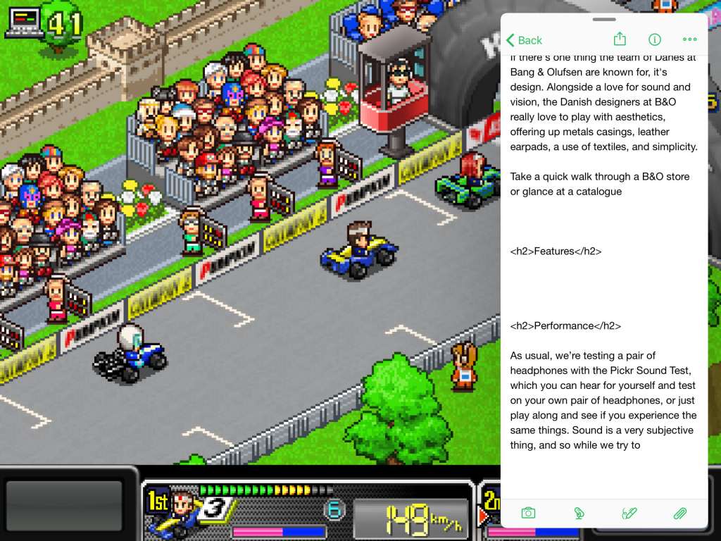
While you’ll still have the split-screen action from previous generations, now any app can be dragged over the top of any other app and used atop something else.
Are you playing a game and doing work at the same time? Drag the app from the dock over the app and watch what happens, with the app’s window suddenly appearing over the top, loading the small version of that app.
Don’t like that work section on the right side, swipe it to the left. Don’t want it there at all? Swipe it out and it disappears.
That at least appears to be the compromise Apple is working with to get app developers to play nicely and integrate their apps with the split-screen system, which not everyone is doing, and it’s a good compromise at that. Not all apps work here – we found Google Mail still wouldn’t touch the system – as you still need to have support for multitasking split screen windows, which allows the app to shrink down to its a one column size.
Still, when it works, it’s a rather cool treat, and finally brings a way to write or work as you do something else: surf the web, control music, run a timer; this is what multitasking is like on a desktop, but just with support for your fingers, giving it that Apple iPad spin on things.
Also useful is how iOS deals with apps where the split-screen connection has occurred, saving their last state in the multitasking window and letting you jump back in quickly and use them.
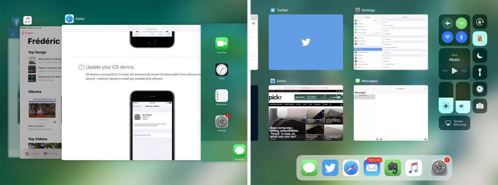
The multitask window has changed dramatically too, something you’ll see if you double-press the home button.
Rather than load up windows side by side in a scrolling almost Coverflow-like display, you’ll find the apps you have open appear closer to how iOS itself works for apps, viewable in a grid alongside the controls previously found in Control Centre, many of which are more tactile and easy to control.
Screenshots, keyboards, and more
There are also some handy bits and bobs that Apple has improved to make things a little better overall, like the keyboard, what happens when you take screenshots, and the way the App Store looks.
For the screenshots, you’ll find the power and home button still capture, but now they compile at the bottom in a small collection, almost as if your screenshots were collected as a pile of Polaroid photographs all being shaken to life.
It’s a cute addition, and it’s not one without reason, offering a way to mark-up and draw all over those screenshots when you touch the pile, ideal if you happen to be making some changes.
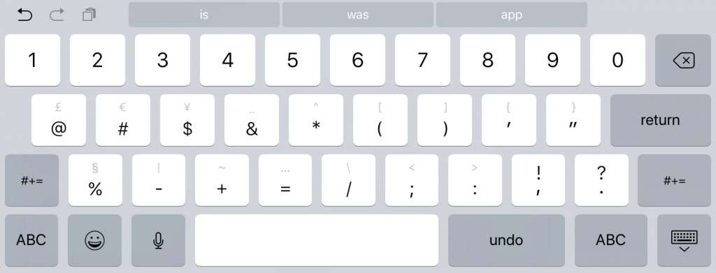
Changes can also be found in the keyboard, which now offers a little more spacing, not to mention the ability to flick up on a key and have it quickly type the extra character, not to mention the ton of Emoji you now have at your disposal.
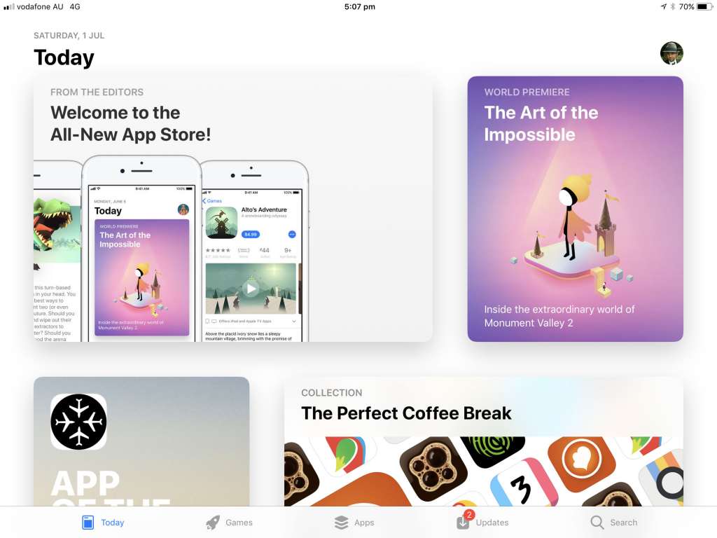
And that App Store? It’s going to be a little more like your Apple News feed, curated and offering suggestions in a very visual manner.
Should you try the beta?
With solid multitasking and a great dock, not to mention a release date that is likely a good month or two away, there are certainly some great reasons to try Apple’s mobile MacOS out, but there are also some great reasons to stay away, at least until Apple finalises things and releases iOS 11 properly.
One of them is the obvious point: this is a beta, and things just won’t work the same.
Development cycles often have two phases of testing before they’re released into the wild, outside of sheer development of course, with “alpha” being the initial test and “beta” being the close-to-release test. Apple’s iOS 11 is in beta, but there are certainly things about it that make that hard to believe.
Take simple commands that every device has had for years, with copy and paste. The shortcuts you’ve known and loved for years still exist on iOS 11 beta, but they don’t always work, and almost never activate from any keyboard.
Safari also comes with its own bugs, because while the new operating system delivers a new version of the Safari web browser, it crashes so regularly, you’ll lose count, particularly if you happen to be saving images or trying to open things in a new tab.
Installing apps also throws up a red flag or two, and sometimes just won’t work at all, while other aspects like the battery indicator on the daily agenda page seem more like they’re a stand-in, with no real information and all of it just fake.
And if you use something like the Apple SD card reader, that does not work at all under beta, crashing out and refusing to let you import a single thing.
That’s the problem with betas: they’re in testing as developers and quality assurance (QA) engineers look for bugs, finding and helping to solve them with the development team. Until that point, the bugs remain, and leaving your device a little broken until the new version arrives waiting for you to test.
And if that’s something you think you can handle, you’ll find instructions to install over at Apple’s beta website, installing a beta provisioning profile and letting Apple do the rest.
Apple doesn’t recommend the beta to be installed on a device you rely on full time, and that’s likely because of the bugs. However, if you’re keen to see what’s coming ahead of a release either in August or September, this is the way forward before the final version arrives.
