Adobe’s “Illustrator” design tool turns 30 this week, and to celebrate, why not have a few updates.
You may not realise it, but the company behind the term “Photoshop” (and the software that inspires the term) has been around for quite a while, and one of its first tools is having a birthday.
Celebrating its 30th without all the alcohol or fear of what happens for the next 20 years, Adobe is rolling out a few changes to its integral design tool “Illustrator”, an application that has survived threat from competitors, from other solutions that were then bought out even by Adobe (say goodbye to Macromedia’s “Freehand”), with the company talking up its existence almost like a new 30 year old embracing their age ready to take on the world.

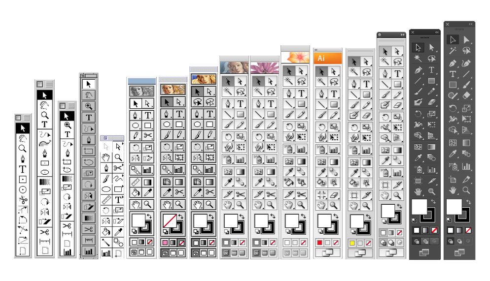
So here’s Illustrator in 2017, 30 years on: you get a new toolbar, support to export for multiple screens (technically this was added last year), an easier way to access colour themes, and a crop tool.

Illustrator isn’t the only app seeing a change or two, with the other designer-friendly app getting a bit of a boost in the form of an InDesign tweak or two.

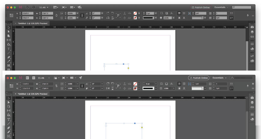
First is news that the interface has been tided up a little — big whoop, I hear you thinking — while the second tweak is a little more obvious.
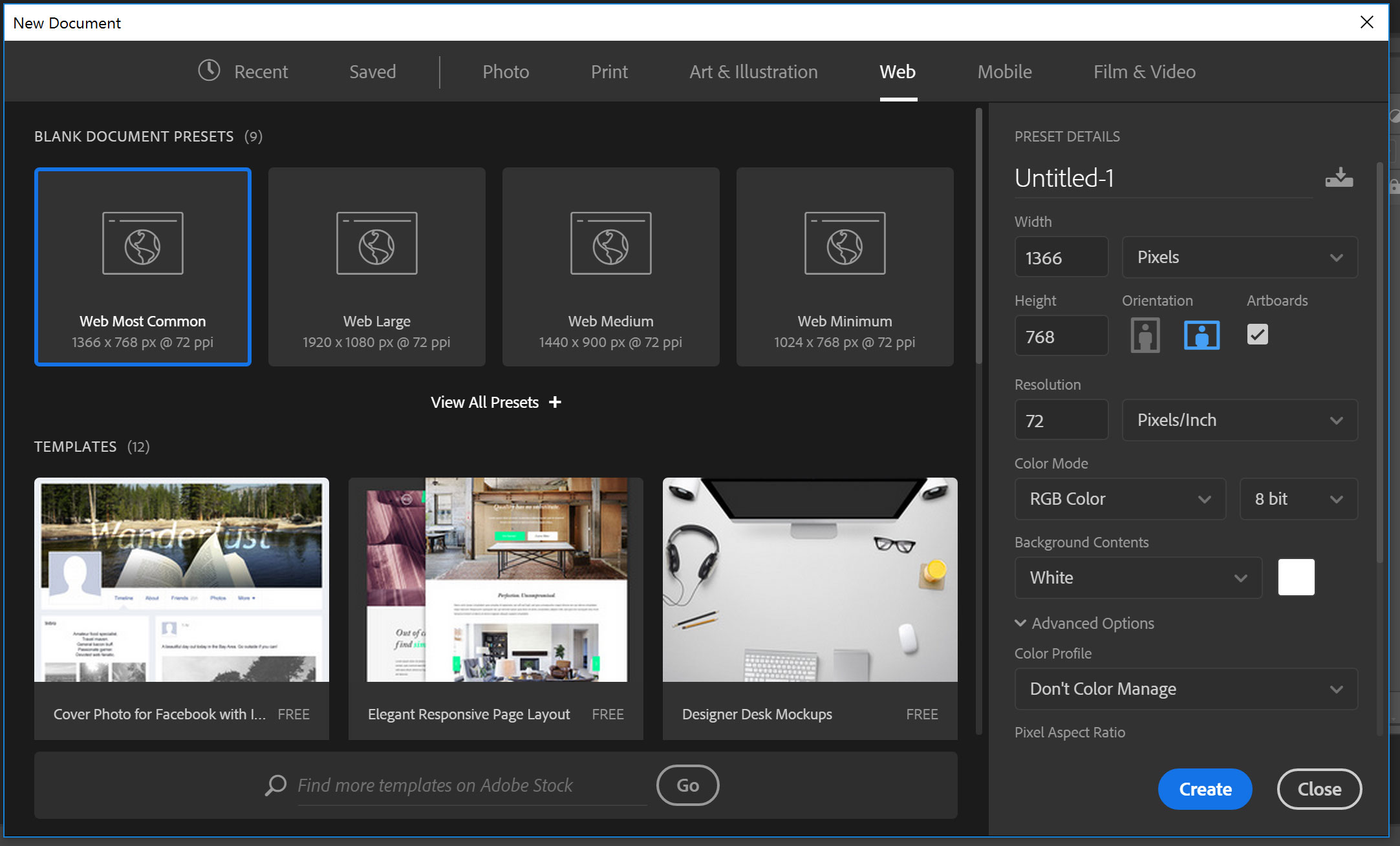
Technically it’s a minor change, but it’s one that could see designers going “yay!” or “boo, bring the old one back!”, as the new document window becomes just like that out of Photoshop, offering templates from Adobe Stock that you can grab and start working on quickly and easily.
Think of these as templates for office applications, Word and the like, but for InDesign, offering designers the chance to either start fresh from the blank slate that is a new document, or from something started by someone else.

After playing with this option in Photoshop for a while, we can tell you that it makes more sense used in InDesign, though we need to note that it can feel like it slows down creation of a new document in Photoshop.
Fortunately, Adobe does offer the option of using the “legacy” new window in Photoshop, so hopefully it works like that inside InDesign, too, because if you sit in that second camp of “boo, bring the old one back!”, you won’t be angry for very long.
Adobe’s updates to InDesign and Illustrator are rolling out now across Adobe CC subscriptions.


