Quick review
The good
The not-so-good
Depending on who you ask, the next generation of computers is one dominated by touch. If you’re in the Windows camp, it’s a laptop with a touchscreen, or a tablet with a pen. And if you’re a Mac user, it’s a computer that acts like a computer because you may already have a touchscreen in your life, like the iPhone or the iPad.
That’s the path Apple has more or less laid out for itself, though in the new MacBook Pro, it’s changing things a little.
Aside for more power, faster innards, and a change to the keyboard and how you charge and plug things into the machine, you now have the option for a small touchscreen.
Called the “Touch Bar”, it’s what makes the 2016 MacBook Pro special, and it has everyone either praising Apple or scratching their heads trying to work things out.
What is this thing, and does it make the MacBook Pro stand out, or is it just a gimmick for the sake of being different?
Features
This might feel like deja-vu all over again because we’re pretty sure we’ve reviewed this computer at least once before, and quite recently. Indeed, the MacBook Pro with Touch Bar and Touch ID is so close to the MacBook Pro without it, much of this review is spot on to its sibling simply because there is so much alike.
That starts with design and much of the spec, as the 13 inch MacBook Pro features more or less the same type of hardware in the same design.
As such, you can expect Intel’s sixth-generation “Skylake” processors here, working with dual-core variants in the 13 inch model in either an i5 option from the factory of i7 if you choose to customise.
8GB RAM is default on both variants of the Touch Bar and Touch ID-enabled 2016 MacBook Pro (configurable to 16GB), though different from the entry level, it is clocked faster, set to 2133MHz instead of 1866MHz.
The storage is also a little faster, because while you get either 256GB or 512GB (with the option to customise a little higher), the NVMe M.2 solid-state storage is faster in the Touch Bar-specific MacBook Pro.
Outside of that, the connections are mostly the same, with WiFi 802.11ac and Bluetooth, while the metal body, keyboard, and huge Force Touch trackpad remain spot on.
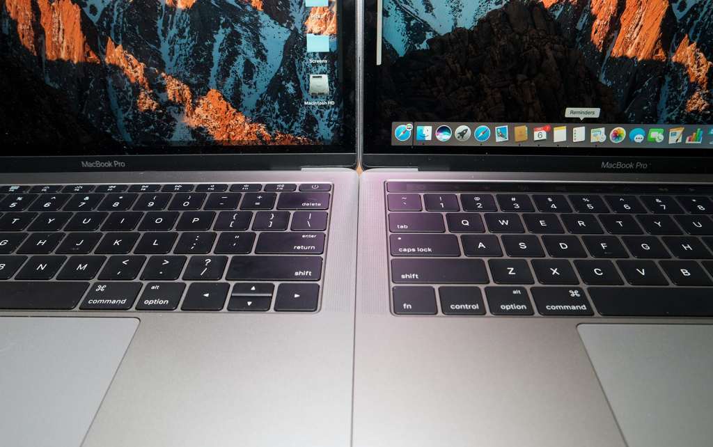
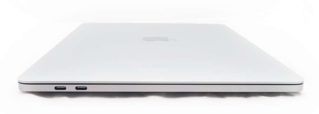
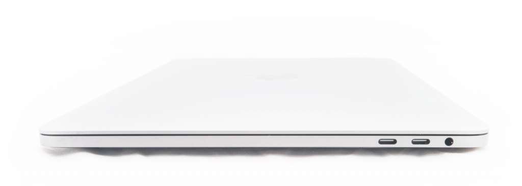
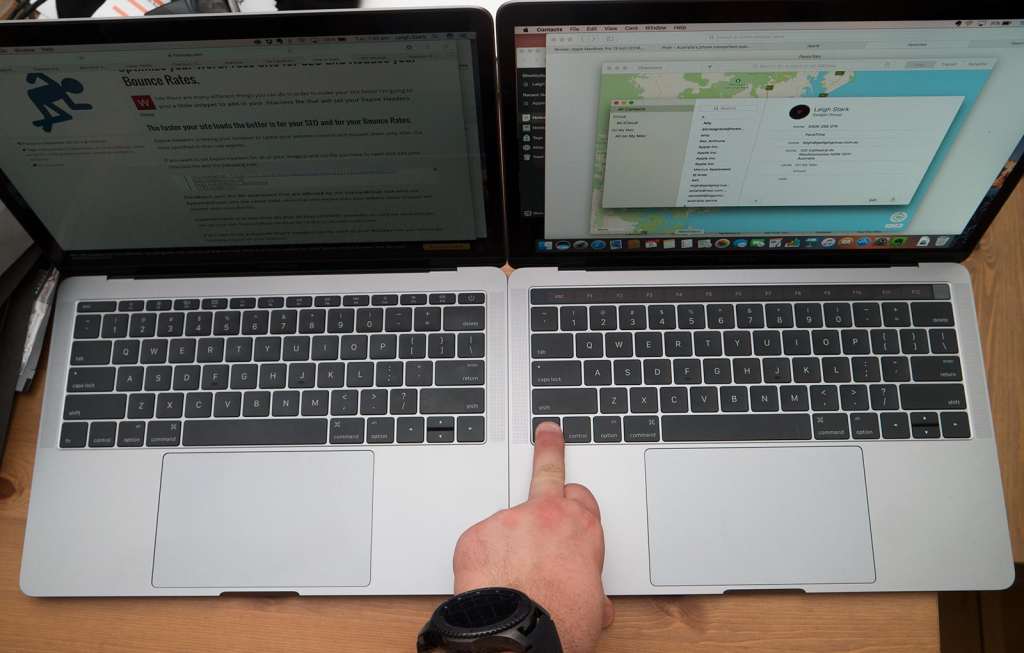
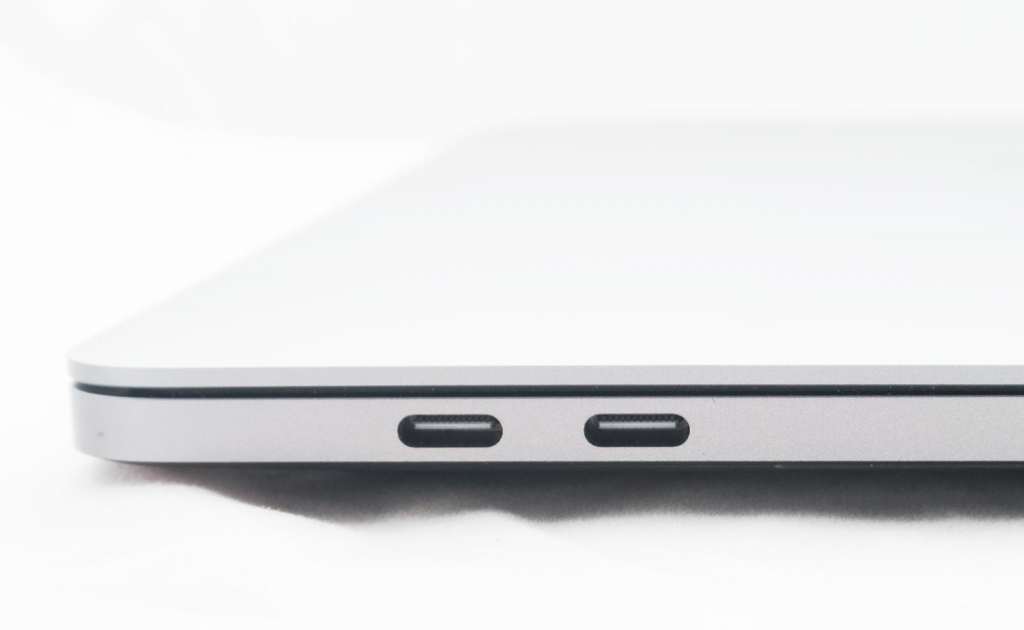
There is a slight change to the number of USB Type C ports you get out of the box, with twice the ports available in the Touch Bar edition: two on the left edge and two on the right.
Audio changes a little, too, with the speakers a little taller and a little louder in comparison to the entry-level computer, while an extra microphone has been added, raising the count in the MacBook Pro with Touch Bar to three.
And there’s the screen, which keeps the same 13.3 inch 2560×1600 Retina display offering 227 pixels per inch, the P3 colour gamut, and more brightness (500 nits) than any of the laptops Apple has made prior.
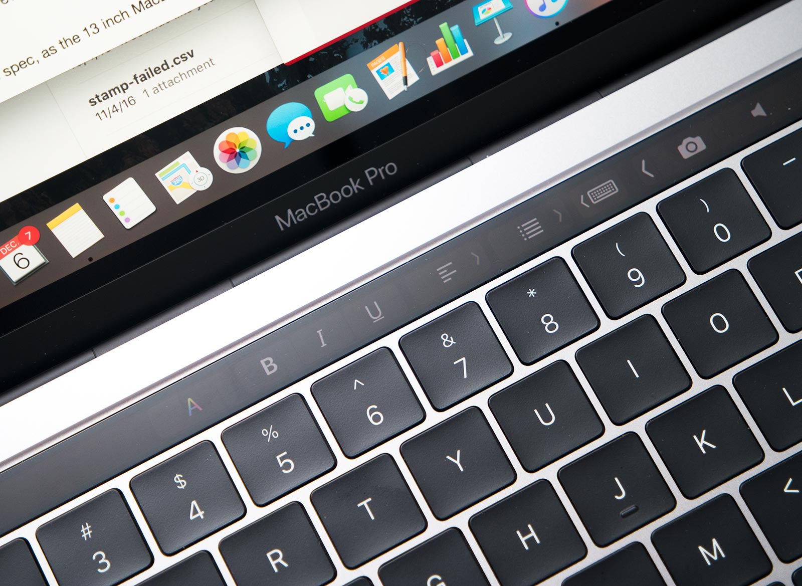
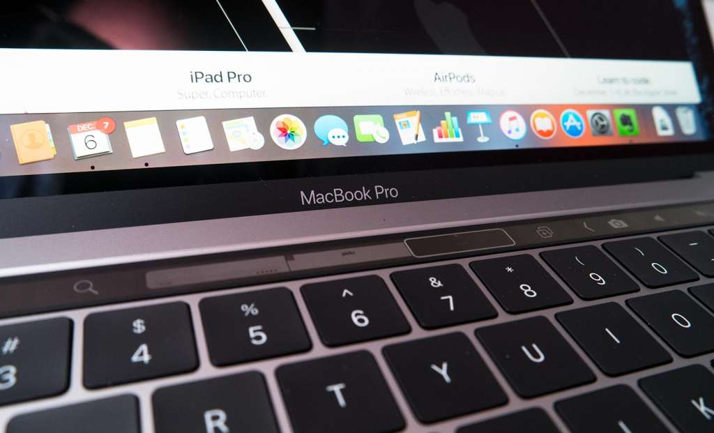
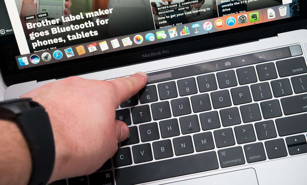
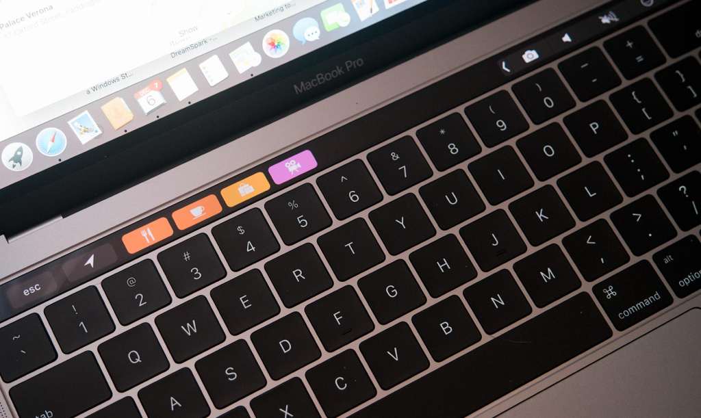
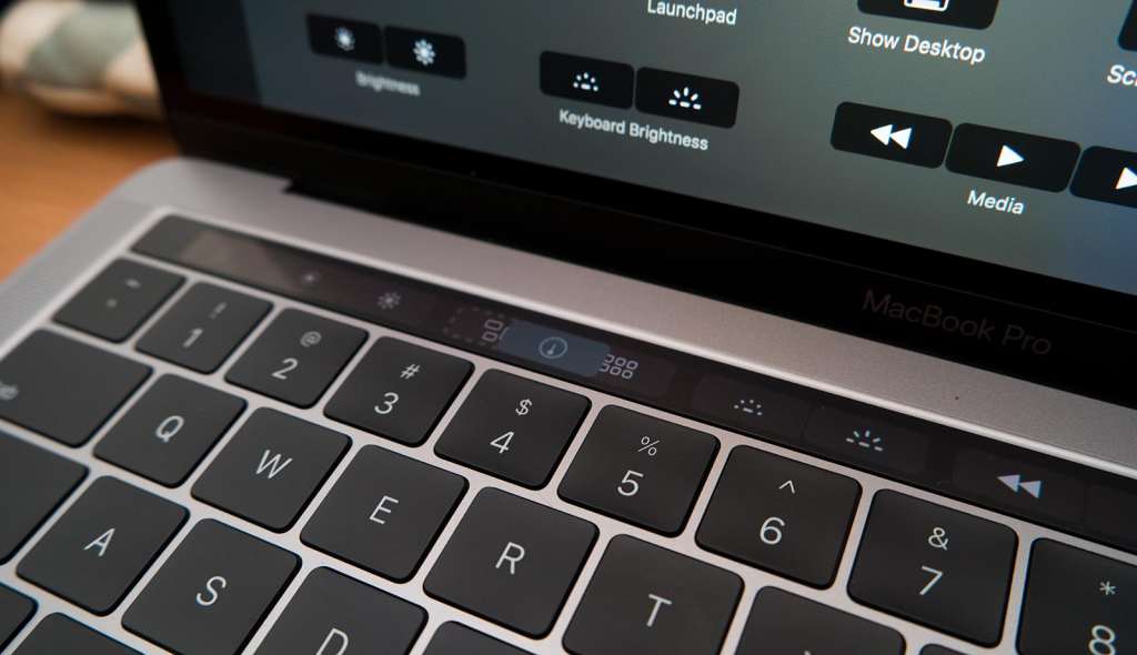
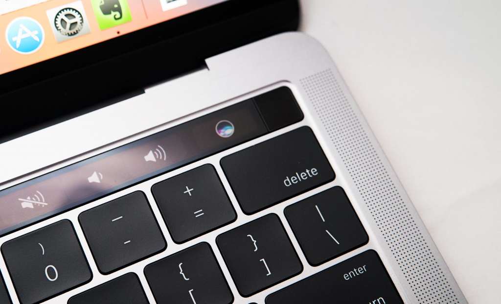
One other screen does make an appearance, however, with a small OLED “touch bar” that does bring a modicum of touch to macOS, found just above the keyboard and being an interactive replacement for the typical function keys most laptops have.
Design
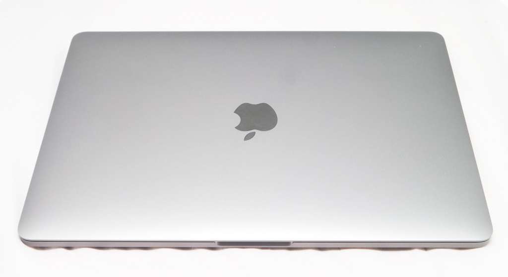
If you haven’t read our MacBook Pro review, you may want to brush up on that, because this MacBook Pro is more of the same: a metal mostly unibody laptop with more of that typically Apple-designed perfection, a flat black keyboard with only a modicum of travel, and yet now a black strip of a touchscreen up top.
Yes, we said “touchscreen”, because that’s essentially what the Touch Bar is, and what makes the difference between this MacBook Pro and that other MacBook Pro.
By “that other MacBook Pro”, we mean the one that lacks the touchscreen and is the otherwise ordinary MacBook Pro, and outside of this and the two extra Thunderbolt 3 / USB Type C ports on the right, you’d be hard pressed to see any difference in design.
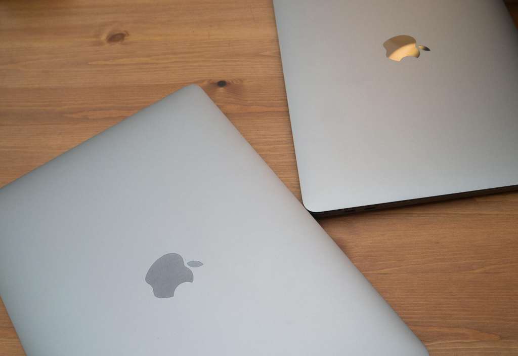
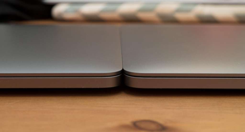
That’s one of the things we loved about the entry-level MBP, and it’s one of the things we continue to love, with a super slick metal body painted in either Apple’s silver or a darker “space grey”, all with a thickness of a machine that manages to be thinner than Apple’s MacBook Air, and with more grunt, too.
Good luck being disappointed with the design of the 2016 MacBook Pro, because it’s slim and sexy, just the way you want your ultra-portable to be.
Performance and in-use
Next up is functionality, because if it doesn’t perform, what good is the new machine?
Fortunately, the 2016 MacBook Pro with Touch Bar handles its own, but understandably, the changes are relatively minor so expecting a huge amount of grunt to change things is a little unreasonable.
You do get some, however, so aside for a marginally speedier performance from the memory, Apple has also provided some faster storage on the write side of things.
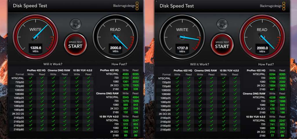
Technically, it reads at the same 2000MB per second, but it will write at a good 400MB per second faster, clocking in at 1737MB per second in our tests compared to the 1330MB per second on the entry level MBP.
Is it a massive difference? No, but it is one that could make you jump at the $500 difference, especially if you’re wondering what you’re paying for outside of the Touch Bar, which we’ll get to momentarily.
We’re still a little miffed that you only have the option for Intel’s graphics, and whle they’ve been upgraded from the Intel 540 to the Intel 550 in the Touch Bar model, we still yearn for a discrete graphics chip, something perhaps made by AMD (ATI) or Nvidia, as that would really complete the performance package.
Outside of that, however, it’s your same easy-to-use, high-performance MacBook Pro, though it does come with two different things the $2199 model doesn’t see.
Touch Bar
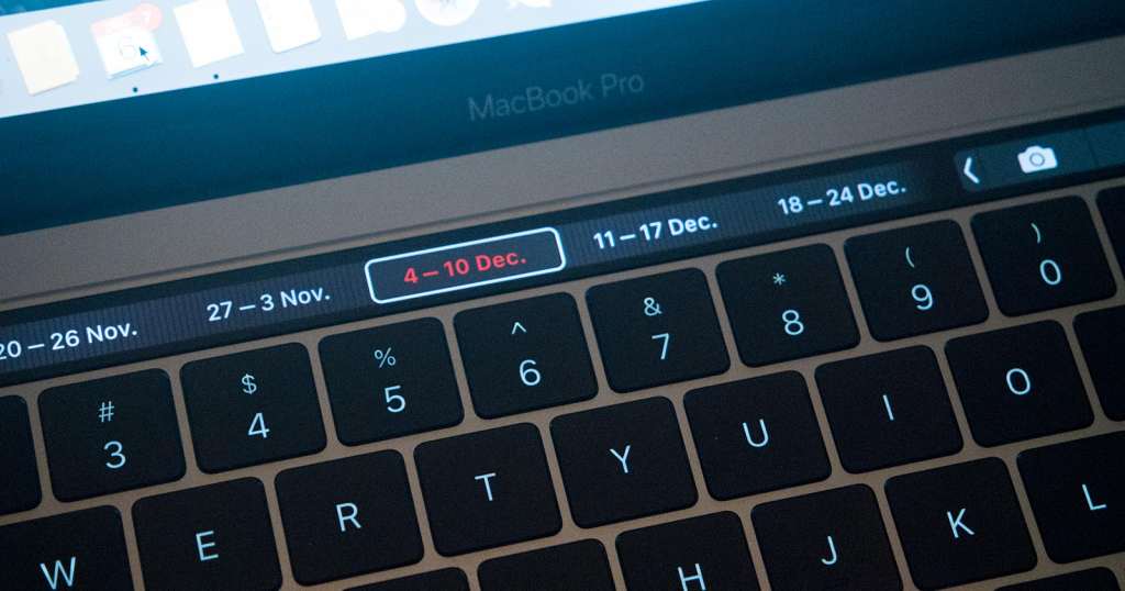
Easily the most controversial part of the new MacBook Pro, the Touch Bar is one of those changes, and comprises of a small OLED touchscreen that graces the section just above the keyboard where the function keys would normally go.
Without doubt, this is the part of the new MacBook Pro people will be looking forward to, and really it’s the one thing that has people in a bit of a frenzy over the new computer.
So what is the Touch Bar?
Well, simply put, it’s a touchscreen, albeit one that is very long and yet also quite slim. It’s about as touchy as Apple seems keen to get on a laptop, and it does something a little different from the conventional touchscreens you find on laptops and tablet these days.
Rather than provide you with a touch experience for the entire operating system, letting you slide and swipe and gesture your way to software for work and life, the Touch Bar is more of a customisable shortcut dock, allowing you to add the shortcuts you’ll use most, move them around on an app-by-app basis, and get some of the features that make iOS (iPhone, iPad) easier in the desktop environment.
Let’s get one thing out of the way first: iOS isn’t macOS.
Sure, they have some similarities, and iOS was technically built out of an older version of Mac OSX, but the paths have diverged and they are very, very different, with one made for touch, and the other, well, not.
MacOS isn’t like Windows where the entire system has been overhauled to make your fingers more of a controller than just something to type and use a mouse with, and so it makes more sense to not have touch on macOS than it does to have it at all.
But that doesn’t mean macOS can’t benefit from a small touchscreen, as the Touch Bar demonstrates that some of these features have the potential to make using a Mac laptop more interesting.
Most applications don’t demonstrate this, that being said, because if you know the shortcuts for opening a tab or don’t rely hard on your bookmarks, you won’t find touching the Touch Bar to open these inside Safari will make much of a dent, and the Touch Bar doesn’t appear to do anything in the other popular browser of Chrome, simply because Google hasn’t built it yet.
Likewise, seeing icons pop up on Maps for finding amenities isn’t any huge thrill, and neither are the emoji when you’re typing a message. If perhaps Apple rolled out sticker support, we might have something, but it’s not there yet on the desktop, and so you don’t get any.
Instead, most of the use of the MacBook Pro Touch Bar seems to come from customising the Finder menus which allows you to drag shortcuts in and out of the menu using your mouse, as well as the quick shortcut Bar which is always there and can be sorted with up to four icons and shortcuts.
Some of Apple’s apps make great use of the Touch Bar, though, such as Photos which lets you slide through your image list by dragging your finger left and right, glimpsing a preview of the image on the fill color OLED bar, while watching videos turns the preview into a video scrubber to let you skip around with ease.
Mail and Calendar both have a pretty handy way of using the Touch Bar to highlight days and flag email, and if you’re typing in an app, the Touch Bar turns into a word suggestion location so you can quickly use a word the Mac suggests or change font settings if you’re not a fast typist.
But if you are, most of this will go by unused, reducing the need for the Touch Bar, making your dependency on the feature something that is specific to the app you’re using, or plan to use.
The problem with the Touch Bar isn’t then that it’s not useful, but that nothing really great takes advantage of it yet. You can imagine the possibilities when Adobe builds support into Photoshop, Illustrator, Premiere, InDesign, or Audition, with various panels and modes supporting different full-colour touch controls, almost like a condensing of Adobe’s panels into a small bar on the laptop.
3D development also bodes well, with the various apps possibly providing customisable shortcuts, as could any application, but that’s the bulk of what makes the Touch Bar good, because it’s a great idea, but it needs more support, even a month or so out of release.
And that’s the thing: it’s early days, so in a few months, you can expect more to make use of the Touch Bar than there is a few weeks out from release, and a release that still results in a waiting time once you put the money down.
You can see the promise, though, so that’s positive, and it’s hard not to be reminded of similar ideas by Art Lebedev or the small LCD-based trackpad Razer once used in a single laptop.
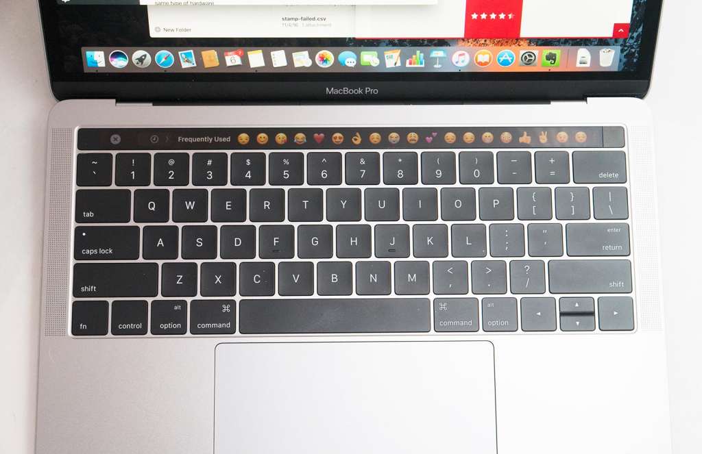
Still, Apple’s concept feels like a proper execution of the evolving interface of keyboards, as it struggles with the idea of a touchscreen not necessarily being needed, but still useful all the same.
It’s worth checking out, that’s for sure, and even if you don’t use it all that often — and you probably won’t — you’ll find one other aspect of the MacBook Pro is worth the price of the ticket: fingerprint security.
Touch ID
While the usefulness of Apple’s Touch Bar remains something that will be based quite heavily on what you plan to use the laptop with, the Touch ID fingerprint lock isn’t in question at all.
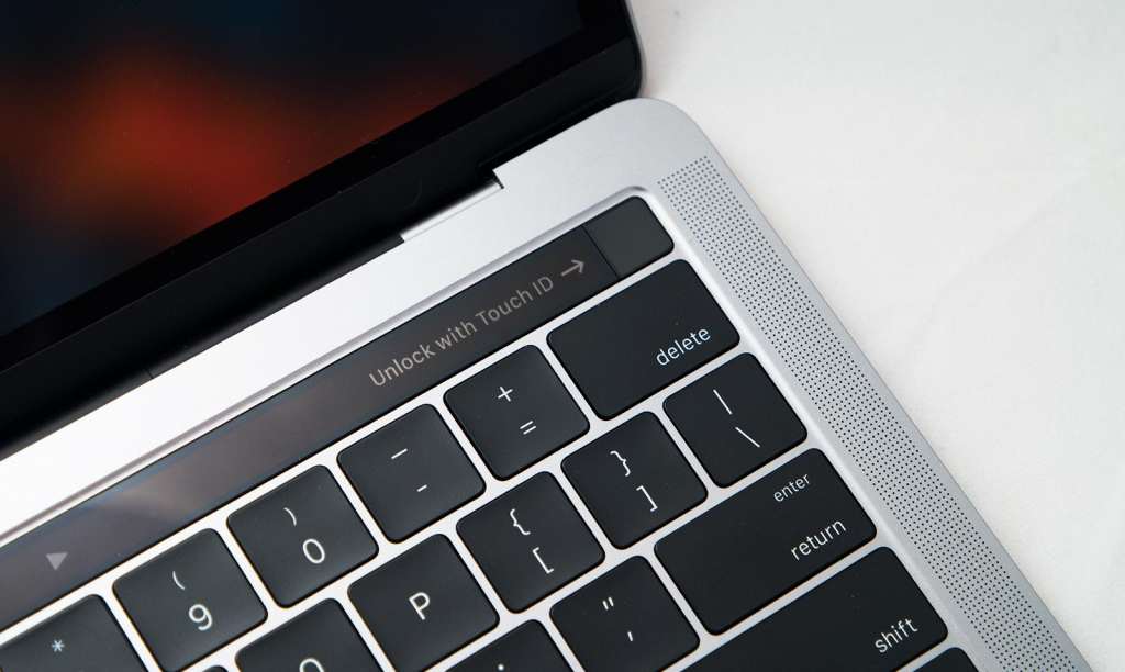
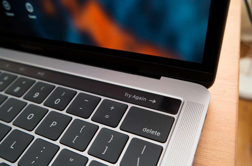
In fact, this is by far the easiest and best fingerprint lock we’ve seen on any laptop thus far, as Apple takes the same technology from its iPhone and iPad and applies it to the world of computing.
The result is an unlocking mechanism that works very, very well, and even serves to provide an easy way to jump between profiles when they’ve been mapped to a fingerprint, allowing you to easily separate work and play with nothing more than a single digit on the hand.
There are more usage scenarios, too, such as using your fingerprint in tandem with Apple Pay in Safari, allowing you to pay for things and access those credit card details when you hold your finger to the sensor, or even paying for things on the iTunes Store.
Like the Touch Bar, the uses are minimal at the moment, but you can imagine developers finding more use for Touch ID as time goes on, and without a doubt, this feature became one of our favourite parts of the MacBook Pro throughout out time with the machine.
Battery
Also strong on the feature list is that of overall battery performance, and just like its entry-level sibling, you’ll find more than enough battery life for most activities, with a solid nine to ten hours possible here, though dependent on what you actually use the laptop for, you may find closer to six, which is what we saw, particularly thanks to our dependency on creative applications like Adobe’s Photoshop.
That’s still a solid result, and proof of Apple’s optimisation of all of the components, particularly that of the Touch Bar and Touch ID.
More interesting, however, is that of how you charge the new MacBook Pro, because thanks to four USB Type C ports on the laptop, you can charge through any of the ports on either side of the laptop.
That’s a super handy inclusion that makes the MacBook Pro more convenient for charging, particularly if you’re travelling and aren’t sure where the nearest powerpoint will be: to the left or to the right of you.
Value
The one area you may have struggles realising is that of value, because starting at a price of $2699, the MacBook Pro isn’t a cheap machine.
For $500 more than the regular model, you get more ports, more features, and slightly faster memory, which at least makes the $2699 model better value across the board than its entry-level sibling.
But $2699 is still expensive, and unless you feel like you can justify that for 256GB storage that runs a little better and has a small touchscreen attached, you may feel like Apple hasn’t quite nailed the value as well as it could have.
What needs work
The special features not withstanding, you still feel like some things could be improved upon, and mostly because the features are missing and probably shouldn’t be.
For instance, you get two more USB Type C and Thunderbolt 3 ports than the entry-level model, but still not SD card slot, an omission we’re still not sure we understand.
That means you now need to bring a memory card reader with you, adding a little bulk and an accessory to the photographer’s arsenal when Apple could have just as easily left it in.
Likewise, where’s the option for a discrete graphics chip? You only find a dedicated graphics option on the 15 inch MacBook Pro, while 13 inch PCs have offered dedicated graphics for quite some time.
This isn’t a new thing, and if you’re spending over $2500, you should be able to grab high-end parts, not just good looking high-end parts.
There’s so much to love about the new MacBook Pro, but what it doesn’t have isn’t part of it, and given that we live in a world where everything gets smaller and yet pieces still converge, this is a little frustrating to say the least.
Final thoughts (TLDR)
After a week with Apple’s MacBook Pro with Touch Bar and Touch ID — and almost a month with the entry-level model — we can say without any uncertainty that both machines are very good, even if they don’t necessarily inspire the same innovative edge that everything Apple once drew.
These are exceptional, albeit expensive computers, and while they won’t necessarily revive the feeling of Apple’s golden years of major ingenuity, they still have time, particularly the mid-range and higher priced MacBook Pros.
The Touch Bar may not make you pull up visions and dreams of what you can do, but full touchscreens rarely do that either, and we give more attention to thought out and well-executed products in the end.
Don’t get us wrong, we like touchscreen computers, but we don’t use the touchscreen as much as you’d think, even though we sit in the creative field. Likewise, we didn’t end up using the Touch Bar as often as we’d hoped, though we did try to find ways of involving it in our workflow.
That might just be a problem with how we work, or it might be an issue with the software we regularly use, but we can definitely say when the apps evolve and grow up, the experience should be better across the board.
What you get now, however, is a slightly more innovative laptop that feels marginally ahead of its time, even if it’s going to take some improvements to software to get the world to see it for that it is.
